Introduction
One of the things I found frustrating in the previous versions of Silverlight was the lack of the Right Mouse Click support. Now we know that this functionality has turned real with Silverlight 4. Furthermore, we know that the April 2010 Silverlight toolkit release comes with a ContextMenu Control to be used in combination with the right click. So it’s time to put these new things in practice and try to use them in our projects. In this article we will see how to create and use a ContextMenu, how it is made and then we will extend it in a peculiar way.
You can download the source code used in the article from here.
Features included in this release of the ContextMenu Control
As you may already know, the ContextMenu is essentially a menu which appears on a UI control after clicking the right mouse button. This menu typically contains items related to the context of the control and comes in handy in various situations. As written in the Delay’s Blog this release of ContextMenu is a subset of its WPF’s cousin. What is not supported is principally the multi level menu; however, the rest is more or less there. You have obviously mouse and keyboard support, custom positioning of the menu, icon support, enable/disable items and so on.
How to use the ContextMenu Control
First of all you have to download and install the April 2010 release of the Silverlight Toolkit available on Codeplex. After that, add the necessary references (System.Windows.Controls.Toolkit and System.Windows.Controls.Input.Toolkit) and move to your xaml page where you simply have to add to the list of namespace mappings what follows:
1: xmlns:toolkit=”http://schemas.microsoft.com/winfx/2006/xaml/presentation/toolkit”
By the way, this is a small but appreciated new entry of the April toolkit release. Now you are ready to attach your first ContextMenu to one of the controls of your UI. If you are already familiar with the WPF version of the ContextMenu you should not have any difficulty in following the rest of the paragraph. Suppose you want to add it to a button: what you have to do is first use an attached property, the so called ContextMenuService. ContextMenu, inside the xaml of the button as described (let’s leave aside what is in the middle for now, we will find it out soon):
1: <Button Content="Right click on me" Name="MyButton" Height="23" Width="75" />
2: <toolkit:ContextMenuService.ContextMenu>
3: ....
4: </toolkit:ContextMenuService.ContextMenu>
5: </Button>
This attached property is defined as follows:
1: public static readonly DependencyProperty ContextMenuProperty = DependencyProperty.RegisterAttached(
2: "ContextMenu",
3: typeof(ContextMenu),
4: typeof(ContextMenuService),
5: new PropertyMetadata(null, OnContextMenuChanged));
and it essentially serves to set the owner of the ContextMenu. In fact, if you look at the source code of the Silverlight toolkit where the context menu is dealt with “Owner” is an internal property of ContextMenu and when it is set, also an event handler to the mouse right click on the owner is set. The real popup menu is created within this event handler using the Popup primitive and associating a Canvas to it. Let’s now move on to adding other elements to our xaml example as follows:
1: <Button x:Name="MyButton" Content="Right click on me!">
2: <toolkit:ContextMenuService.ContextMenu>
3: <toolkit:ContextMenu>
4: <toolkit:MenuItem Header="menu item 1" />
5: <toolkit:MenuItem Header="menu item 2"/>
6: </toolkit:ContextMenu>
7: </toolkit:ContextMenuService.ContextMenu>
8: </Button>
Here we have just added the ContextMenu in the attached property and inside the ContextMenu we added two menu items. In the image below you may see the result:

the ContextMenu is nothing but a class derived from ItemsControl which is the control generally used to present a collection of items. Also MenuItem derives from ItemsControl, but here the intermediate class in the hierarchy, HeaderedItemsControl, exposes something interesting. HeaderedItemsControl, in fact, contains a heading (or title) and multiple items. What we used in the example above is the Header property of HeaderedItemsControl to label our menu items with a string, but if you look at the definition of the Header:
1: // Summary:
2: // Gets or sets the item that labels the control.
3: //
4: // Returns:
5: // The item that labels the control. The default value is null.
6: public object Header { get; set; }
You will see that it is defined as an object; what does It mean? It means that here you can virtually insert whatever you want, not just a string. We will come back on this later on. Let's move on and let’s add other features to our first ContextMenu:
1: Button x:Name="MyButton" Content="Right click on me!">
2: <toolkit:ContextMenuService.ContextMenu>
3: <toolkit:ContextMenu>
4: <toolkit:MenuItem Header="menu item 1" />
5: <toolkit:MenuItem Header="menu item 2"/>
6: <toolkit:Separator/>
7: <toolkit:MenuItem Header="menu item 3" >
8: <toolkit:MenuItem.Icon>
9: <Image Source="Paste.png"/>
10: </toolkit:MenuItem.Icon>
11: </toolkit:MenuItem>
12: </toolkit:ContextMenu>
13: </toolkit:ContextMenuService.ContextMenu>
14: </Button
Below is how it appears with the additions:
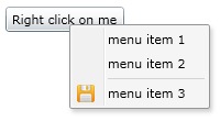
Separator is simply a basic control stylized as a line and it is useful to separate different items. The Icon property of the MenuItem class is more interesting; it is strongly recommended to set this property if you want to accompany a menu item with an icon. But take a look at how this property is defined:
1: /// <summary>
2: /// Identifies the Icon dependency property.
3: /// </summary>
4: public static readonly DependencyProperty IconProperty = DependencyProperty.Register(
5: "Icon",
6: typeof(object),
7: typeof(MenuItem),
8: new PropertyMetadata(null));
As you can see it is a simple object just like the “Header” property. So what happens if we swap the content of “Header” and “Icon” of our ContextMenu as in the xaml code below?
1: toolkit:ContextMenuService.ContextMenu>
2: <toolkit:ContextMenu>
3: <toolkit:MenuItem Header="menu item 1" />
4: <toolkit:MenuItem Header="menu item 2"/>
5: <toolkit:Separator/>
6: <toolkit:MenuItem >
7: <toolkit:MenuItem.Header>
8: <Image Source="save.png"/>
9: </toolkit:MenuItem.Header>
10: <toolkit:MenuItem.Icon>
11: "menu item 3"
12: </toolkit:MenuItem.Icon>
13: </toolkit:MenuItem>
14: </toolkit:ContextMenu>
15: </toolkit:ContextMenuService.ContextMenu>
It happens what we expect to happen:
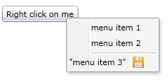
In other words, “Icon” and “Header” are two virtually interchangeable properties not considering visual side effects.
How it is made
The ContextMenu consists of a “Grid” type container which includes a Rectangle of 28 pixel in width on the left and an ItemsPresenter.
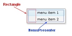
The Rectangle on the left serves as background for the area in which icons are inserted. The ItemsPresenter is used to display the menu items.
Let’s focus on a single menu item now:
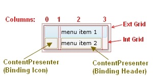
As you can see in the image above, the MenuItem is made of a grid with 4 columns. The first column is reserved for the Icon object, the second for the vertical separator and the third column contains the Header object. The fourth and last column serves as spacer.
How to abuse it
Let’s try to extend the ContextMenu by adding something that looks like a multilevel menu. The idea is: since we found that we can include whatever we want into the “Header” section of the MenuItem, why not adding another ContextMenu there?
Let’s suppose to add a TextBlock in the header and hook a ContextMenu to it through ContextMenuService as in the following piece of code:
1: <toolkit:ContextMenuService.ContextMenu>
2: <toolkit:ContextMenu>
3: <toolkit:MenuItem>
4: <toolkit:MenuItem.Header>
5: <TextBlock Text="menu item 1" >
6: <toolkit:ContextMenuService.ContextMenu>
7: <toolkit:ContextMenu Margin="8">
8: <toolkit:MenuItem Header="menu AA" >
9: </toolkit:MenuItem>
10: <toolkit:MenuItem Header="menu AB"/>
11: </toolkit:ContextMenu>
12: </toolkit:ContextMenuService.ContextMenu>
13: </TextBlock>
14: </toolkit:MenuItem.Header>
15: </toolkit:MenuItem>
16: <toolkit:MenuItem Header="menu item 2"/>
17: <toolkit:Separator/>
18: <toolkit:MenuItem Header="menu item 3" >
19: <toolkit:MenuItem.Icon>
20: <Image Source="save.png"/>
21: </toolkit:MenuItem.Icon>
22: </toolkit:MenuItem>
23:
24: </toolkit:ContextMenu>
25: </toolkit:ContextMenuService.ContextMenu>
The result would be:
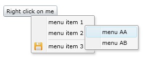
Nice, isn't it? Actually, it is not quite as good as it appears because you have to do a right click twice: the first on the button and the second on the item of the ContextMenu and this is not what one would expect. So let’s try another way. Let’s take out the attached property ContextMenuService and look for another mechanism to hook the ContextMenu to a single item.
In the code below I added a StackPanel to the Header of the first MenuItem. I set the “Orientation” as “Horizontal” and I inserted a TextBlock to label the MenuItem and a ContextMenu detached from any Control.
1: <toolkit:ContextMenuService.ContextMenu>
2: <toolkit:ContextMenu>
3: <toolkit:MenuItem>
4: <toolkit:MenuItem.Header>
5: <StackPanel Orientation="Horizontal">
6: <TextBlock Text="menu item 1" />
7: <toolkit:ContextMenu Margin="2">
8: <toolkit:MenuItem Header="menu AA" />
9: <toolkit:MenuItem Header="menu AB"/>
10: </toolkit:ContextMenu>
11: </StackPanel>
12: </toolkit:MenuItem.Header>
13: </toolkit:MenuItem>
14: <toolkit:MenuItem Header="menu item 2"/>
15: <toolkit:Separator/>
16: <toolkit:MenuItem Header="menu item 3" >
17: <toolkit:MenuItem.Icon>
18: <Image Source="save.png"/>
19: </toolkit:MenuItem.Icon>
20: </toolkit:MenuItem>
21:
22: </toolkit:ContextMenu>
23: </toolkit:ContextMenuService.ContextMenu>
The result is:
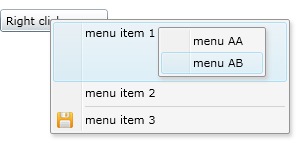
As you may see it does not look like a traditional multi-level menu because the main menu incorporates also the sub menu; however in some way it works. You can move the pointer on the single items of the sub menu to highlight them and the underlying item remains highlighted. The problem is that the sub menu does not disappear when you go on another MenuItem of the main menu. To add this functionality you can use the mechanism of the attached properties.
The attached property I used, which I called ContextMenuHelper.CheckSubMenu is defined in a ContextMenuHelper static class as follows:
1: public class ContextMenuHelper
2: {
3: public static readonly DependencyProperty CheckSubMenuProperty =
4: DependencyProperty.RegisterAttached("CheckSubMenu", typeof(bool), typeof(ContextMenuHelper),
5: new PropertyMetadata(CheckSubMenuPropertyChanged));
6:
Whenever this property is set by a MenuItem, the event handler CheckSubMenuPropertyChanged is fired. In this event handler whose code you can see below:
1: private static void CheckSubMenuPropertyChanged (DependencyObject d, DependencyPropertyChangedEventArgs e)
2: {
3: FrameworkElement menuItemWithSubMenu = d as FrameworkElement;
4:
5: if ((bool)e.NewValue)
6: {
7: menuItemWithSubMenu.GotFocus += new RoutedEventHandler(menuItemWithSubMenu_GotFocus);
8: }
9: else
10: {
11: menuItemWithSubMenu.GotFocus -= new RoutedEventHandler(menuItemWithSubMenu_GotFocus);
12: }
13:
14: }
I added a RoutedEventHandler to the GotFocus event of each MenuItem in which the attached property has been set to “true”. The menuItemWithSubMenu’s RoutedEventHandler below has the logics which permit to visualize or hide the sub menu.
1: static void menuItemWithSubMenu_GotFocus(object sender, RoutedEventArgs e)
2: {
3: FrameworkElement menuItemWithSubMenu = (FrameworkElement)sender;
4:
5: if( null == menuItemWithSubMenu)
6: return;
7:
8: // search for subContextMenus inside the menuItem
9: List<ContextMenu> contextMenusInMenuItemWithSubMenu = menuItemWithSubMenu.GetChildrenByType<ContextMenu>(c => c is ContextMenu);
10:
11: if (contextMenusInMenuItemWithSubMenu.Count > 0)
12: {
13: contextMenusInMenuItemWithSubMenu[0].Visibility = Visibility.Visible;
14: }
15: else
16: {
17: ContextMenu MainContextMenu1 = menuItemWithSubMenu.Parent as ContextMenu;
18: // search for other subContextMenus inside other itemMenus
19: List<ContextMenu> contextMenusInOtherMenuItems = MainContextMenu1.GetChildrenByType<ContextMenu>(c => c is ContextMenu);
20:
21: foreach (ContextMenu subCM in contextMenusInOtherMenuItems)
22: {
23: subCM.Visibility = Visibility.Collapsed;
24: }
25: }
26: }
When a MenuItem receives the focus, a search is performed among the child controls to locate a sub-ContextMenu. If a sub-contextMenu is found then it is made visible. If there are no sub-contextMenu another search is performed, this time starting from the main ContextMenu and each sub-contextMenu found is made invisible.
What remains to do in order to make it work is adding this attached property to each MenuItem of the ContextMenu and set it to true as in the xaml code below:
1: <Button Content="Mouse Right click here" Height="23" HorizontalAlignment="Left" Margin="167,109,0,0" Name="button1" VerticalAlignment="Top" Width="164">
2: <toolkit:ContextMenuService.ContextMenu>
3: <toolkit:ContextMenu >
4: <toolkit:MenuItem local:ContextMenuHelper.CheckSubMenu="True">
5: <toolkit:MenuItem.Header>
6: <StackPanel Orientation="Horizontal" Background="Transparent">
7: <TextBlock>menu item 1</TextBlock>
8: <toolkit:ContextMenu Margin="2" Visibility="Collapsed" >
9: <toolkit:MenuItem Header="submenu item 1" local:ContextMenuHelper.CheckSubMenu="True" Click="MenuItem_Click" >
10: </toolkit:MenuItem>
11: <toolkit:MenuItem Click="MenuItem_Click_1" Header="submenu item 2"/>
12: </toolkit:ContextMenu>
13: </StackPanel>
14: </toolkit:MenuItem.Header>
15: </toolkit:MenuItem>
16: <toolkit:MenuItem Header="menu item 2" local:ContextMenuHelper.CheckSubMenu="True" />
17: <toolkit:MenuItem local:ContextMenuHelper.CheckSubMenu="True">
18: <toolkit:MenuItem.Header>
19: <StackPanel Orientation="Horizontal" Background="Transparent">
20: <TextBlock>menu item 3</TextBlock>
21: <toolkit:ContextMenu Margin="2" Visibility="Collapsed" >
22: <toolkit:MenuItem Click="MenuItem_Click" Header="submenu item 1" />
23: <toolkit:MenuItem Click="MenuItem_Click_1" Header="submenu item 2"/>
24: </toolkit:ContextMenu>
25: </StackPanel>
26: </toolkit:MenuItem.Header>
27: </toolkit:MenuItem>
28: <toolkit:MenuItem Header="menu item 4" local:ContextMenuHelper.CheckSubMenu="True"/>
29: </toolkit:ContextMenu>
30: </toolkit:ContextMenuService.ContextMenu>
31: </Button>
With this mechanism you can nest other sub-sub-ContextMenu as in the following image:
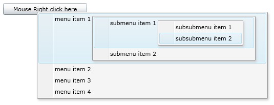
Finding the way to prevent the expansion of the parent ContextMenu is left to the reader.
An application to a real case
I have recently ported an application which I already described in two of my previous articles here and here to Silverlight 4 and I took the chance to introduce a ContextMenu. In the image below you can see an example of a ContextMenu stylized.
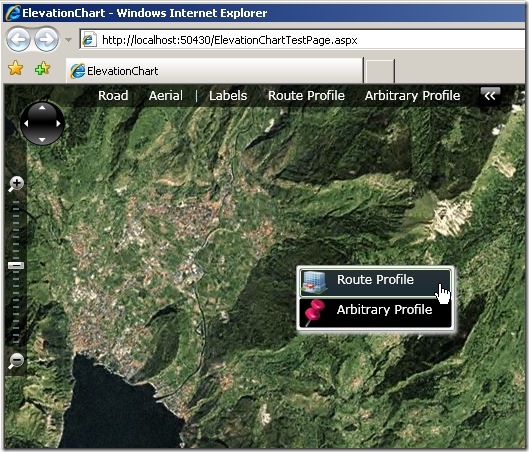
Summary
In this article we have explored in depth the new ContextMenu Control introduced with the April 2010 relase of the Silverlight toolkit. We have learned how to create it and use it and then we have enjoyed trying to extend it in an unusual way.