Last week I did a First Look at Silverlight 2 post that talked about the upcoming Silverlight 2 Beta1 release. In the post I linked to some end-to-end tutorials I've written that walk through some of the fundamental programming concepts behind Silverlight and WPF, and demonstrate how to use them to build a "Digg Search Client" application using Silverlight:
- Part 1: Creating "Hello World" with Silverlight 2 and VS 2008
- Part 2: Using Layout Management
- Part 3: Using Networking to Retrieve Data and Populate a DataGrid
- Part 4: Using Style Elements to Better Encapsulate Look and Feel
- Part 5: Using the ListBox and DataBinding to Display List Data
- Part 6: Using User Controls to Implement Master/Details Scenarios
- Part 7: Using Templates to Customize Control Look and Feel
- Part 8: Creating a Digg Desktop Version of our Application using WPF
In this first set of Silverlight tutorials I didn't use a visual design tool to build the UI, and instead focused on showing the underlying XAML UI markup (which I think helps to explain the core programming concepts better). Now that we've finished covering the basics - let's explore some of the tools we can use to be even more productive.
Expression Blend Support for Silverlight
In addition to releasing the upcoming Beta1 of Silverlight 2, we are also going to ship Visual Studio 2008 and Expression Studio tool support for targeting it. These tools will offer a ton of power for building RIA solutions, and are designed to enable developers and designers to easily work on projects together.
In today's post I'm going to introduce some of the features in the upcoming Expression Blend 2.5 March preview. After demonstrating some of the basics of how Blend works, we are going to use it to build a cross-platform, cross-browser Silverlight IM chat client:
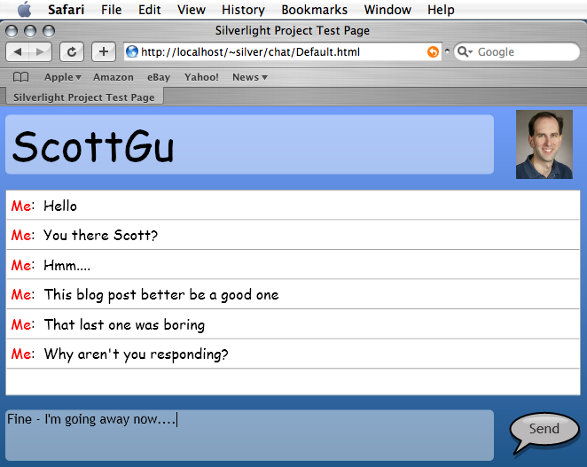
The above screen-shot shows what the application looks like at runtime on a Mac. Below is a screen-shot of what it looks like at design-time within Expression Blend:
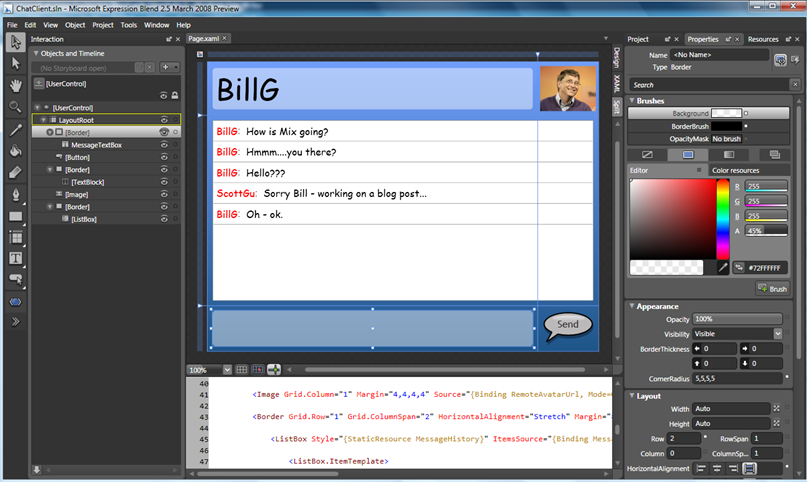
We'll use Expression Blend to graphically construct all of the UI for the application, as well as use it to cleanly data-bind the UI to .NET classes that represent our chat session and chat messages.
All of the controls we'll use to build the chat application are built into Beta1 of Silverlight 2.
Disclaimer: I am not a designer (nor am I cool)
Let me say up front that I am a developer and not a designer. I'm also not very cool. While I understand the techniques to create UI, I sometimes choose bad colors and fonts when putting it together (only after I did all the screen-shots for this post did a co-worker helpfully point out that there is actually a site dedicated to banning some of the fonts and colors I used. Ouch).
For those of you with artistic skill out there - please be gentle with me and focus your attention on the features and techniques I demonstrate below, rather than on the font and color choices I use. :-)
Getting Started: Creating a new Silverlight 2 Project
Expression Blend and Visual Studio 2008 share the same solution/project file format, which means that you can create a new Silverlight project in VS 2008 and then open it in Expression Blend, or you can create a new Silverlight project in Expression Blend and open it in VS. You can also have both Expression Blend and VS 2008 open and editing the same project as the same time.
Since in my previous Silverlight tutorial series I already showed how to create a new Silverlight project using VS 2008, let's use this post to show how to create a new Silverlight application using Expression Blend. To do this, simply choose File->New Project in Expression Blend, select the "Silverlight 2 Application" icon, and click ok:
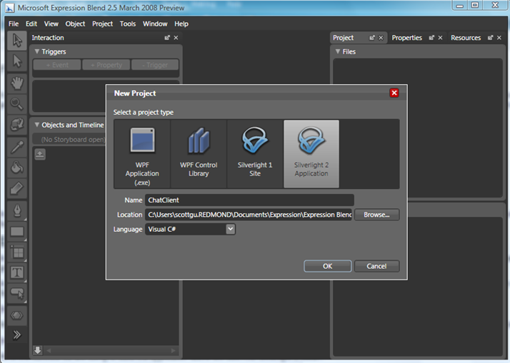
This will create a new (VS-compatible) solution file and Silverlight application project:
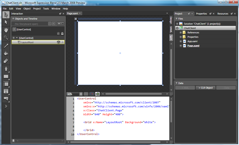
Blend includes a full WYSIWYG designer for Silverlight 2 applications. When opening Silverlight pages and controls you can switch the design-surface to be in design view, a XAML source view, or a split-view that shows both the design view and XAML source view at the same time (and which supports live edits of both). Above we are using the split-view option.
Understanding Some Basics: Adding Controls to the Surface
Expression Blend has a slightly different tool palette then Visual Studio (it more closely resembles what you'd find in a design tool like Photoshop).
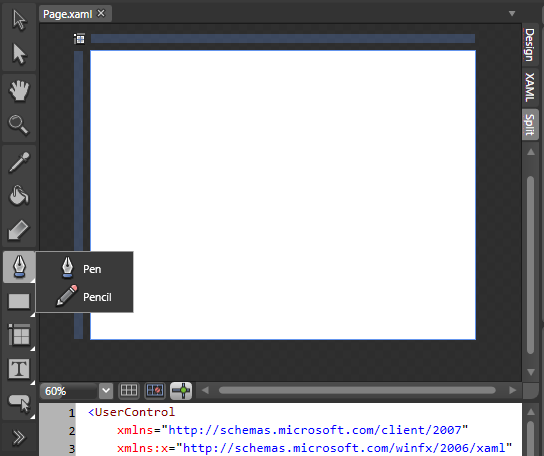
Blend supports vector graphic editing:
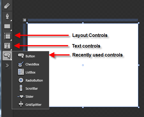
Blend also supports adding and working with controls. There is a special icon on the Toolbox for layout controls (Grid, Stack, Canvas, Border, ScrollViewer, etc), text controls (TextBox, TextBlock, etc), and an icon that displays the controls you've recently used:
Clicking on the final ">>" icon on the tool palette displays all of the controls that are available to be used:
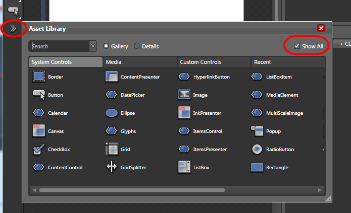
Make sure to click the "Show All" checkbox in the top-right hand corner of the Asset Library if you don't see the control you are looking for. You can also use the "search" textbox to filter the controls by name.
Important: Blend supports a design experience for all controls (both the built-in ones as well as any custom control or user control that your application references).
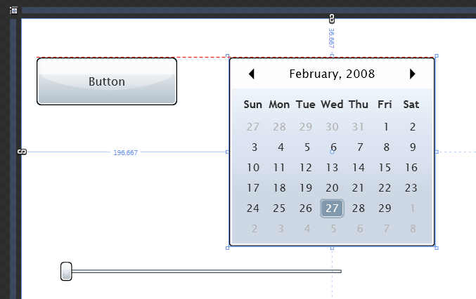
Once you select a control from the toolbox, you can click and drag on the design-surface and draw out the control. You can also drag controls from the asset tool onto the artboard. By default you get automatic rules and positioning placement markers when you add and interact with the controls on the design-surface (below is a form with the built-in button, calendar and slider control on it):
Understanding More Basics: Working with Control Properties
You can select any object on the design-surface and then click on the "properties" panel on the right-hand side of the screen to customize its properties:
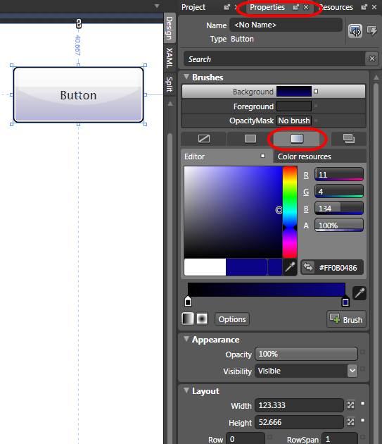
Above I'm changing the "Background" brush of the button to be a deeper blue gradient (the third tab circled in red under the "Brushes" node allows us to configure the gradient brush).
Useful Tip: The properties window includes a search box near the top that you can optionally use to filter the visible property names:
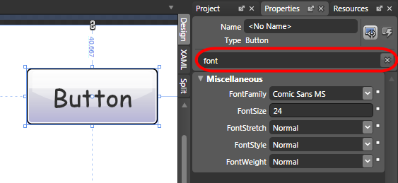
Because all UI objects in Silverlight and WPF are composed using vector graphics, we can shape/stylize/transform controls however we want. For example, we could either set the "Transform" properties on our Button control or click on the corner edges of it to rotate/skew/scale it:
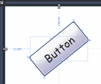
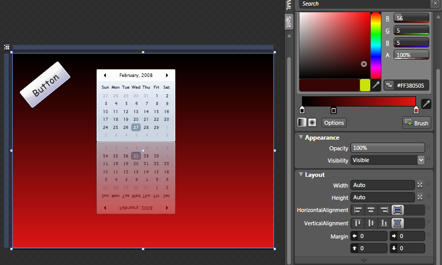
This gives us a lot of power and flexibility to quickly and easily customize the experience however we want:
Useful Tip: You can zoom in and out of the design surface by holding down the ctrl key and then use the wheel of your mouse to control the zoom depth. You can then move the viewable region of the design surface by holding down the space bar, which will cause a hand-cursor to display, and then you can hold down the mouse and use it to drag the currently visible region around the screen. This later tip is useful when you are zoomed way in and want to easily move the visible content around.
Building our Chat Application: Defining the Layout
In Part 2: Using Layout Management of my previous Silverlight tutorial series I talked about the layout management system within Silverlight and WPF, and how we can use layout panels to easily control application layout and flow. Expression Blend makes defining layout rules easy, and includes built-in tool support for using these layout panels.
Remember that our goal in building our chat application is to have UI that looks like this:

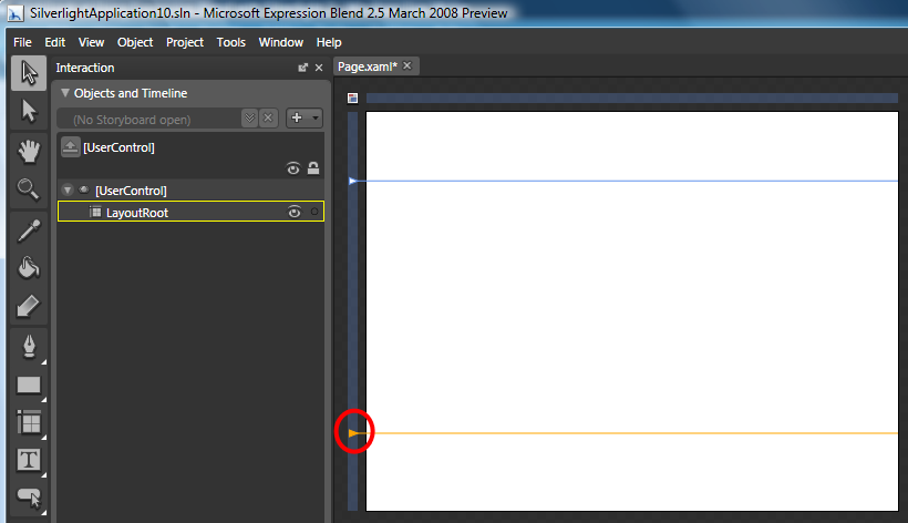
To do this we'll start by defining a three row layout on our page. We'll do this by hovering the mouse over the left margin of the design-surface and then click where we want to establish a new row definition (below I've already setup a top row definition - the cursor location circled in red indicates where I'll click to add a second row definition):
Clicking on the top-left corner of the design surface (circled in red below) allows us to toggle whether the design surface is in Canvas layout mode or Grid layout mode.
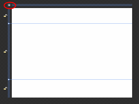
When in Grid layout mode Blend will show us whether a particular row or column has a fixed width, or whether it is proportional to the size of the control. Above the "empty locks" indicates that the three rows are currently proportional to each other (meaning they will all increase proportionally if we resize the browser to get bigger):
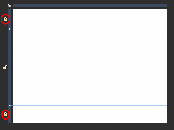
If we click the top and bottom locks we can set those rows to have a fixed height instead, and leave the middle row to fill the remaining height.
One last step we can take is to click on the top margin and define a right-hand column as well - which we'll set to have a fixed width (and leave the left column to dynamically resize):
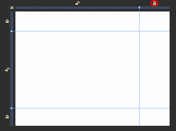
Once we do the steps above, our XAML file with have a Grid defined like so:
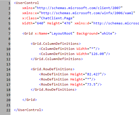
Useful Tip: Above we have a fixed width and height set for our Silverlight application (notice the Width and Height attributes on the root element). We can cause the application to instead have a dynamic size and automatically flow and size to fit the containing HTML element or browser window size by removing the Width and Height attributes completely (I talk about this at the end of my layout tutorial here). If we want to set a design-time width and height on our application, we can do that by setting a d:DesignWidth="640" and d:DesignHeight="476" attribute on the root UserControl element. This will cause the designer to default to that size dimension when using the designer on the application.
Building our Chat Application: Adding Controls and Colors
Now that we have the core layout of our chat application defined, let's add some controls to it and start to customize how it looks.
We'll start by selecting the root Grid layout panel and customize its background color to be a blue gradient. One easy approach we can use to select a particular control is to use the "Interaction" panel and then click the control we want to select within it:
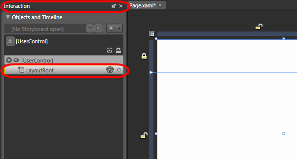
We can then use the "Brushes" property panel to customize a blue LinearGradient brush for the background of our Grid:
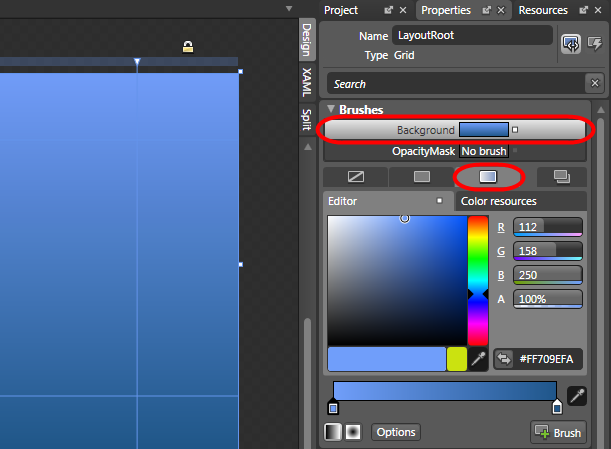
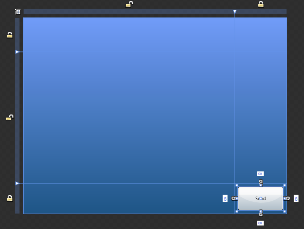
Once we have this set we'll work on the bottom of our chat window, and add a "Send" button to it:
For our chat message textbox we'll use a standard textbox. But to add a little more pizzazz we'll first add a border control with a "RoundRadius" of 5 and a Background and BorderBrush like so:

We'll then embed our TextBox within the Border control.
Important Tip: To nest the TextBox within the Border control using the design-surface, we'll want to double-click the Border control within the interaction window. This will set it as the active insertion control in the design surface, and highlight it in yellow like below:
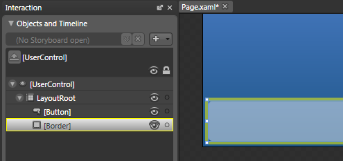
We can then use the control toolbox to select a TextBox control and add it into the Border control. We'll set the TextBox's background and border brush to pick up the nice curved look from the parent Border control:

The XAML markup generated by Blend will look like below (notice how the TextBox is nested under the Border control - it wouldn't have been if the Border hadn't been the active insertion control):

We can repeat the above process for the header row as well, and embed a TextBlock within a Border control and add a image control to the right column to create UI like so:

The XAML markup generated by Blend looks like below:

Last but by no means least, we'll add another Border control in our center row and add a ListBox control inside it. We'll configure the Border control to stretch across both columns in our Grid, and customize its background and foreground colors. We'll then put some test message inside the ListBox as placeholder text (we'll customize the UI and databind real values later):
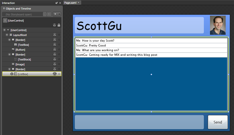
The XAML markup generated by Blend looks like below:

And now when we run the application we have a basic chat IM client (with hard coded values) running in the browser. As we resize the browser the application will automatically flow and resize to fit the window.
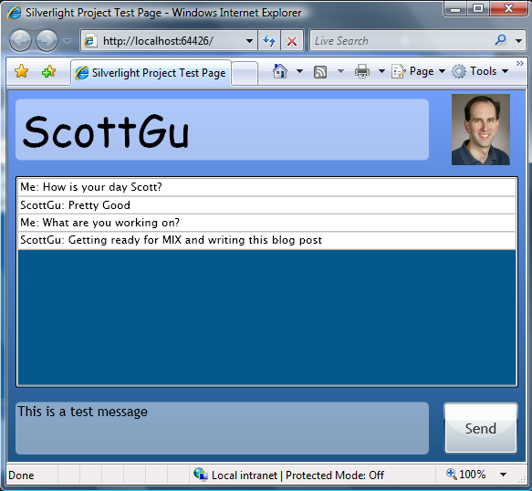
We still have a bunch of UI work to-do to make our IM client look less lame, but at least we now have something up and running.
Building our Chat Application: Adding "ChatMessage" and "ChatSession" classes
Now that we have created our initial UI within Expression Blend, let's open up the same project in Visual Studio and add some chat classes that we can use to bind our UI against.
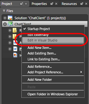
We can open up the project in Visual Studio either by selecting File->Open Project inside VS 2008 and selecting the project file for our project, or within Expression Blend we can right-click on the project node and choose the "Edit in Visual Studio" menu item to launch VS 2008 with the project open:
VS 2008's Silverlight support in Beta1 has project management support for Silverlight 2 solutions, full intellisense and event-wireup support, and support for debugging Silverlight applications running both on Windows and the Mac. VS 2008 also has split-view editing support for Silverlight .xaml files. For example, here it the same Page.xaml file we built above in Blend open inside VS 2008:
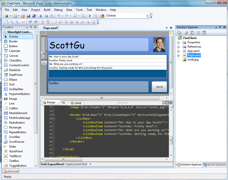
The VS 2008 design-view in Beta1 isn't interactive (meaning it is still read-only). Changes you make in source-view, though, are updated immediately in design-view - which gives you a nice XAML-pad experience (and VS 2008 supports full XAML source intellisense with Silverlight 2 Beta1).
For this blog post we aren't going to be using the Visual Studio XAML editor. Instead we are going to create some classes that we'll use to represent a ChatSession and associated chat messages. We'll then use Expression Blend to bind our UI controls against these.
We'll start by adding a new class called "ChatMessage" that defines two public properties:

We'll then create a class called "ChatSession" that represents a chat session.
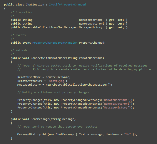
The ChatSession class above has three public properties. The first two properties represent the remote user name and avatar on the other end of the chat.
The third property is a collection of the past chat messages. Notice that its type is not a List collection - but rather an ObservableCollection collection. ObservableCollection might not be a familiar class to you if you are coming from an ASP.NET background - but those coming from a Windows Forms or WPF background are probably familiar with it. Basically it is a generic collection class that raises change notification events when items are added/removed from it (or when items that implement INotifyPropertyChanged within it have their properties changed). This comes in very handy when doing data-binding - since UI controls can use these notifications to know to automatically refresh their values without a developer having to write any code to explicitly do so.
The ChatSession class then has two public methods - one whose job it is to connect to a chat server, and another whose job it is to send messages to the chat server. For the sake of simplicity (and because I don't have a chat server) I've just faked out these methods. In real-life we would probably use the network sockets implementation built-into Silverlight to connect to a remote chat server.
The ChatSession class implements the INotifyPropertyChanged interface - which means it exposes a public "PropertyChanged" event. We'll raise this event within our class when we change the properties on it. This will enable listeners (for example: controls data-binding against it) to be notified when changes in the property values occur - which allows them them to rebind the values.
Implementing Fake Data for Design-time Databinding
From a purely functional perspective, the above code is all we need in order to implement our chat client. To help improve the design-time experience in Blend, though, we'll also add a constructor that checks whether we are in runtime or design-time mode, and loads up our ChatSession object with "fake data" if it is being hosted in a designer:
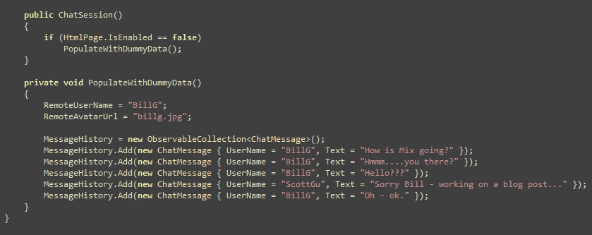
We'll see in a moment how this helps make it easier to visualize data-bound data in the designer.
Building our Chat Application: Wiring up UI using DataBinding in Expression Blend
Now that we have the ChatMessage and ChatSession objects defined, we can use them within Expression Blend to databind our UI controls.
I introduced how data-binding in Silverlight and WPF work in my Tutorial 5: Using Databinding and the ListBox control to display list data post from last week. In today's post we'll be using Expression Blend to wire-up the databinding expressions instead of manually typing them. We'll start by using the "Data" panel under the "Project" panel inside Blend:
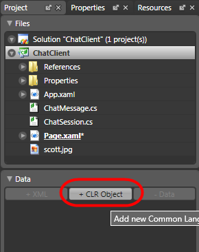
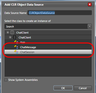
We'll click the "+ CLR Object" link in the "Data" panel to pull up a dialog that allows us to pick any .NET object to databind our UI controls against. We'll use it to select the "ChatSession" object we just created:
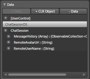
This will cause the ChatSession object to be added to our Data tray, and expose its properties (and sub-properties) in a tree-view:
We can then bind any of our UI controls in the design-view to these properties by selecting them in the "Data" tray and dragging/dropping them onto the UI controls in the design-surface. For example, we could replace the static "ScottGu" label with a {Binding RemoteUserName} databinding expression by dragging the RemoteUserName property from the Data tray on top of it:
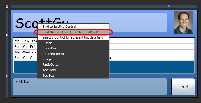
When we drop the "RemoteUserName" property onto the TextBlock, Blend will prompt us like above to either Bind the property to the existing TextBlock, or create a new Control to represent the property. If we choose the default (bind to the existing control), Blend will then ask us what type of binding expression we want:
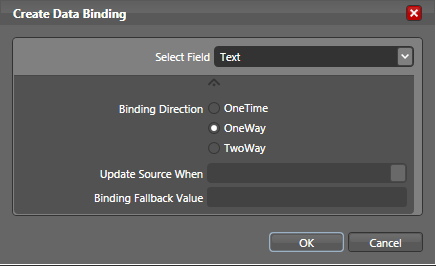
We'll indicate we want a "OneWay" binding to the TextBlock's "Text" property. When we click ok our control will be updated with a {Binding RemoteUserName} expression for its "Text" property.
We can repeat this drag/drop interaction for the Image control (with the RemoteAvatarUrl property) as well as the ListBox (with the MessageHistory collection property). When we are done Blend will show our "dummy" data within the design-view surface like so:
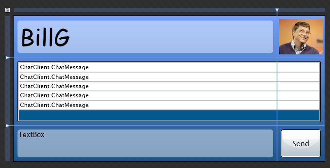
You might be wondering about the contents of the ListBox - why do the items show up as "ChatClient.ChatMessage"? Well, right now the ListBox is binding to a collection of custom .NET objects and the "ChatClient.ChatMessage" string is the value being returned by calling "ToString()" on the ChatMessage instances.
We can modify this to look better by adding a to the ListBox like so:

Note: For the Blend 2.5 March preview release of Blend you have to define datatemplates in source-view. In future preview releases you'll be able to use the designer to define them as well. This feature is already available for WPF projects if you want to play with it: As a designer, you can interactively create the look of data with a full WYSIWYG experience. Just create a WPF project to try it out.
Doing this will then cause our UI to look like below at design-time:
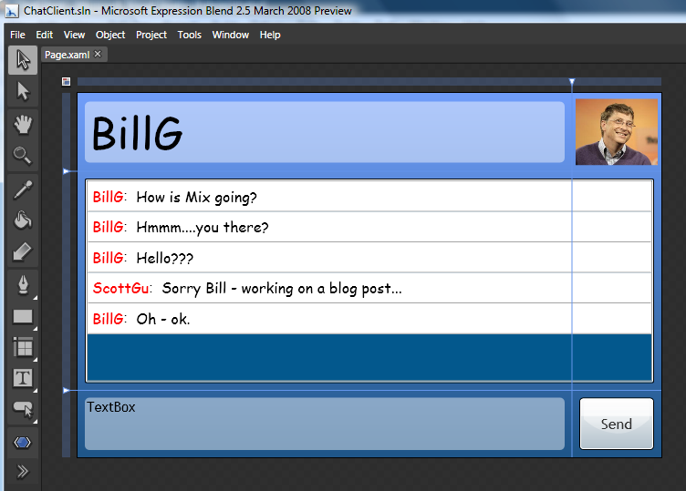
The benefit of having this "dummy data" show up at design-time is that it enables us to get a much better sense of what the UI experience will be like at runtime, and allow a designer (or a developer) to easily work on the UI without having to wait on the rest of the application to be built.
Building our Chat Application: Updating our Button and ListBox UI using Styles and Control Templates
One of the things I talked about in my Part 7: Using Control Templates to Customize a Control's Look and Feel Digg tutorial was about how Silverlight and WPF allow developers and designers to completely customize the look and feel of controls. This provides a tremendous amount of flexibility to sculpt the UI of an application and create exactly the user experience desired.
We could use the Control Template feature of Silverlight and WPF to customize the Send button and the ListBox structure in our chat application above to have a little more of a polished look and feel. We could do this by creating "MessageHistory" and "SendButton" style resources that we store within the App.xaml file of our project. Each of these style objects would then have a Control Template that overrides the look and feel of the control and changes its visual structure.
Note: the Blend 2.5 March preview release of Blend you have to define control templates in source-view. In future preview releases you'll be able to use the designer to define them as well. This feature is already available for WPF projects if you want to play with it - just create a WPF project to try it out.
For example, the below ListBox Control Template could be used to remove the outer double border around the ListBox control and define a "flat" look with just a scroll-bar for the list container:
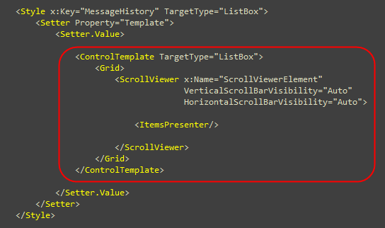
Applying this template to our ListBox would then cause it to render with a much flatter look around the edges:

We could get even fancier with our Button control template, and not only define a custom button shape - but also define various story-board animations to apply to the shape to provide custom UI behavior when it is in "MouseOver", "Pressed", or "Normal" states (these can all be encapsulated within the Style definition - meaning the page developer never has to-do anything to enable them):
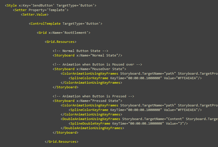
Once we have our "MessageHistory" and "SendButton" style objects defined, it is easy to use Expression Blend to apply them to controls on the design-surface.
Clicking on the "Resources" tool Window within Expression Blend lists all of the resource locations within our project:
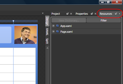
We can expand the "App.xaml" node to see the styles that are available for us to use within it. To apply a particular style to a control on the page, we can simply drag/drop it onto the control. For example, here is what our send button control looks like before we apply the "SendButton" Style:
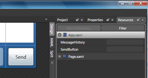
Dragging/dropping the SendButton style onto it will change it to our custom Control Template shape/structure:
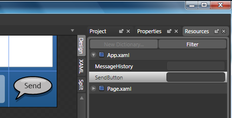
Because our "SendButton" style has state animations defined within it, the button will change at runtime depending on how the end user interacts with it.
By default the button will look like this:

When an end user moves the mouse over it the balloon will subtlety change to a lighter color:

When in the push down state the button will depress and its shadow will disappear:

When released the button will pop back up.
These subtle animations and interactivity gestures can add some really nice polish to an application. Best of all, a designer can build and customize this functionality entirely themselves - the developer implementing the page functionality does not have to be involved nor write any code to enable it.
In future preview releases of Expression Blend 2.5 designers will be able to not only define the shape/structure of this button - but also define all of the animation transitions for it - entirely using the design surface (no source editing or coding required).
Implementing our our Chat functionality
Now that our we've used Expression Blend to databind our control UI, and to tweak and polish the interactivity of the UI, let's go back to Visual Studio and write the code that implements the UI chat behavior functionality.
Specifically, we'll add the below code to our Page constructor to initiate a ChatSession with a remote user, and then handle the scenario where the "Send" button is clicked to send a message to the remote user.
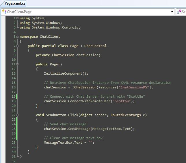
When we add the above code and re-run the application we'll see that our UI now databinds to a ChatSession with "ScottGu" as the RemoteUserName (instead of the fake design-time data we defined earlier). When we type text in the message TextBox and click the customized Send button our Listbox is automatically updated with the chat history:

Why did the ListBox automatically update you might wonder? It did this because the ListBox was data-bound to the ChatSession.MessageHistory property - which is of type ObservableCollection. This means the collection automatically raises change notifications when a new ChatMessage object is added to it, which the ListBox then detects and uses to update itself with the new data.
No explicit code was required by us to have the ListBox reflect these changes. The clean view/model binding architecture of our application automatically handled it for us.
Summary
I've only shown a few of the features supported with Expression Blend. All of these features work for both Silverlight and WPF projects. All of them will also ship in the upcoming Expression Blend 2.5 March preview - which will be available to download (for free) shortly.
I think you'll find that Visual Studio 2008 and Expression Studio bring a tremendous amount of productivity and power for building great RIA solutions. Developers and designers can use them together when working on the same projects (and avoid accidentally stepping on each other). You can also easily have both open together on one machine and edit a single application with them at the same time.
I'll be blogging more about Expression Blend (and a bunch of features in it that I haven't covered yet) once it is available for download. I'll also post the above simple chat example for download once Silverlight 2 Beta1 ships so that you can open and run the code yourself.
Hope this helps,
Scott