Create glassy feedback buttons easily using Microsoft Expression Design. Here are the steps:
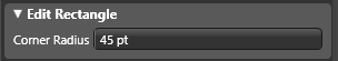
1. Choose the Rectangle tool and, while holding the Shift key, drag a square shape 250 pixels square. On the Edit Rectangle panel that appears on the Properties pane, set the Corner Radius to 45 points.
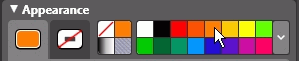
2. Click on the Fill tab and then click on the bright orange color swatch in the favorite swatches section.
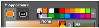
3. Click on the Stroke tab and choose the None stroke type button to remove the stroke.
This is the basic button shape which should be on a layer of its own. This way it will be easy to change the color of the button later. The steps that follow will demonstrate how to name the layer, lock it and create a new layer.
4. On the Layers panel, double click on the layer name (Layer 1) and type "Orange Base" to rename the layer.
5. Click on the lock icon on the right end of the layer to lock the layer.
6. Click on the New Layer button at the bottom of the Layers panel.
7. Double click on the name "Layer 2" and type "Symbols" to rename the layer.
The new layer is the active layer where we'll create the symbols that appear on the face of the button.
8. Choose the Ellipse tool in the Toolbox. Hold the Shift key to constrain the ellipse to a perfect circle shape and drag a circle approximately 350 pixels in diameter.
9. Click the Fill tab and then the None fill type button to remove the fill.
10. Click on the Stroke tab and choose a blue color. (We'll change this soon but blue will make it easier to see against the white artboard color.) Set the stroke width to 37 pixels.
11. Choose the Direct Selection tool (second tool from the top in the Toolbox) and click on the anchor point at the top of the circle.
12. Hold down the Shift key and click on the anchor point on the right side of the circle. Both the top and right anchor points on the circle are now active.
13. Hold down the Alt key, click on the segment between the two active anchor points, and drag away from the circle. This drags a duplicate of segment being dragged. Release the mouse button and then release the Alt key.
14. With the Selection tool (first tool at the top of the Toolbox), move the new shape into place above the base button shape and change the stroke color to white.
15. Create another circle 200 pixels in diameter, holding down the Shift key as you drag, and then follow steps 9 through 13 above. Move this new shape segment into place above the base button shape:
16. To complete the button symbol, change the fill color to white, if it isn't white already, remove the stroke and drag out a small circle shape holding the Shift key as you drag. Move the circle into place on top of the base button shape:
This completes the symbols portion of the button. Lock the layer so the symbol shapes won't be disturbed as we create the glass effect. In the steps that follow we'll create a new, duplicate layer and use gradients and transparency to create the glass effect.
17. Unlock the Orange Base layer and click on the layer to make it active.
18. Click on the Layer Options button at the bottom of the Layers panel and choose Duplicate Layer from the pop up menu. By default, Design creates new layers above the active layer. In our case the new layer appears between the Orange Base and Symbol layers. Double click on the layer name (Orange Base copy) and type "Glass" to rename the new layer. The new duplicate layer contains a copy of the base button shape.
19. Lock the Orange Base layer so we don't accidentally alter the base button shape. Also, click on the Eye icon to hide the basic button shape.
20. Choose the Delete Anchor Point tool, which lives under the Pen tool, along with the Add Anchor Point and Convert Anchor Point tools which we'll use shortly:
21. Click on the following three nodes to delete them:
Your shape should now look like the following:
21. Choose the Add Anchor Point tool and add anchor points to the path as follows:
22. Clicking with the Add Anchor Point in the step above adds corner (sharp) points. To convert them to curved points, choose the Convert Anchor Point tool and click on the points you added to convert them to curves.
23. With the Direct Selection Tool, drag on each new anchor point upwards and to the left to form an arc, like this:
24. Drag the lower most anchor point downward slightly:
At this point, use the Direct Selection tool to make any other adjustments to this "glass effect" shape to suit your needs. In the steps that follow we'll duplicate the shape so it's important that the shape is to your satisfaction at this stage.
25. Click the Fill tab on the Appearance panel and then click on the Gradient fill type button. The shape will fill with the default black to white gradient.
26. Click on the black Gradient Stop.
27. Click on the Initial Color Box on the Appearance panel, which should be orange, to deposit the orange color on the Gradient Stop. (If your initial color box isn't orange you can choose the orange color from the favorite swatches section.)
28. Drag the orange Gradient Stop about 12% to the right on the Gradient Bar and drag the Stop Alpha slider to the left until you reach approximately 90%.
29. Drag the Fill Opacity slider to 60%.
30. Choose the Gradient Transform tool, which lives under the Fill Transform tool, and drag from below the lower left corner to the edge of the new shape. (Make your base button shape visible so you can see the effect.)
31. On the Effects panel, click the Add Effect button (labeled fx) and choose Effects > Gaussian Blur and set the Radius to 0.4.
32. Finally, choose Ctrl+C to copy the shape and then Ctrl+F to paste the copy on top of the original shape. I find that this creates more of a glassy look.
To see the completed button, click the Eye icon on the Symbol layer.
If orange isn't your favorite color, select the base button shape in the Orange Base layer and give it a new color. Then choose the two shapes in the Glass layer and set the first Gradient Stop to the new color as well.
(Thanks to Annie Ford for writing up this tutorial!)