Recommended

Skip Navigation LinksHome / Search

Search

 
Results Per Page

Found 5 results for Button.
Date between: <not defined> and <not defined>
Search in: News , Articles , Tips , Shows , Showcase , Books

Order by Publish Date   Ascending Title   Rating  

  • 0 comments  /  posted by  Silverlight Show  on  May 08, 2009 (more than a year ago)
    Alex Knight has a great tutorial in which he shows how to create a button that looks as if it has a fire lurking inside. The tutorial uses both Expression Design and Expression Blend.

    For this tutorial we will start off in Expression Design to create the graphics for the button, then we will move into Expression Blend to create the button template and animate it.


  • 3 comments  /  posted by  Martin Mihaylov  on  Nov 28, 2008 (more than a year ago)

    Have you ever noticed that the MouseLeftButtonDown and MouseLeftButtonUp events are not fired when a Silverlight button is clicked? The reason for this is that the button handles these two events itself by overriding the OnMouseLeftButtonDown  and the OnMouseLeftButtonUp  handlers. In the OnMouseLeftButtonDown  override, the Click event is raised and the MouseLeftButtonDown event is marked as handled so it couldn't bubble in the visual tree. The OnMouseLeftButtonUp  override also marks the MouseLeftButtonUp  as handled.

    This thing can be changed using the ClickMode property of the Button control. It has the following values - Hover, Press, Release. The default one is Pressed and we have already explained it. When we have ClickMode set to Release, the Click event will be raised in the OnMouseLeftButtonUp override and the MouseLeftButtonDown and MouseLeftButtonUp events will be handled inside the button again. If we set the ClickMode to Hover, the Click event will be raised with the MouseEnter event and we will also be able to use the mouse button events.

    That's it!

  • 0 comments  /  posted by  Denislav Savkov  on  Sep 03, 2008 (more than a year ago)

    In Silverlight the Button, as some other controls does not have the old well known Text property. It is replaced by a new property named Content of type object. The idea is to remove the limitation to show only strings as content of a control. Now with this new approach you can put whatever you wish inside of a Button. This makes the presentation layer extremely powerful. However if you provide a regular string for the Content then the result will be exactly as if we used the Text property.

    Xaml

    <Button x:Name="simpleButton" Content="Click Me" />
    <Button x:Name="advancedButton">
        <Button.Content>
            <CheckBox Content="Check box on a button"></CheckBox>
        </Button.Content>
    </Button>

    C#

    Button simpleButton = new Button();
    simpleButton.Content = "Click Me";
     
    Button advancedButton = new Button();
    CheckBox checkBox = new CheckBox();
    checkBox.Content = "Check box on a button";
    advancedButton.Content = checkBox;

    As you can see the first button named simpleButton uses plain text 'Click Me' for its content, while the second button named advancedButton hosts check box control with the text 'Check box on a button'.

    That's it!


  • 4 comments  /  posted by  Nikolay Raychev  on  May 11, 2008 (more than a year ago)

    Introduction

    The Button is a Silverlight control which responds when the user clicks on it.

    See also:
    Button Controls Article
    HyperlinkButton Article
    ToggleButton Article
    RepeatButton Article

    Overview

    Since the Button derives directly from the ButtonBase class and there isn’t an additional functionality, I’ll use the examples from the Button Controls Article.

    The most important event of the Button, inherited from ButtonBase class is the Click event. It occurs when a user clicks on the button. For example:

    XAML:

  • 6 comments  /  posted by  Nikolay Raychev  on  May 11, 2008 (more than a year ago)

    Introduction

    Button controls are Silverlight controls which in the common scenario respond in some way to the user who is clicking on them. There are a lot of button controls: Button, HyperlinkButton, RepeatButton, ToggleButton, CheckBox, RadioButton.

    See also:
    Button Article
    HyperlinkButton Article
    ToggleButton Article
    RepeatButton Article

    Overview

    Four button controls derive from the base ButtonBase class: Button, HyperlinkButton, RepeatButton, and ToggleButton. The ToggleButton is a base class for the CheckBox and RadioButton controls but it can also be used as a standalone control. There are two descendants of the Button class named CalendarButton and CalendarDayButton.

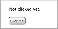
    The most important member of the ButtonBase class is the Click event. It occurs when a user clicks on the button control. For example:

    XAML:


Help us make SilverlightShow even better and win a free t-shirt. Whether you'd like to suggest a change in the structure, content organization, section layout or any other aspect of SilverlightShow appearance - we'd love to hear from you! Need a material (article, tutorial, or other) on a specific topic? Let us know and SilverlightShow content authors will work to have that prepared for you. (hide this)