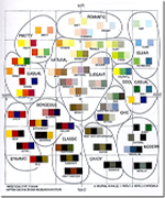
Matthias Shapiro found that the Color Images Scale might be very useful so he decided to share it with you.

If you’re a designer, you’re almost certainly interested in color. And if you’re interested in color, you could hardly do better than to pick up a copy of Shigenobu Kobayashi’s Color Image Scale. [...]
Kobayashi’s work is particularly awesome because he categorizes three-color combinations along a “soft-to-hard/warm-to-cool” axis and assigns zones of color that match how we respond to the combinations.