This article is compatible with the latest version of Silverlight.
In this article we'll try to create a Silverlight Glowing effect that will be used along with other Silverlight controls. It's going to behave like the Border control and will have two shapes - rectangle and ellipse. Obviously it won't be used along with triangles or polygons. The control should also allow us to set its color, the spread of the glowing, its height and width and its shape. We can easily align it to the control that we want to have glowing effect, just like we do with the Border control. So let's get to the job!
Live Demo | Sample Source Code
What we need:
- One Grid with 3 rows and 3 columns
- 9 Rectangles
- Some LinearGradientBrushes and RadialGradientBrushes
- Set of properties, that will allow the user to adjust the control to his likings and needs
- Methods and handlers where needed
Configuring the Grid
Here is the Grid:
<Grid x:Name="LayoutRoot" Background="#00000000" Width="Auto" Height="Auto">
<Grid.RowDefinitions>
<RowDefinition Height="Auto"></RowDefinition>
<RowDefinition Height="Auto"></RowDefinition>
<RowDefinition Height="Auto"></RowDefinition>
</Grid.RowDefinitions>
<Grid.ColumnDefinitions>
<ColumnDefinition Width="Auto"></ColumnDefinition>
<ColumnDefinition Width="Auto"></ColumnDefinition>
<ColumnDefinition Width="Auto"></ColumnDefinition>
</Grid.ColumnDefinitions>
</Grid>
We have defined 3 rows and 3 columns. Note that the width and respectively the height are set to "Auto". That's because the size of the control is dynamic and we want the cells to take the size of the content in them. We also set the background to be transparent. The first two "0"s in "#00000000" indicate that the opacity is 0. If they were two "f"s ("#ff000000") the opacity would have been 255 or 100%.
Adding the Rectangles and the Gradients
As you probably have already figured it out, we place one rectangle in each cell. After this step we're going to fill them with gradients, but that later. I gave the Rectangles names depending on their position in the grid, for example TopLeft, BottomRight, Middle etc. Here is the idea:
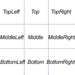
All rectnagles except the middle one will be filled with Gradients - the corner rectangles with RadialGradientBrushes and the side rectangles with LinearGradientBrushes, so we can form the glowing like a rectangle. If we want to create an ellipse shaped glowing we just "remove" the side rectangles and than the corner rectangles will form an ellipse, due to the radial gradients. Here is the code:
<Grid x:Name="LayoutRoot" Background="#00000000" Width="Auto" Height="Auto" ShowGridLines="False">
<Grid.RowDefinitions...>
<Grid.ColumnDefinitions...>
<Rectangle Grid.Row="0" Grid.Column="0" x:Name="TopLeft">
<Rectangle.Fill>
<RadialGradientBrush Center="1.0,1.0" RadiusX="1" RadiusY="1" GradientOrigin="1.0,1.0" >
<GradientStop x:Name="TopLeftPrimary" Color="#B4ffcc00" Offset="0"></GradientStop>
<GradientStop x:Name="TopLeftSecondary" Color="#00000000" Offset="1"></GradientStop>
</RadialGradientBrush>
</Rectangle.Fill>
</Rectangle>
<Rectangle Grid.Row="0" Grid.Column="1" x:Name="Top">
<Rectangle.Fill>
<LinearGradientBrush StartPoint="0.5, 0" EndPoint="0.5, 1">
<GradientStop x:Name="TopSecondary" Color="#00000000" Offset="0.0"></GradientStop>
<GradientStop x:Name="TopPrimary" Color="#B4ffcc00" Offset="1"></GradientStop>
</LinearGradientBrush>
</Rectangle.Fill>
</Rectangle>
<Rectangle Grid.Row="0" Grid.Column="2" x:Name="TopRight">
<Rectangle.Fill>
<RadialGradientBrush Center="0.0,1.0" RadiusX="1" RadiusY="1" GradientOrigin="0.0,1.0">
<GradientStop x:Name="TopRightPrimary" Color="#B4ffcc00" Offset="0"></GradientStop>
<GradientStop x:Name="TopRightSecondary" Color="#00000000" Offset="1"></GradientStop>
</RadialGradientBrush>
</Rectangle.Fill>
</Rectangle>
<Rectangle Grid.Row="1" Grid.Column="0" x:Name="MiddleLeft">
<Rectangle.Fill>
<LinearGradientBrush StartPoint="0, 0.5" EndPoint="1, 0.5">
<GradientStop x:Name="MiddleLeftSecondary" Color="#00000000" Offset="0.0"></GradientStop>
<GradientStop x:Name="MiddleLeftPrimary" Color="#B4ffcc00" Offset="1"></GradientStop>
</LinearGradientBrush>
</Rectangle.Fill>
</Rectangle>
<Rectangle Grid.Row="1" Grid.Column="1" x:Name="Middle" Fill="#B4ffcc00">
</Rectangle>
<Rectangle Grid.Row="1" Grid.Column="2" x:Name="MiddleRight">
<Rectangle.Fill>
<LinearGradientBrush StartPoint="1, 0.5" EndPoint="0, 0.5">
<GradientStop x:Name="MiddleRightSecondary" Color="#00000000" Offset="0.0"></GradientStop>
<GradientStop x:Name="MiddleRightPrimary" Color="#B4ffcc00" Offset="1"></GradientStop>
</LinearGradientBrush>
</Rectangle.Fill>
</Rectangle>
<Rectangle Grid.Row="2" Grid.Column="0" x:Name="BottomLeft">
<Rectangle.Fill>
<RadialGradientBrush Center="1.0,0.0" RadiusX="1" RadiusY="1" GradientOrigin="1.0,0.0" >
<GradientStop x:Name="BottomLeftPrimary" Color="#B4ffcc00" Offset="0"></GradientStop>
<GradientStop x:Name="BottomLeftSecondary" Color="#00000000" Offset="1"></GradientStop>
</RadialGradientBrush>
</Rectangle.Fill>
</Rectangle>
<Rectangle Grid.Row="2" Grid.Column="1" x:Name="Bottom">
<Rectangle.Fill>
<LinearGradientBrush StartPoint="0.5, 1" EndPoint="0.5, 0">
<GradientStop x:Name="BottomSecondary" Color="#00000000" Offset="0.0"></GradientStop>
<GradientStop x:Name="BottomPrimary" Color="#B4ffcc00" Offset="1"></GradientStop>
</LinearGradientBrush>
</Rectangle.Fill>
</Rectangle>
<Rectangle Grid.Row="2" Grid.Column="2" x:Name="BottomRight">
<Rectangle.Fill>
<RadialGradientBrush Center="0.0,0.0" RadiusX="1" RadiusY="1" GradientOrigin="0.0,0.0" >
<GradientStop x:Name="BottomRightPrimary" Color="#B4ffcc00" Offset="0"></GradientStop>
<GradientStop x:Name="BottomRightSecondary" Color="#00000000" Offset="1"></GradientStop>
</RadialGradientBrush>
</Rectangle.Fill>
</Rectangle>
</Grid>
I will not fall in explanations about the Gradients and their positioning in the rectangles, I think you can figure that out by yourself. Note that we always have two GradientStops - the first one is for the main color, and the second is transparent or will be set to the background color. The GradientStops have Names, that will be used later in order to manipulate the colors. Note also that the middle rectangle is solid color. It represents the control to which the glow effect will be applied. And when we set the width and the height of our control they will be applied to this rectangle. The size of the other rectangles depends on the spread of the glowing, which will be represented by its own property. Now as we have our Grid, Rectangles and Gradients ready, we can go to the codebehind file and continue with the work on our Glowing effect control.
The Properties
We want the users to be able to set the width, the height, the shape, the color and the spread of the glowing. For that purpose we create properties for each of them and set a default value of course. Let's start with the color of the glowing:
private Color glowColor = Color.FromArgb( 255, 255, 255, 255 );
public Color GlowColor
{
get
{
return glowColor;
}
set
{
glowColor = value;
this.TopLeftPrimary.Color = value;
this.TopPrimary.Color = value;
this.TopRightPrimary.Color = value;
this.MiddleRightPrimary.Color = value;
this.MiddleLeftPrimary.Color = value;
this.BottomLeftPrimary.Color = value;
this.BottomRightPrimary.Color = value;
this.BottomPrimary.Color = value;
this.Middle.Fill = new SolidColorBrush( value );
}
}
When the color is set we change the color of the gradients to the selected value. And we create one more property for the BackgroundColor aka the secondary color of the gradient:
private Color backgroundColor = Color.FromArgb( 255, 0, 0, 0 );
public Color BackgroundColor
{
get
{
return backgroundColor;
}
set
{
backgroundColor = value;
glowColor = value;
this.TopLeftSecondary.Color = value;
this.TopSecondary.Color = value;
this.TopRightSecondary.Color = value;
this.MiddleRightSecondary.Color = value;
this.MiddleLeftSecondary.Color = value;
this.BottomLeftSecondary.Color = value;
this.BottomRightSecondary.Color = value;
this.BottomSecondary.Color = value;
}
}
The next properties all affect the size or the form of our control. So when we set the we call a method that adjust the size or the form of it to the new values. But I'll explain it later in the article. The first one is the shape of the glowing. First we create an enumerator called GlowShapes:
public enum GlowShape
{
Rectangular,
Oval
}
And here is the property:
private GlowShapes shape = GlowShapes.Rectangular;
public GlowShapes Shape
{
get
{
return shape;
}
set
{
shape = value;
//Will be explained later
this.AdjustSize();
}
}
The next property is called Spread. It will determine the size of the glowing (how much it spreads away from the figure):
public double spread = 0;
public int Spread
{
get
{
return spread;
}
set
{
spread = value;
//Will be explained later
this.AdjustSize();
}
}
The last two properties will be used to set the height and the width of the figure that glows. I've called them ShapeWidth and ShapeHeight:
private double shapeWidth = 0;
private double shapeHeight = 0;
public double ShapeHeight
{
get
{
return shapeHeight;
}
set
{
shapeHeight = value;
this.AdjustSize();
}
}
public double ShapeWidth
{
get
{
return shapeWidth;
}
set
{
shapeWidth = value;
this.AdjustSize();
}
}
These are the properties we need. Now let's get to the helper method and an event handler that will come in handy.
Adjusting the size and the shape of our control
When one of the properties that regards the shape or the size of our control is set, we must apply the changes. That's why I create a method to do this job. It's called AdjustSize(). In it there is a switch for the GlowShape. Here is the code:
private void AdjustSize()
{
switch( this.Shape )
{
case GlowShape.Rectangular:
this.TopLeft.Height = this.Spread;
this.TopLeft.Width = this.Spread;
this.TopRight.Height = this.Spread;
this.TopRight.Width = this.Spread;
this.Top.Height = this.Spread;
this.Top.Width = this.ShapeWidth;
this.MiddleLeft.Width = this.Spread;
this.MiddleLeft.Height = this.ShapeHeight;
this.MiddleRight.Width = this.Spread;
this.MiddleRight.Height = this.ShapeHeight;
this.Middle.Height = this.ShapeHeight;
this.Middle.Width = this.ShapeWidth;
this.BottomLeft.Height = this.Spread;
this.BottomLeft.Width = this.Spread;
this.BottomRight.Height = this.Spread;
this.BottomRight.Width = this.Spread;
this.Bottom.Width = this.ShapeWidth;
this.Bottom.Height = this.Spread;
break;
case GlowShape.Oval:
this.TopLeft.Height = this.Spread + ( this.ShapeHeight / 2 );
this.TopLeft.Width = this.Spread + ( this.ShapeWidth / 2 );
this.TopRight.Height = this.Spread + ( this.ShapeHeight / 2 );
this.TopRight.Width = this.Spread + ( this.ShapeWidth / 2 );
this.Top.Height = 0;
this.Top.Width = 0;
this.MiddleLeft.Width = 0;
this.MiddleLeft.Height = 0;
this.MiddleRight.Width = 0;
this.MiddleRight.Height = 0;
this.Middle.Height = 0;
this.Middle.Width = 0;
this.BottomLeft.Height = this.Spread + ( this.ShapeHeight / 2 );
this.BottomLeft.Width = this.Spread + ( this.ShapeWidth / 2 );
this.BottomRight.Height = this.Spread + ( this.ShapeHeight / 2 );
this.BottomRight.Width = this.Spread + ( this.ShapeWidth / 2 );
this.Bottom.Width = 0;
this.Bottom.Height = 0;
double offset = this.ShapeWidth / ( 2 * this.Spread + this.ShapeWidth );
this.TopLeftGradient.Offset = offset ;
this.TopGradient.Offset = offset ;
this.TopRightGradient.Offset = offset ;
this.MiddleRightGradient.Offset = offset ;
this.MiddleLeftGradient.Offset = offset ;
this.BottomLeftGradient.Offset = offset ;
this.BottomRightGradient.Offset = offset ;
this.BottomGradient.Offset = offset ;
break;
}
this.LayoutRoot.UpdateLayout();
}
I think that by the Rectangular shape everything is clear - the ShapeWidth and the ShapeHeight are the width and the height of the middle rectangle. The side rectangles also depend on these two values. The corner rectangles depend only on the value of the Spread. But when we have a Oval shape, the things are a bit more specific. In order to create an oval glowing we must use only the corner rectangles, because they contain radial gradients. So the middle and the side ones are hidden ( we set their width and height to 0 ). Now we have 4 rectangles with radial gradients in them, but the default offset, that we set in the Xaml, makes the spread to begin from the center of the ellipse. In order to create a solid figure with ShapeWidth and ShapeHeight in the center we must change the offset property of the radial gradients. I came to this formula for the offset - it depends on the spread of the glowing and the width of the figure:
double number = this.ShapeWidth / ( 2 * this.Spread + this.ShapeWidth );
Finally we update the layout of our Grid, so the changes can take effect. And that's all, now we have a whole Silverlight control that can add a glowing effect to our controls. We can change the form, manipulate the height, width and the spread of the glowing. I have some more ideas of how to extend this control, so you can expect more articles about this control.