
Note: This article is submitted by Doug Blackmore for Silverlight: Write and Win contest.Thanks a lot, Doug! Hello All, Please drop a comment if you like it.
“It is time to vote now! Please, choose your favorite articles and enter your vote by going to contest page. Thank you!„
This article is compatible with the latest version of Silverlight.
In this article I will show you how to implement custom ComboBox that includes templating, data binding, and auto complete functionality.
View the Demo
Download Source Code
Getting Started
The initial code for the combo box was obtained by reflecting (http://www.red-gate.com/products/reflector/) on the Silverlight ListBox control. This provided the initial xaml and C# for the dropdown portion of the combo box, so we renamed the controls from ListBoxItem to ComboBoxItem and ListBox to ComboBox. To complete the control, we added a TextBox and a Button.

Populating the Combo Box
The ComboBoxItem element has a Content property that can be used to populate the combo box in the XAML markup file.
<local:ComboBoxItem Content="British Columbia" />
<local:ComboBoxItem Content="Alberta" />
<local:ComboBoxItem Content="Saskatchewan" />
In code, you can use the Add() method of the Items property on the Combo Box.
this.cboProvinces.Items.Add("British Columbia");
this.cboProvinces.Items.Add("Alberta");
this.cboProvinces.Items.Add("Saskatchewan");
You can also set the ItemsSource property of the combo box.
IList<Province> Provinces = new List<Province>();
Provinces.Add(new Province("British Columbia", "BC", new DateTime(1871, 7, 20)));
Provinces.Add(new Province("Alberta", "AB", new DateTime(1905, 9, 1)));
Provinces.Add(new Province("Saskatchewan", "SK", new DateTime(1905, 9, 1)));
this.cboProvinces.ItemsSource = Provinces;
Data Templates
For more complex dropdown combo box items, you can define a DataTemplate in your XAML.
<local:ComboBox.ItemTemplate>
<DataTemplate>
<StackPanel Margin="0,3,0,3">
<StackPanel Orientation="Horizontal">
<TextBlock Width="150"
Text="{Binding Path=FullName}"
VerticalAlignment="Center" FontSize="14" />
<TextBlock Text="{Binding Path=Abbreviation}"
HorizontalAlignment="Right"
VerticalAlignment="Center"
FontSize="12" />
</StackPanel>
<TextBlock Text="{Binding Path=DateOfConfederation, Converter={StaticResource DateConverter}}"
Foreground="DarkRed"
FontSize="10" />
</StackPanel>
</DataTemplate>
</local:ComboBox.ItemTemplate>
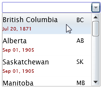
Here’s the resulting dropdown:
Data Binding
Of course, once a selection has been made from a rather complex dropdown, the entry in the text box portion of the combo box is the ToString() result of the selection.

There are 2 ways to bind the selection to the text box:
DisplayMemberPath
Specify a property of the selection object.
<local:ComboBox x:Name="cboProvinces" Width="200" DisplayMemberPath="Description" />
DisplayMemberBinding
Specify the binding to use when displaying the selected item in the text box.
<local:ComboBox x:Name="cboProvinces"
DisplayMemberBinding="{Binding DateOfConfederation}">
This becomes more useful when a type converter is specified.
<local:ComboBox x:Name="cboProvinces"
DisplayMemberBinding="{Binding DateOfConfederation,
Converter={StaticResource DateConverter}}">
If both DisplayMemberPath and DisplayMemberBinding are specified, only DisplayMemberPath is used.
Auto Complete
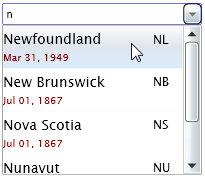
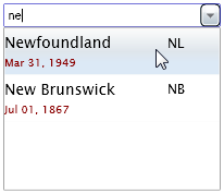
The auto-complete functionality is available by default. Each item in the drop down is compared with the text in the text box. If there’s a match, the item’s Visibility property is set to Visible. Otherwise, it’s set to Collapsed.
Initial dropdown
Type ‘n’ in the text box
Type ‘ne’ in the text box
“Auto” DropDownWidth
The width of the dropdown defaults to the width of the combo box itself. You can specify a smaller or larger value by specifying a number, or you can auto-size the dropdown by specifying a DropDownWidth of “Auto”.
<local:ComboBox x:Name="cboProvinces" Width="250" />
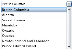
<local:ComboBox x:Name="cboProvinces" Width="250" DropDownWidth="200" />
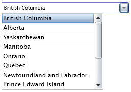
<local:ComboBox x:Name="cboProvinces" Width="250" DropDownWidth="300" />
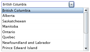
<local:ComboBox x:Name="cboProvinces" Width="250" DropDownWidth="Auto" />

Processing the Selection
Subscribe to the SelectionChanged event to process the selection.
private void OnSelectionChanged(object sender, SelectionChangedEventArgs e)
{
object selectedItem = this.cboProvinces.SelectedItem;
this.txtSelection.Text = (selectedItem == null)
? string.Empty
: ((Province)selectedItem).Description;
}
Summary
We hope this custom implemented control tides you over. If you are so inclined, the source included here may give you a little insight into writing a control of your own.
The WorkSight Blog has just started, but drop by or subscribe. Our intent is to publish additional articles on software design and development.