Once you get in touch with the Silverlight Templated controls it became evident that there are three kind of controls you can put in the XAML. Given that the structure of the page is a hierarchical tree - for this reason is is commonly called Visual Tree - you can expand this paradigm to understand the three types of controls.
- "Leaf" controls are classes inherited from Control and they terminate the hierarchy because nothing can be inserted into them
- "Content" controls are inherited from the ContentControl class. These controls can host other elements inside of them. They are nodes in the hierarchy
- "Items" controls are usually inherited from ItemsControl and they can contain multiple instances of child controls so they are also a particular case of nodes with many branches starting from it.
The boundary between one kind and the other is not always immediately evident when you use a control. As an example, if you consider the Button control at the first sight is may seems a leaf control but instead it is a Content control and thanks to this you can have button that hosts images and texts and not only a label.
When you start creating a templated control the choice of the class from which inheriting is really important and you have to make the choice carefully because this choice can impact the effectiveness and reusability of the control. Many times the choice of inheriting from Control is good, but you have always to try to give a chance to the ContentControl, reasoning about the final structure you want to achieve. Content control can often give an additional gear to your work paying an often low price in when you first create the control layout.
Creating a ContentControl from scratch
Download the source code
The first time you create a control, it is really hard to deal with the concept of content. It seems there is nothing you can't do inheriting from the simple Control class, exposing a bunch of properties to set the various aspect of the control. For the purpose of this article we will create a Balloon control similar to the ones it is usual to find in chat clients, containing the messages exchanged between the parts. The control is basically a rectangle with a spike and at the first sight it may seem it suffice to inherit from Control and expose a property "Text" to set the content of the baloon. The solution can work fine but the first time we have to put an emoticon into the chat the things become immediately hard. Given that the "Text" property can contain a string it is very difficult to put the image of the emoticon inside of the balloon because you have to write a sort of parser to detect the emoticon inside of the text and change them to an image. The things become much more complicated if you want to support image attachments, different fonts, text styles and so on.
If you make the Balloon a ContentControl you can think instead to its content as another branch of the Visual Tree you can put into a property of the control. The ContentControl class have a Content property where you can add other elements of the hierarchy because its type is "object". This way you can put almost everything inside the control and it becomes something widely usable. The first step to implement a content control is to create a class that inherits from the ContentControl class:
public class Balloon : ContentControl
{
public Balloon()
{
this.DefaultStyleKey = typeof(Balloon);
}
}
For this purpose you can also use the Templated control wizard of Visual Studio then, when the wizard has done its work, you have to change the base class from Control to ContentControl just because the wizard by default creates a leaf control.
Now that the class is ready, it is time of create the default template. If you used the Visual Studio's wizard it already added the generic.xaml file and an empty template for your control. In other cases you have to manually create this file in the Themes folder and manually add the ControlTemplate this way:
<ResourceDictionary
xmlns="http://schemas.microsoft.com/winfx/2006/xaml/presentation"
xmlns:x="http://schemas.microsoft.com/winfx/2006/xaml"
xmlns:local="clr-namespace:SLPG.Controls">
<Style TargetType="local:Balloon">
<Setter Property="Template">
<Setter.Value>
<ControlTemplate TargetType="local:Balloon">
<!-- Add here the default appearance of your control -->
</ControlTemplate>
</Setter.Value>
</Setter>
</Style>
</ResourceDictionary>
Finally it is time to create a layout for the balloon.For the scope of this example I've created a simplified template. It is made of a grid of two columns. The leftmost column contains the spike, with a negative right margin, so it goes outside of its column and slightly enter the second column. In the other column I've two borders, one on top of the other. The spike is positioned in the middle of the two borders so it appear the spike breaks the border of the balloon. Here is the code:
<ControlTemplate TargetType="local:Balloon">
<Grid HorizontalAlignment="Stretch" VerticalAlignment="Stretch">
<Grid.ColumnDefinitions>
<ColumnDefinition Width="Auto" />
<ColumnDefinition Width="*" />
</Grid.ColumnDefinitions>
<Border Grid.Column="1" BorderThickness="0"
Background="{TemplateBinding BorderBrush}" />
<Polyline Points="20,-20 0,0 20,-10" Width="40" Height="40"
Fill="{TemplateBinding Background}"
Stroke="Transparent" Stretch="Fill"
StrokeThickness="0" VerticalAlignment="Bottom"
Margin="0,0,-20,0" />
<Border Grid.Column="1"
Background="{TemplateBinding Background}"
Margin="{TemplateBinding BorderThickness}"
Padding="{TemplateBinding Padding}"
BorderBrush="Transparent">
<StackPanel>
<TextBlock FontWeight="Bold">Here goes the title</TextBlock>
<!-- here goes the content -->
</StackPanel>
</Border>
</Grid>
</ControlTemplate>
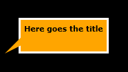
The template in the snippet is not jet complete because it still miss the part of the content. The figure on the side shows the layout I created so you can understand the parts I've listed above.
 I've prepared a layout that is really close to the balloon that you can find in the text messagges list but I've also add a title. Many of the properties of the control I'm developing are connected with a counterpart inside the layout. This helps the user to customize the look&feel of the balloon without changing the template.
For the moment I've marked the title and the content with a fixed text and a comment because now we have to understand how to connect the content that the developer puts into the new Balloon tag with the correct position inside the layout.
The role of the ContentPresenter
Now that the layout is almost ready and we tested it into the page, it is now the time to display the content in the correct position. For this purpose it exists a special element named ContentPresenter. The ContentPresenter derive from FrameworkElement so it is not really a Control but it is able to take the content from a property of the control and display it in its place. You can think at the ContentPresenter like a placeholder that will be sobstituted by the content at runtime.
The ContentPresenter is so smart you can simply add it to the ControlTemplate and it automatically detects the content to present, but for the purpose of learning how it works I've manually connected its properties using the TemplateBinding markup extension:
<!-- continue previous ControlTemplate -->
<StackPanel>
<TextBlock FontWeight="Bold">Here goes the title</TextBlock>
<ContentPresenter Content="{TemplateBinding Content}" ContentTemplate="{TemplateBinding ContentTemplate}" />
</StackPanel>
<!-- continue previous ControlTemplate -->
The ContentPresented can be slightly customized, arranging its alignment, changing its margins and size but it does not have any "visual" property like Background, BorderBrush and so on. From this side the presenter is completely transparent but inherits its aspect from the area where it is placed. Once the content presenter is in place we can write the content directly inside the Balloon tag and it will be displaied in the right place.
<ct:Balloon Background="Orange" Padding="5"
HorizontalAlignment="Center"
VerticalAlignment="Center" MaxWidth="200"
BorderBrush="White" BorderThickness="3">
<Border Background="White" Padding="5">
<toolkit:WrapPanel>
<TextBlock TextWrapping="Wrap">Hey boys, this sounds</TextBlock>
<TextBlock>embarassing!</TextBlock>
<Image Source="smile.PNG" Width="19" Height="19" VerticalAlignment="Top" />
</toolkit:WrapPanel>
</Border>
</ct:Balloon>
Hosting multiple contents
We have not jet completed our work. It remains to connect the header of the ballon to a property to let a developer to customize it. In the simplest way we can connect it to a normal Text dependency property. We can instead doing something more. The ControlTemplate of a control can contain more than one presenter so we can expose an additional content property (of type object) with the name HeaderContent and then connect it to another ContentPresenter. First of all we have to expose the dependency property:
public class Balloon : ContentControl
{
public static readonly DependencyProperty HeaderContentProperty =
DependencyProperty.Register(
"HeaderContent",
typeof(object),
typeof(Balloon),
new PropertyMetadata(null));
public object HeaderContent
{
get { return (object)GetValue(HeaderContentProperty); }
set { SetValue(HeaderContentProperty, value); }
}
public Balloon()
{
this.DefaultStyleKey = typeof(Balloon);
}
}
The HeaderContent property must be of type object because it have to host every kind of element or also a simple text. Once the new dependency property is created you can add another ContentPresenter to the template and use TemplateBinding to connect its content to the new property. Once there is two presenters it is required the second one to have the TemplateBinding. Only one presenter in the template can not hanve the explicit binding.
<!-- continue previous ControlTemplate -->
<StackPanel>
<ContentPresenter
Content="{TemplateBinding HeaderContent}" />
<ContentPresenter
Content="{TemplateBinding Content}"
ContentTemplate="{TemplateBinding ContentTemplate}" />
</StackPanel>
<!-- continue previous ControlTemplate -->
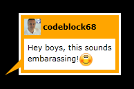
Having the new HeaderContent property let you to specify a complex header instead of a simple text. You have only to explicitly open the <Balloon.HeaderContent> tag and start writing a layout element and its content. In the figure by the side you can see the final aspect of the control with Content and HeaderContent. 
Final thoughts
I'm always stunned every time I get in touch with the powerfulness of the Templated Controls in Silverlight and also in WPF. They connect an easy way of create reusable parts of UI with the full set of tools of the language. The content controls are a step forward in the direction of having a clean and well formed XAML and knowing them in deep is vital to improve you programming with Silverlight.
Happy control programming.
About the Author
 Andrea Boschin is 41 years old from Italy and currently lives and works in Treviso, a beautiful town near Venice. He started to work in the IT relatively late after doing some various jobs like graphic designer and school teacher. Finally he started to work into the web and learned by himself to program in VB and ASP and later in C# and ASP.NET. Since the start of his work, Andrea found he likes to learn new technologies and take them into the real world. This happened with ASP.NET, the source of his first two MVP awards, and recently with Silverlight, that he started to use from the v1.0 in some real projects.