This article is compatible with the latest version of Silverlight.
Since the first release of Silverlight 2 there was a lot of talk about controls such as TreeView, auto complete TextBox, WrapPanel, DockPanel etc, and because of the high demand some custom controls were created. The Silverlight Toolkit introduced the so long awaited controls. In this article we'll take a closer look at one of them - the TreeView.
Introduction
I believe that most of you are already familiar with the controls of this type either from their web or desktop experience with technologies such as WPF, WinForms or ASP.NET. But for those who are going to be introduced to this type of controls I'll give a short description: The TreeView is a control with tree structure which main purpose is to display hierarchical data in the form of nodes. Each node that has children can be collapsed and expanded.
Getting Started
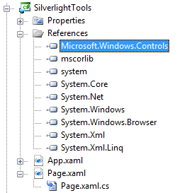
To start using the TreeView control we must first download the Silverlight Toolkit and after that add a reference to the Microsoft.Windows.Controls.dll.

Next we declare the Microsoft.Windows.Controls namespace in our XAML and add a TreeView in the UserControl:
<UserControl x:Class="SilverlightTools.Page"
xmlns="http://schemas.microsoft.com/winfx/2006/xaml/presentation"
xmlns:x="http://schemas.microsoft.com/winfx/2006/xaml"
xmlns:toolkit="clr-namespace:Microsoft.Windows.Controls;assembly=Microsoft.Windows.Controls">
<Grid x:Name="LayoutRoot">
<toolkit:TreeView x:Name="MyTreeView"></toolkit:TreeView>
</Grid>
</UserControl>
If you run the application at this time you won’t see anything, because the TreeView element is nothing, but a container for the items that we want to display in hierarchy.
Adding items to the TreeView control
There are two ways to add items to the TreeView control – to add them as static items defined either in the XAML or in the codebehind or to set the ItemsSource property to a collection and define a template for the items.
Static TreeViewItem controls
To add static items to the TreeView control we use the TreeViewItem control:
XAML
<toolkit:TreeView x:Name="MyTreeView">
<toolkit:TreeViewItem Header="Announcements"/>
<toolkit:TreeViewItem Header="Products">
<toolkit:TreeViewItem Header="Controls"/>
<toolkit:TreeViewItem Header="Media Players"/>
<toolkit:TreeViewItem Header="Games"/>
<toolkit:TreeViewItem Header="Charts"/>
</toolkit:TreeViewItem>
<toolkit:TreeViewItem Header="Tools"/>
<toolkit:TreeViewItem Header="Moonlight"/>
<toolkit:TreeViewItem Header="Demos"/>
<toolkit:TreeViewItem Header="Learn">
<toolkit:TreeViewItem Header="Videos"/>
<toolkit:TreeViewItem Header="Presentations"/>
<toolkit:TreeViewItem Header="Tutorials"/>
<toolkit:TreeViewItem Header="Resources"/>
<toolkit:TreeViewItem Header="Samples"/>
<toolkit:TreeViewItem Header="QuickStarts"/>
<toolkit:TreeViewItem Header="Tips and Tricks"/>
</toolkit:TreeViewItem>
<toolkit:TreeViewItem Header="Issues"/>
<toolkit:TreeViewItem Header="Misc"/>
<toolkit:TreeViewItem Header="Write and Win Contest"/>
</toolkit:TreeView>
C#
TreeViewItem item1 = new TreeViewItem();
item1.Header = "Products";
item1.Items.Add( new TreeViewItem() { Header = "Controls" } );
item1.Items.Add( new TreeViewItem() { Header = "Media Players" } );
item1.Items.Add( new TreeViewItem() { Header = "Games" } );
item1.Items.Add( new TreeViewItem() { Header = "Charts" } );
MyTreeView.Items.Add( item1 );
Using the ItemsSource property
Another way to populate the TreeView is to bind it to a collection and to do that we must set the ItemsSource property and the ItemTemplate property. Before doing that, let's prepare the collection.
Creating the collection
I create a class called Category:
public class Category
{
public string Name { get; set; }
public List<Category> SubCategories { get; set; }
}
The property Name contains the name of the category and the property SubCategories contains its children.
I read the categories form the following XML file using LINQ to XML (more about it here):
<?xml version="1.0" encoding="utf-8" ?>
<categories>
<category name="Announcements"></category>
<category name="Products">
<category name="Controls"></category>
<category name="Media Players"></category>
<category name="Games"></category>
<category name="Charts"></category>
</category>
<category name="Tools"></category>
<category name="Moonlight"></category>
<category name="Demos"></category>
<category name="Learn">
<category name="Videos"></category>
<category name="Presentations"></category>
<category name="Tutorials"></category>
<category name="Resources"></category>
<category name="Samples"></category>
<category name="QuickStarts"></category>
<category name="Tips and Tricks"></category>
</category>
<category name="Issues"></category>
<category name="Misc"></category>
<category name="Write and Win contest"></category>
</categories>
private void LoadData()
{
List<Category> categories = new List<Category>();
XDocument categoriesXML = XDocument.Load( "Categories.xml" );
categories = this.GetCategories( categoriesXML.Element( "categories" ) );
}
private List<Category> GetCategories( XElement element )
{
return ( from category in element.Elements( "category" )
select new Category()
{
Name = category.Attribute( "name" ).Value,
SubCategories = this.GetCategories( category )
} ).ToList();
}
I use recursion in order to create the hierarchical structure of the categories in the list and to prepare it for use, and now when it's ready let's prepare the TreeView control to accept it.
Setting the Source and defining the templates
When we have a source that our control will bind to, we must also have an item template:
<toolkit:TreeView x:Name="MyTreeView" BorderThickness="0,0,0,0">
<toolkit:TreeView.ItemTemplate>
</toolkit:TreeView.ItemTemplate>
</toolkit:TreeView>
But in our case defining some controls in the ItemTemplate and binding their properties to the objects' properties in the collection is not enough. In the Item template we need to define the hierarchical structure of the collection. For that purpose we use the HierarchicalDataTemplate:
<toolkit:TreeView x:Name="MyTreeView" BorderThickness="0,0,0,0">
<toolkit:TreeView.ItemTemplate>
<toolkit:HierarchicalDataTemplate ItemsSource="{Binding SubCategories}">
<StackPanel >
<TextBlock Text="{Binding Name}"></TextBlock>
</StackPanel>
</toolkit:HierarchicalDataTemplate>
</toolkit:TreeView.ItemTemplate>
</toolkit:TreeView>
All we have to do is to set the ItemSource of the HierarchicalDataTemplate to the child collection of our objects and define the template for the item in it. Everything else will be handled by it. And now we can set the ItemsSource of the TreeView, build and run the application in order to see our category tree.
private void LoadData()
{
List<Category> categories = new List<Category>();
XDocument categoriesXML = XDocument.Load( "Categories.xml" );
categories = this.GetCategories( categoriesXML.Element( "categories" ) );
this.MyTreeView.ItemsSource = categories;
}
Styling the TreeView
In this section I'll give you some tips about the advanced styling of the TreeView control using the Expression Blend 2.
While styling it, I have defined the items as static TreeViewControls in the XAML, in order to see something in the Expression Blend Designer. Now let's see what we need in order to style our TreeView.
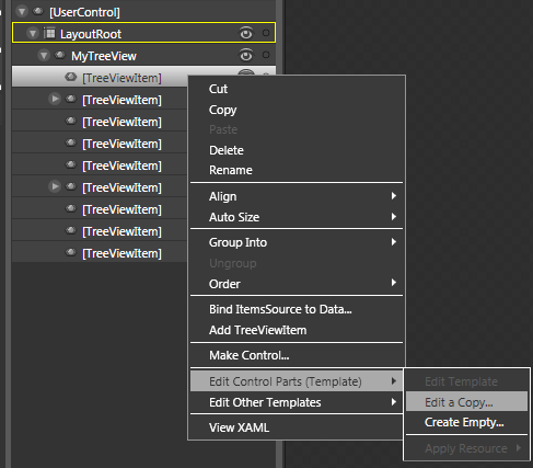
The thing we'd want to change most probably is the look of the TreeViewItem, so let’s edit a copy of its template:

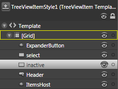
And here is how the template sub-elements look like:

Now you have the possibility to customize the states of the TreeViewItem (Normal, Disabled, Selected, Unselected) changing the properties of the inactive and select rectangles or recording a new animation for the state. Another thing you can do is to go deeper into the template and modify the ExpanderButton and the Header. You'd probably want to customize the expander according to the design of your application. In the Header you can find the MouseOver state for the TreeViewItem, so it also worths templating.
Here is a little example for what can be done using the Blend to style the TreeView control; I have recreated the Browse menu of SilverlightShow in Silverlight:
And here is the source code Source code.
Conclusion
Finally we have a basic TreeView control in Silverlight as a part of the Silverlight Toolkit. As we know the demand for such a control was really big, that is why some great proprietary controls were created providing really tremendous functionality (like RadTreeView from Telerik, TreeView for SIlverlight from ComponentOne and etc.). Unlike these controls, the standard tree view isn't so powerful, but I think it has its place in our Silverlight development and I will surely find use of it.