As often happens, the timeframe passed between the release of Windows 8 and the new release numbered 8.1, have brought to the light some things that developers felt missing during the their work. Many of these are simply obvious features left behind just for time issues, others are answers to new needs that could not be imagined in the first release, and others again are some effective behaviors proposed by some successful application. In this release all these paradigms have created a new output, in the form of a number of "Controls" that are now available to developers.
On the front of the "time victims" there are new pickers that simplify the input of Date and Time values and some new flyouts to better answer to the needs of the Moder UI requirements. There is then a new CommandBar, made to implement easily the most common layout of an Application Bar, without the headaches coming from its layout. Finally there is also a new Hub control that make easy and widely available the hub paradigm presented by some application in Windows 8. Turn on the lights and let start explore them.
The missing pickers and flyouts
Every application, also the most simple, has the need of asking input from the user and usually this is a point where errors and difficulties become hard to be handled. The TextBox control, the sole available before Windows 8.1, it is really hard to ask the user to input different datatypes and create a constrained interface to prevent input errors. The date and time values are a really practical example of this problem and from time to time Microsoft and third party companies provided some specific control in every platform. Windows 8.1 make available the new DatePicker and TimePicker controls, not only to avoid input errors, but also to give a uniform usability to Moder UI interfaces. Here is some examples:
1: <DatePicker Header="Abbreviated"
2: DayFormat="{}{day.integer}" DayVisible="True"
3: MonthFormat="{}{month.integer}" MonthVisible="True"
4: YearFormat="{}{year.abbreviated}" YearVisible="True" />
5:
6: <DatePicker Header="With padding zero"
7: DayFormat="{}{day.integer(2)}" DayVisible="True"
8: MonthFormat="{}{month.integer(2)}" MonthVisible="True"
9: YearFormat="{}{year.full(4)}" YearVisible="True" />
10:
11: <DatePicker Header="Custom format"
12: DayFormat="{}{dayofweek.abbreviated} - {day.integer(2)}" DayVisible="True"
13: MonthFormat="{}{month.abbreviated(3)}" MonthVisible="True"
14: YearFormat="{}{year.abbreviated}" YearVisible="True" />
15:
16: <DatePicker Header="Week day only"
17: DayFormat="{}{dayofweek.full}" DayVisible="True"
18: MonthVisible="False" YearVisible="False" />s
The previous examples produce the following output. In this screenshot I've included two Cultures (it-IT and en-US) to show how the control automatically handles internazionalization.
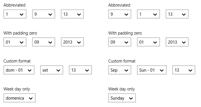
With format properties you can choose from a wide set of formats that are good for the finest tastes. You can also exclude one or more parts of the date when you do not need to get a complete date from your user. As for dates you can also use the TimePicker to get a time value:
1: <TimePicker ClockIdentifier="24HourClock" Header="24 hour clock"/>
2:
3: <TimePicker ClockIdentifier="12HourClock" Header="24 hour clock"/>
This code shows the following result:
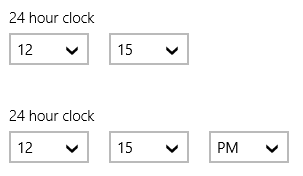
With the ClockIdentifier property you are able to switch between a 12/24 time picker. The output of the controls are a plain DateTime for the DatePicker and a Timespan fo the TimePicker. This let you to simply add the timespan to the date to get a full DateTime including time.
The two control present a wide list of values when an item is selected and this let the user to select easily the choosen value also if he is using a finger instead of the mouse pointer. These controls are definitely awesome and well designed.
Another trouble with Windows 8, especially in XAML are the flyouts. Flyout is a generic name give to each part of the user interface that "flies" over other control. This includes the generic popups, menu and the settings panel. To solve these troubles, Windows 8.1 include some new Flyout controls targeted to these issues. Every FrameworkElement can get an attached flyout, using the special attached property "FlyoutBase.AttachedFlyout". This lets you position a flyout relatively to the item it is attached to, setting the Placement property to one of foru predefined value. Once a flyout has been attached to an element, you can show it using the FlyoutBase.ShowAttachedFlyout() method. Here is an example:
1: <Ellipse Tapped="Ellipse_Tapped" Fill="Blue" Width="50" Height="50">
2: <FlyoutBase.AttachedFlyout>
3: <Flyout>
4: <Ellipse Width="100" Height="100" Fill="Red"></Ellipse>
5: </Flyout>
6: </FlyoutBase.AttachedFlyout>
7: </Ellipse>
This code adds a flyout to an Ellipse and sets its content to another (much bigger) Ellipse. To open the flyour you have to manually handle the "Tapped" event and call the ShowAttachedFlyout methot passing a reference to the ellipse to which the flyout is attached.
1: private void Ellipse_Tapped(object sender, TappedRoutedEventArgs e)
2: {
3: FlyoutBase.ShowAttachedFlyout((FrameworkElement)sender);
4: }
This code opens the flyout as expected, positioned on the top of the element. The flyout is a rectangle area with a border. The Button is a special case for flyouts because it have a "Flyout" property and automatically handle the click to open the attached flyout. So in this case you can simply write this in XAML:
1: <Button Content="Press me!">
2: <Button.Flyout>
3: <Flyout Placement="Bottom">
4: <TextBox Header="Enter the name" />
5: </Flyout>
6: </Button.Flyout>
7: </Button>
The previous code, without any codebehind, shows the flyout on the left side.
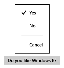
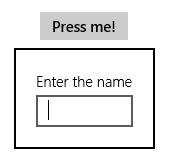
The flyout is a simple container where you can put your own element in plain XAML, and it will behave as if it was in the main Visual Tree. So you can handle events, use databinding and resources. If you need to create a flying menu instead, there is a special Flyout control called menù flyout. Inside it you can use a set of menu items and separators to create list of options the user can select. At the right side an example of this kind of menù.
The control is really simple and includes text items, toggle buttons that appear as a tickmark and a special separator item:
1: <Button Content="Do you like Windows 8?">
2: <Button.Flyout>
3: <MenuFlyout Placement="Top">
4: <ToggleMenuFlyoutItem Text="Yes" IsChecked="True" />
5: <ToggleMenuFlyoutItem Text="No" IsChecked="False" />
6: <MenuFlyoutSeparator />
7: <MenuFlyoutItem>Cancel</MenuFlyoutItem>
8: </MenuFlyout>
9: </Button.Flyout>
10: </Button>
Finally, the SettingsFlyout let you handle the settings panel with few lines of code. Implementing the settings contract was not so simple before Windows 8.1 because you was in charge of creating all the UI for the settings options. In Windows 8.1 you can create a special UserControl called SettingsFlyout and design it aspect as you do with a normal page. After selecting the "New Item" in Visual Studio you can add a SettingsFlyout element and start with its interface in the designer.
1: <SettingsFlyout
2: x:Class="XPG.WinRTBehaviors.AppSettings"
3: xmlns="http://schemas.microsoft.com/winfx/2006/xaml/presentation"
4: xmlns:x="http://schemas.microsoft.com/winfx/2006/xaml"
5: xmlns:local="using:XPG.WinRTBehaviors"
6: xmlns:d="http://schemas.microsoft.com/expression/blend/2008"
7: xmlns:mc="http://schemas.openxmlformats.org/markup-compatibility/2006"
8: mc:Ignorable="d" Title="Settings" d:DesignWidth="346">
9:
10: <StackPanel VerticalAlignment="Stretch" HorizontalAlignment="Stretch">
11:
12: <ComboBox Header="Language" HorizontalAlignment="Stretch" Margin="0,0,0,25" SelectedIndex="0">
13: <ComboBoxItem>Italian</ComboBoxItem>
14: <ComboBoxItem>English</ComboBoxItem>
15: </ComboBox>
16:
17: </StackPanel>
18:
19: </SettingsFlyout>
Then in the page, handling the CommandRequested event for the settings contract you have to provide a command to open your settings flyout. Into the command you create an instance of the flyout you have created and then call the Show method as you do with a popup.
1: private void MainPage_CommandsRequested(Windows.UI.ApplicationSettings.SettingsPane sender, Windows.UI.ApplicationSettings.SettingsPaneCommandsRequestedEventArgs args)
2: {
3: Windows.UI.ApplicationSettings.SettingsCommand settingsCommand =
4: new Windows.UI.ApplicationSettings.SettingsCommand(1, "Settings",
5: (handler) =>
6: {
7: AppSettings settings = new AppSettings();
8: settings.Show();
9: });
10:
11: args.Request.ApplicationCommands.Add(settingsCommand);
12: }
It is really easy and straightforward.
Simplify your AppBar experience: the CommandBar
Setting up an application bar in XAML is an easy task, but most of the times you simply need to place some buttons inside it, and preparing the layout may be annoying. The new CommandBar control is made to avoid the overhead of work you have in these case and to consolidate the Modern UI guidelines that have a strong requirement for the positioning of buttons inside an application bar. The CommandBar appear as a simple container that hosts a number of buttons.
1: <Page.BottomAppBar>
2: <CommandBar>
3: <AppBarButton Icon="Home" Label="Go to home" />
4: <AppBarButton Icon="Add" Label="Add item" />
5: </CommandBar>
6: </Page.BottomAppBar>
All the items that are directly inside the CommandBar are considered "primary" buttons. They are hosted on the immediate right of the application bar as the guidelines prescribe. When you need to add buttons to the left side (the contextual items), you have to use the SecondaryButtons property as in the following example.
1: <Page.BottomAppBar>
2: <CommandBar>
3: <AppBarButton Icon="Home" Label="Go to home" />
4: <AppBarButton Icon="Add" Label="Add item" />
5: <CommandBar.SecondaryCommands>
6: <AppBarButton Icon="Delete" Label="Delete" />
7: <AppBarButton Icon="MoveToFolder" Label="Move" />
8: <AppBarSeparator />
9: <AppBarToggleButton Icon="Bold" Label="Bold" />
10: </CommandBar.SecondaryCommands>
11: </CommandBar>
12: </Page.BottomAppBar>
This configuration shows the following application bar:

In this command bar you can see the separator and the Bold button is defined as AppBarToggleButton so you can switch it on or off. The Icon property of the buttons can be set with a predefined serie of given values. This helps to keep the look and feel of applications very similar in the glyphs they uses. You can also use your own bitmap of XAML path to define the image in the icon:
1: <AppBarButton Label="Icon with bitmap">
2: <AppBarButton.Icon>
3: <BitmapIcon UriSource="ms-appx:///Assets/Icons/mycustomicon.png"/>
4: </AppBarButton.Icon>
5: </AppBarButton>
To specify a path you can use the PathIcon element. Additionally, with the FontIcon element you can use a glyph from a font, specifying the FontFamily and the code as and exadecimal value.
Enhance the apps with the Hub control
One of the more requested features in Windows 8, just after the launch, is the Hub constrol that many applications showed since first days. The news application, but also the sports, meteo and travel come with a similar aspect that allows the user to slide between different sections stacked side by side horizontally. In Windows 8.1 the hub contro become real and the following picture shows how it appear.
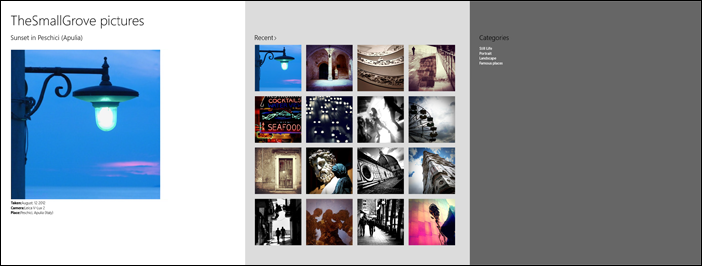
In this example I've created with little effort using my pictures in instagram (http://instagram.com/thesmallgrove), you see three sections stacked. The first one (white) is the main section, usually reserved to introduce news. In this figure is shows the most recent picture. The second section contains recent shoots and finally another section shows categories. Nothing prevents you to add other sections and they will be showed scrolling horizontally since the screen usually covers only the first sections (in this example the first and part of the second). The code to create this example is slightly simple; first of all add a Hub control:
1: <Hub Header="TheSmallGrove pictures" Background="White">
2:
3: </Hub>
Here I define the main title of the hub. This title is fixed on the screen and the hub scrolls under it. A section is created using a HubSection element inside the Hub control
1: <HubSection MinWidth="1000" Header="Sunset in Peschici (Apulia)">
2: <DataTemplate>
3: <StackPanel>
4: <Image Source="http://distilleryimage8.ak.instagram.com/f0a5619826b411e39cc222000a9f38cc_7.jpg" Margin="0,20,0,0" />
5: <StackPanel>
6: <TextBlock Style="{ThemeResource BodyTextBlockStyle}"><Run Text="Taken:" FontWeight="Bold" /><Run Text="August, 12 2012" /></TextBlock>
7: <TextBlock Style="{ThemeResource BodyTextBlockStyle}"><Run Text="Camera:" FontWeight="Bold" /><Run Text="Leica V-Lux 2" /></TextBlock>
8: <TextBlock Style="{ThemeResource BodyTextBlockStyle}"><Run Text="Place:" FontWeight="Bold" /><Run Text="Peschici, Apulia (Italy)" /></TextBlock>
9: </StackPanel>
10: </StackPanel>
11: </DataTemplate>
12: </HubSection>
This snippet shows the very first section. Inside a section you have to use a DataTemplate to fill the content. Then inside the DataTemplate you place the portion of the Visual Tree. Each section has a title itself and you also convert it to an hyperlink using the IsInteractive property. The other sections are stacked into the hub control. Here is the complete code:
1: <Hub Header="TheSmallGrove pictures" Background="White">
2: <HubSection MinWidth="1000" Header="Sunset in Peschici (Apulia)">
3: <DataTemplate>
4: <StackPanel>
5: <Image Source="http://distilleryimage8.ak.instagram.com/f0a5619826b411e39cc222000a9f38cc_7.jpg" Margin="0,20,0,0" />
6: <StackPanel>
7: <TextBlock Style="{ThemeResource BodyTextBlockStyle}"><Run Text="Taken:" FontWeight="Bold" /><Run Text="August, 12 2012" /></TextBlock>
8: <TextBlock Style="{ThemeResource BodyTextBlockStyle}"><Run Text="Camera:" FontWeight="Bold" /><Run Text="Leica V-Lux 2" /></TextBlock>
9: <TextBlock Style="{ThemeResource BodyTextBlockStyle}"><Run Text="Place:" FontWeight="Bold" /><Run Text="Peschici, Apulia (Italy)" /></TextBlock>
10: </StackPanel>
11: </StackPanel>
12: </DataTemplate>
13: </HubSection>
14:
15: <HubSection Header="Recent" IsHeaderInteractive="True"
16: Background="Gainsboro" MinWidth="400">
17: <DataTemplate>
18: <Grid>
19: <Grid.ColumnDefinitions>
20: <ColumnDefinition Width="Auto" />
21: <ColumnDefinition Width="Auto" />
22: <ColumnDefinition Width="Auto" />
23: <ColumnDefinition Width="Auto" />
24: </Grid.ColumnDefinitions>
25: <Grid.RowDefinitions>
26: <RowDefinition Height="Auto" />
27: <RowDefinition Height="Auto" />
28: <RowDefinition Height="Auto" />
29: <RowDefinition Height="Auto" />
30: </Grid.RowDefinitions>
31: <Image Grid.Column="0" Grid.Row="0" Width="190" Height="190" Source="http://distilleryimage8.ak.instagram.com/f0a5619826b411e39cc222000a9f38cc_7.jpg" Margin="0,0,20,20" />
32: <Image Grid.Column="1" Grid.Row="0" Width="190" Height="190" Source="http://distilleryimage3.ak.instagram.com/b4d88ab42b5a11e3ab8622000ab5c723_7.jpg" Margin="0,0,20,20" />
33: <Image Grid.Column="2" Grid.Row="0" Width="190" Height="190" Source="http://distilleryimage1.ak.instagram.com/7e800e48270d11e3bf1c22000aa8008f_7.jpg" Margin="0,0,20,20" />
34: <Image Grid.Column="3" Grid.Row="0" Width="190" Height="190" Source="http://distilleryimage6.ak.instagram.com/07cad20225d611e3a73522000a1faf50_7.jpg" Margin="0,0,20,20" />
35: <Image Grid.Column="0" Grid.Row="1" Width="190" Height="190" Source="http://distilleryimage1.ak.instagram.com/1deed2dc24f911e3be6b22000aa80214_7.jpg" Margin="0,0,20,20" />
36: <Image Grid.Column="1" Grid.Row="1" Width="190" Height="190" Source="http://distilleryimage7.ak.instagram.com/2f7722e8244011e3ab6722000a1fb853_7.jpg" Margin="0,0,20,20" />
37: <Image Grid.Column="2" Grid.Row="1" Width="190" Height="190" Source="http://distilleryimage7.ak.instagram.com/5c23c6d623c111e39a4b22000a1fb593_7.jpg" Margin="0,0,20,20" />
38: <Image Grid.Column="3" Grid.Row="1" Width="190" Height="190" Source="http://distilleryimage7.ak.instagram.com/b3e01a62239611e3b6c622000a1f92d1_7.jpg" Margin="0,0,20,20" />
39: <Image Grid.Column="0" Grid.Row="2" Width="190" Height="190" Source="http://distilleryimage6.ak.instagram.com/bac0f9f6292111e3995e22000ab5a7b8_7.jpg" Margin="0,0,20,20" />
40: <Image Grid.Column="1" Grid.Row="2" Width="190" Height="190" Source="http://distilleryimage10.ak.instagram.com/ddbd777827cc11e3a9dd22000a9e29a7_7.jpg" Margin="0,0,20,20" />
41: <Image Grid.Column="2" Grid.Row="2" Width="190" Height="190" Source="http://distilleryimage2.ak.instagram.com/794a6a5230f111e3815722000aaa049c_7.jpg" Margin="0,0,20,20" />
42: <Image Grid.Column="3" Grid.Row="2" Width="190" Height="190" Source="http://distilleryimage3.ak.instagram.com/b97c03bc2e9211e3aa3022000a9e2931_7.jpg" Margin="0,0,20,20" />
43: <Image Grid.Column="0" Grid.Row="3" Width="190" Height="190" Source="http://distilleryimage7.ak.instagram.com/c1db47722cce11e3a23c22000a1f9d66_7.jpg" Margin="0,0,20,20" />
44: <Image Grid.Column="1" Grid.Row="3" Width="190" Height="190" Source="http://distilleryimage7.ak.instagram.com/9dae4d1c228911e3bb0922000a1fbf4a_7.jpg" Margin="0,0,20,20" />
45: <Image Grid.Column="2" Grid.Row="3" Width="190" Height="190" Source="http://distilleryimage6.ak.instagram.com/52eedb6021db11e3935222000a1fb825_7.jpg" Margin="0,0,20,20" />
46: <Image Grid.Column="3" Grid.Row="3" Width="190" Height="190" Source="http://distilleryimage8.ak.instagram.com/62bd4818210611e39ff222000aa8009c_7.jpg" Margin="0,0,20,20" />
47: </Grid>
48: </DataTemplate>
49: </HubSection>
50:
51: <HubSection Header="Categories" Foreground="White"
52: Background="#666666" MinWidth="300">
53: <DataTemplate>
54: <StackPanel>
55: <TextBlock Text="Still Life" Style="{ThemeResource TitleTextBlockStyle}" />
56: <TextBlock Text="Portrait" Style="{ThemeResource TitleTextBlockStyle}" />
57: <TextBlock Text="Landscape" Style="{ThemeResource TitleTextBlockStyle}" />
58: <TextBlock Text="Famous places" Style="{ThemeResource TitleTextBlockStyle}" />
59: </StackPanel>
60: </DataTemplate>
61: </HubSection>
62:
63: </Hub>
One interesting thing is that the Hub control implemente the ISemanticZoomInformation interface. This allows you to use the control in the ZoomedIn/ZoomedOut properties of the SemanticZoom control and navigate between different views using the pich gesture.
Take it under control.
This release seems to strongly enhance the developer experience, solving much of the issues we experienced previously. thes controls I've shown in this article comes together with a number of new features in the existing control set. It is really important that you scan for these changes because much of the times they makes you really fast and productive.