Recommended

Skip Navigation LinksHome / News / View News

A Chrome and Glass Theme - Part 5

+ Add to SilverlightShow Favorites
0 comments   /   posted by Phil Middlemiss on May 03, 2010
(0 votes)
Phil Middlemiss continues his series on creating a Chrome and Glass style theme, this time looking at the ProgressBar and Slider controls. He takes a close look at the Indeterminate State of the ProgressBar control and explains what Control Parts are.

Control Template of Slider
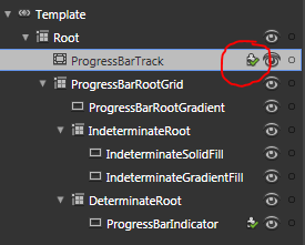
The red circle is around the Control Part icon. That icon indicates that the control expects there to be an element in the template called "ProgressBarTrack", and it usually has to be a control of the same type as is used in the default control template - in this case a Border control for "ProgressBarTrack" and a Rectangle element for "ProgressBarIndicator".
Share


Comments

Comments RSS RSS
No comments

Add Comment


Please add 7 and 8 and type the answer here:

Join the free SilverlightShow webinar 'Silverlight Behaviors for Designers' on July 14th 2010, 3:00pm EDT.
In this session on adding interactivity UX Designer and Consultant Zhivko Dimitrov will show how to bring your designs to life without writing a single line of code! Find out how to use drag & drop behaviors to control animations, add navigation, and simulate validation states. Read more | Register Now (hide this)