Recommended

Skip Navigation LinksHome / Search

Search

 
Results Per Page

Found 14 results for Phil Middlemiss.
Date between: <not defined> and <not defined>
Search in: News

Page 
Order by Publish Date   Ascending Title   Rating  

  • A Chrome and Glass Theme - Part 8

    0 comments  /  posted by  Silverlight Show  on  Jun 27, 2010 (2 weeks ago)
    In the next part from the series, Phil Middlemiss demonstrates how he made the radio buttons he blogged about previously.

    These buttons have gone through many iterations and I’m still not sure I’m quite happy with them just yet, but I’ll cover them anyway since they introduce a few interesting attached properties.

    If you are not familiar with Phil's series, you better first read his introductory post.


  • 0 comments  /  posted by  Silverlight Show  on  Jun 16, 2010 (3 weeks ago)
    Take a look at this cool Expression Blend post of Phil Middlemiss on rounding off buttons.

    I have the following requirements for this radio button style:

    • It must be re-sizable
    • The rounded ends must stay perfect half circles in proportion to the height of the button
    • It must behave correctly in Blend
    • Optional Extra: It would be nice to not have to manually edit XAML in Blend


  • 0 comments  /  posted by  Silverlight Show  on  Jun 08, 2010 (1 month ago)
    Phil Middlemiss has published part 7 of his series on building a Silverlight theme for use in Blend 3.

    ImageThe first post in the theme can be found here. If you haven't done much styling of controls before then I recommend you start there since it introduces practices to keep your styles manageable.
    This far in the series, I'm focusing on specific parts of the more complex controls.
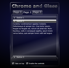
    In this post, we are branching out into the Silverlight Toolkit to style the Accordian control.

    If you have missed some of the previous parts, you can catch up here:
    Part 1, Part 2, Part 3, Part 4, Part 5 and Part 6.
  • 0 comments  /  posted by  Silverlight Show  on  May 27, 2010 (1 month ago)
    Find out how Phil Middlemiss uses the ContentControl for separating content from presentation.

    ImageThe ContentControl is often overlooked when building Silverlight apps. It’s used inside many controls such as the Button or ChildWindow, but it also turns out to be quite useful on it’s own for separating content from presentation.

  • 0 comments  /  posted by  Silverlight Show  on  May 26, 2010 (1 month ago)
    This is one very cool article in which Phil Middlemiss explains how to simulate backlighting on a selected list box item.

    The challenging bit was getting the selected item in the list box to cast a glow on the things around it. The glow seems to escape the list box itself. The reason this wasn't straight forward is that the ListBox control clips its content to keep everything inside the scrollable area. My first instinct was just to set negative margins on something inside the ListBoxItem's template (ItemContainerStyle), but that's when it became obvious that it was being clipped.

  • 0 comments  /  posted by  Silverlight Show  on  May 15, 2010 (1 month ago)
    Take a look at this SilverZine tutorial posted by Phil Middlemiss and find out how to animate the Silverlight opacity mask.

    In the context of animation, one of the biggest features in Flash that is missing from Silverlight 3 is an Opacity Mask layer. I haven't seen any mention of this in to Silverlight 4, but I could be mistaken. The only feature that we have in Silverlight 3 is the OpacityMask on each element, which is either a Brush or an image - (Image Brushes don't tile either, but that's a post for another day).

  • 0 comments  /  posted by  Phil Middlemiss  on  May 11, 2010 (2 months ago)
    Phil Middlemiss continues his series on creating a theme for Silverlight in Blend. In this post he looks at the TabControl.

    ImageThis is the 6th in a series on creating a "Chrome and Glass" Silverlight theme in Expression Blend. The purpose of the theme is to look at all the common controls and point out any interesting or difficult aspects of styling their templates. If you haven't styled many controls before then I recommend you begin with the first post in the series.

    If you have missed some of the previous parts, you can find it here:
    • A Chrome and Glass Theme - Part 5
    • A Chrome and Glass Theme - Part 4
    • A Chrome and Glass Theme - Part 3
    • A Chrome and Glass Theme - Part 2
    • A Chrome and Glass Theme - Part 1
  • 0 comments  /  posted by  Phil Middlemiss  on  May 10, 2010 (2 months ago)
    Have you ever used Photoshop (or similar) to give a button or panel a 3D appearance using inner-bevels etc?
    Phil Middlemis describes an easy way to achieve the same thing but with 100% XAML and completely scalable.

    Some of the graphics were understandably left as raster since there would be no equivalent way to achieve the same result in Blend. But the elements that bothered me were usually simple panels or buttons [...] had rounded corners, and they had some kind of bevel that made them appear raised or lowered.Image

  • 0 comments  /  posted by  Phil Middlemiss  on  May 03, 2010 (2 months ago)
    Phil Middlemiss continues his series on creating a Chrome and Glass style theme, this time looking at the ProgressBar and Slider controls. He takes a close look at the Indeterminate State of the ProgressBar control and explains what Control Parts are.

    Control Template of SliderThe red circle is around the Control Part icon. That icon indicates that the control expects there to be an element in the template called "ProgressBarTrack", and it usually has to be a control of the same type as is used in the default control template - in this case a Border control for "ProgressBarTrack" and a Rectangle element for "ProgressBarIndicator".
  • 0 comments  /  posted by  Phil Middlemiss  on  Apr 26, 2010 (2 months ago)
    Phil Middlemiss has posted the fourth tutorial in his series on creating a Glass and Chrome theme in Blend.

    ImageApart from describing the steps to style each of the controls for this particular theme, I've been trying to describe some of the techniques and knowledge that can be applied generally to any theme or style.


    • In part 1 we covered creating style resources in a resource dictionary.
    • In part 2 we covered editing control templates as part of a style, including states.
    • In part 3 we knocked off a couple of the easier controls to style, although we added some extra elements to the control template.

    In this post, we are going to dig down into a control that is made up of a collection of other controls: the ListBox. But we are going to begin by styling the other controls that make up the ListBox.


Page 
Join the free SilverlightShow webinar 'Silverlight Behaviors for Designers' on July 14th 2010, 3:00pm EDT.
In this session on adding interactivity UX Designer and Consultant Zhivko Dimitrov will show how to bring your designs to life without writing a single line of code! Find out how to use drag & drop behaviors to control animations, add navigation, and simulate validation states. Read more | Register Now (hide this)