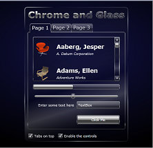
Phil Middlemiss continues his series on creating a theme for Silverlight in Blend. In this post he looks at the TabControl.
 This is the 6th in a series on creating a "Chrome and Glass" Silverlight theme in Expression Blend. The purpose of the theme is to look at all the common controls and point out any interesting or difficult aspects of styling their templates. If you haven't styled many controls before then I recommend you begin with the first post in the series.
If you have missed some of the previous parts, you can find it here:
- A Chrome and Glass Theme - Part 5
- A Chrome and Glass Theme - Part 4
- A Chrome and Glass Theme - Part 3
- A Chrome and Glass Theme - Part 2
- A Chrome and Glass Theme - Part 1