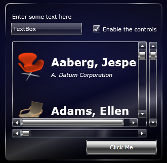
Phil Middlemiss has posted the fourth tutorial in his series on creating a Glass and Chrome theme in Blend.
 Apart from describing the steps to style each of the controls for this particular theme, I've been trying to describe some of the techniques and knowledge that can be applied generally to any theme or style.
• In part 1 we covered creating style resources in a resource dictionary.
• In part 2 we covered editing control templates as part of a style, including states.
• In part 3 we knocked off a couple of the easier controls to style, although we added some extra elements to the control template.
In this post, we are going to dig down into a control that is made up of a collection of other controls: the ListBox. But we are going to begin by styling the other controls that make up the ListBox.