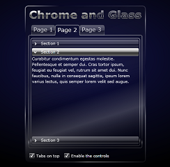
Phil Middlemiss has published part 7 of his series on building a Silverlight theme for use in Blend 3.
 The first post in the theme can be found here. If you haven't done much styling of controls before then I recommend you start there since it introduces practices to keep your styles manageable.
This far in the series, I'm focusing on specific parts of the more complex controls.
In this post, we are branching out into the Silverlight Toolkit to style the Accordian control.
If you have missed some of the previous parts, you can catch up here:
Part 1, Part 2, Part 3, Part 4, Part 5 and Part 6.