(X) Hide this
    • Login
    • Join
      • Generate New Image
        By clicking 'Register' you accept the terms of use .

Using the Grid control in Silverlight

(34 votes)
Nikolay Raychev
>
Nikolay Raychev
Joined Mar 28, 2008
Articles:   22
Comments:   58
More Articles
26 comments   /   posted on Apr 15, 2008
Tags:   grid , layout , nikolay-raychev
Categories:   Controls

Tweet This!This article is compatible with the latest version of Silverlight.

Introduction

The Grid is a layout control used as a container for other Silverlight controls. It acts like a table in HTML but there are many differences in the markup representation.

Overview

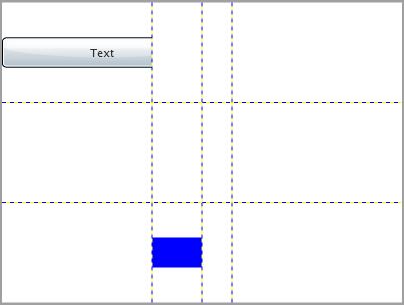
The following example demonstrates how to use a Grid and how to create rows and columns:

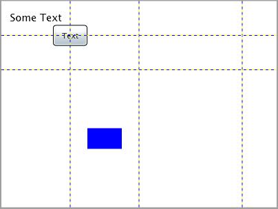
We want to have the following table structure:

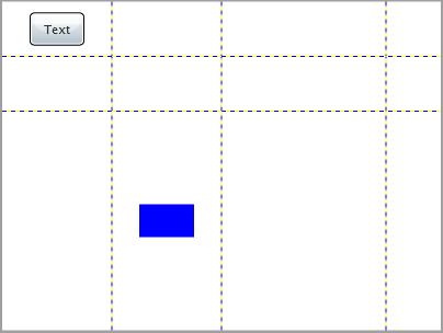
The most important thing about the Grid is how to define its RowDefinitions and ColumnDefinitions collections and how to specify to which row and column every control in the Grid belongs.

Here is the XAML code:

<UserControl x:Class="Grid2.Page"
    xmlns="http://schemas.microsoft.com/winfx/2006/xaml/presentation"
    xmlns:x="http://schemas.microsoft.com/winfx/2006/xaml"
    Width="400" Height="300">
    <Grid x:Name="grdLayoutRoot" Background="White" Width="400" Height="300" ShowGridLines="True">
        <Grid.RowDefinitions>
            <RowDefinition Height="50"></RowDefinition>
            <RowDefinition Height="50"></RowDefinition>
            <RowDefinition Height="*"></RowDefinition>
        </Grid.RowDefinitions>
        <Grid.ColumnDefinitions>
            <ColumnDefinition Width="100"></ColumnDefinition>
            <ColumnDefinition Width="100"></ColumnDefinition>
            <ColumnDefinition Width="*"></ColumnDefinition>
            <ColumnDefinition Width="50"></ColumnDefinition>
        </Grid.ColumnDefinitions>
        <Button x:Name="btnTest" Width="50" Height="30" Content="Text" Grid.Row="0" Grid.Column="0"></Button>
        <Rectangle x:Name="rectBlue" Width="50" Height="30" Fill="Blue" Grid.Row="2" Grid.Column="1"></Rectangle>
    </Grid>
</UserControl>

Note: We set the ShowGridLines="True" This indicates that the grid lines will be visible. You can always set this property to False if you want to hide the grid lines.

For every row in the Grid we have a RowDefinition element. All row definitions are enclosed in a Grid.RowDefinitions element. Our first two rows are 50 pixels high and Height of the third one is set to “*”. This indicates that the row will take the whole place in the Grid which is not taken by the other rows.

Respectively for every column in the Grid we have a ColumnDefinition element. All column definitions are enclosed in a Grid.ColumnDefinitions element. Our first two columns are 100 pixels wide and the last one is 50px. The third column takes the free space because its width is set to “*”.

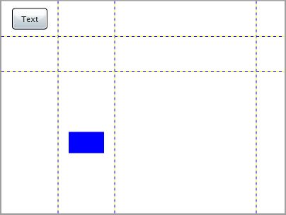
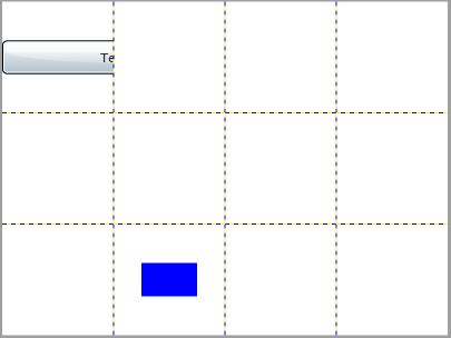
We can also use proportional sizing for both columns and rows. For example we can set the column sizes as follows:

<Grid.ColumnDefinitions>
    <ColumnDefinition Width="2*"></ColumnDefinition>
    <ColumnDefinition Width="2*"></ColumnDefinition>
    <ColumnDefinition Width="5*"></ColumnDefinition>
    <ColumnDefinition Width="1*"></ColumnDefinition>
</Grid.ColumnDefinitions>

Thus our columns will be in a proportion 2:2:5:1 and the user control will look like this:

You can adjust the proportions of the row heights in the same way.

Another option is to set the width and/or the height to “auto”. This way every column/row changes its size so as to match the width/height of the controls in it. For example:

<Grid.ColumnDefinitions>
    <ColumnDefinition Width="auto"></ColumnDefinition>
    <ColumnDefinition Width="auto"></ColumnDefinition>
    <ColumnDefinition Width="auto"></ColumnDefinition>
    <ColumnDefinition Width="auto"></ColumnDefinition>
</Grid.ColumnDefinitions>

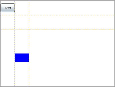
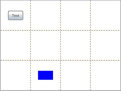
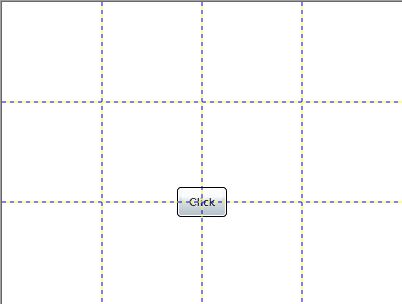
Omitting the width and/or height properties makes all columns and rows the same size:

<Grid.RowDefinitions>
    <RowDefinition></RowDefinition>
    <RowDefinition></RowDefinition>
    <RowDefinition></RowDefinition>
</Grid.RowDefinitions>
<Grid.ColumnDefinitions>
    <ColumnDefinition></ColumnDefinition>
    <ColumnDefinition></ColumnDefinition>
    <ColumnDefinition></ColumnDefinition>
    <ColumnDefinition></ColumnDefinition>
</Grid.ColumnDefinitions>

In comparison with HTML the items in the markup are outside the row definitions and column definitions. For every control in the table you can set the attached properties Grid.Row and Grid.Column to indicate the index of the row and column where the control will be placed. We have two controls in our table, one Button and one Rectangle. The button is placed in the first row (index 0) and the first column (index 0). The rectangle is placed in the third row and the second column.

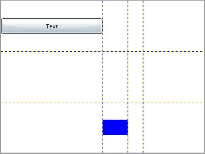
Instead of setting the exact width for every column and height for every row you can use the alternative MinWidth / MaxWidth and MinHeight / MaxHeight properties. The following example demonstrates it:

<Grid.ColumnDefinitions>
    <ColumnDefinition MinWidth="30" MaxWidth="150"></ColumnDefinition>
    <ColumnDefinition Width="Auto" MinWidth="30" MaxWidth="150"></ColumnDefinition>
    <ColumnDefinition Width="Auto" MinWidth="30" MaxWidth="150"></ColumnDefinition>
    <ColumnDefinition Width="Auto" MinWidth="30" MaxWidth="150"></ColumnDefinition>
</Grid.ColumnDefinitions>
<Button x:Name="btnTest" Width="200" Height="30" Content="Text" Grid.Row="0" Grid.Column="0"></Button>
<Rectangle x:Name="rectBlue" Width="50" Height="30" Fill="Blue" Grid.Row="2" Grid.Column="1"></Rectangle>

You see that the first column takes its MaxWidth 150 pixels in spite of the fact that the Button in it is 200 pixels wide. You also see that the third column takes its MinWidth though there is nothing in it.

Please be careful using these properties because they depend on the neighboring columns/rows. The following example demonstrates it:

<Grid.ColumnDefinitions>
    <ColumnDefinition MinWidth="30" MaxWidth="150"></ColumnDefinition>
    <ColumnDefinition MinWidth="30" MaxWidth="150"></ColumnDefinition>
    <ColumnDefinition MinWidth="30" MaxWidth="150"></ColumnDefinition>
    <ColumnDefinition MinWidth="30" MaxWidth="150"></ColumnDefinition>
</Grid.ColumnDefinitions>

Removing the “Auto” width from the second, third and fourth column results in the following:

It seems that the MinWidth and MaxWidth are not taken into consideration at all.

They also depend on the combination of properties in the current column/row.

<Grid.ColumnDefinitions>
    <ColumnDefinition Width="Auto" MinWidth="30" MaxWidth="150"></ColumnDefinition>
    <ColumnDefinition Width="Auto" MinWidth="30" MaxWidth="150"></ColumnDefinition>
    <ColumnDefinition Width="Auto" MinWidth="30" MaxWidth="150"></ColumnDefinition>
    <ColumnDefinition Width="Auto" MinWidth="30" MaxWidth="150"></ColumnDefinition>
</Grid.ColumnDefinitions>
<Button x:Name="btnTest" Width="200" Height="30" Content="Text" Grid.Row="0" Grid.Column="0"></Button>
<Rectangle x:Name="rectBlue" Width="50" Height="30" Fill="Blue" Grid.Row="2" Grid.Column="1"></Rectangle>

We just put an Auto Width for the first column too and the result is the following:

It seems that the MinWidth for the third column works but the MaxWidth for the first column does not with Auto width.

So just be careful using these properties.

What we can do if we want our button to be placed is several cells?

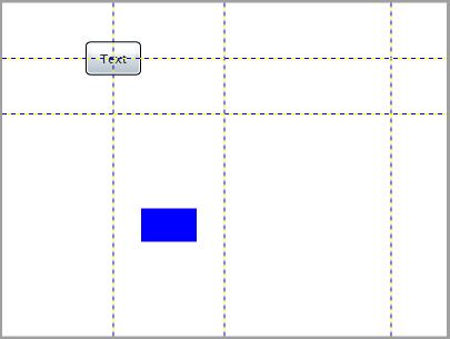
Another opportunity that you have is to set the Grid.ColumnSpan and Grid.RowSpan attached properties for every control in the Grid.

<Button Grid.ColumnSpan="2" Grid.RowSpan="2" x:Name="btnTest" Width="50" Height="30" Content="Text" Grid.Row="0" Grid.Column="0"></Button>

This acts just like the colspan and rowspan attributes of the HTML table cell with the difference that in Silverlight we set these properties to the control. The cool thing here is that these properties act per control and don’t make the table cell bigger. We can put other controls without these two properties and it will be positioned the way it has to be. For example we can put a TextBlock in the first cell:

<TextBlock HorizontalAlignment="Center" VerticalAlignment="Center" x:Name="tblSomeText" Text="Some Text" Grid.Row="0" Grid.Column="0"></TextBlock>

Have you noticed the two new properties of the TextBlock we just added - the horizontal and vertical alignment of the control according to the cell boundaries? We omitted them in the Button and the Rectangle because they are set to “Center” by default for them.

You can get or set the “Grid.Row”,Grid.Column”, “Grid.RowSpan” and “Grid.ColumnSpan” attached properties programatically using the static methods of the Grid class.

The following example demonstrates it:

Code behind:

public partial class Page : UserControl
{
    public Page()
    {
        InitializeComponent();
 
        Grid.SetColumn( this.btnTest, 1 );
        Grid.SetRow( this.btnTest, 1 );
        Grid.SetColumnSpan( this.btnTest, 2 );
        Grid.SetRowSpan( this.btnTest, 2 );
    }
}

XAML:

<Grid x:Name="grdLayoutRoot" Background="White" Width="400" Height="300" ShowGridLines="True">
    <Grid.RowDefinitions>
        <RowDefinition></RowDefinition>
        <RowDefinition></RowDefinition>
        <RowDefinition></RowDefinition>
    </Grid.RowDefinitions>
    <Grid.ColumnDefinitions>
        <ColumnDefinition></ColumnDefinition>
        <ColumnDefinition></ColumnDefinition>
        <ColumnDefinition></ColumnDefinition>
        <ColumnDefinition></ColumnDefinition>
    </Grid.ColumnDefinitions>
    <Button x:Name="btnTest" Width="50" Height="30" Content="Click" Grid.Row="0" Grid.Column="0"></Button>
</Grid>

Result:

Here is another example where we get these properties and increase them:

Grid.SetColumn( this.btnTest, Grid.GetColumn( this.btnTest ) + 1 );
Grid.SetRow( this.btnTest, Grid.GetRow( this.btnTest ) + 1 );
Grid.SetColumnSpan( this.btnTest, Grid.GetColumnSpan( this.btnTest ) + 1 );
Grid.SetRowSpan( this.btnTest, Grid.GetRowSpan( this.btnTest ) + 1 );

The result is the same.

Conclusion

This article is just a brief description of the key features of the Grid control. It targets the developer who has just started with the Silverlight controls. Any comments are welcome.

Reference

http://silverlight.net/learn/tutorials.aspx
http://msdn2.microsoft.com/en-us/library/system.windows.controls.grid(VS.95).aspx


Subscribe

Comments

  • -_-

    RE: Using the Grid control in Silverlight 2


    posted by Mariusz on Apr 10, 2008 01:03

    Hi, I like your tutorials about the layout possibilities in silverlight.

  • -_-

    RE: Using the Grid control in Silverlight 2


    posted by Mariusz on Apr 10, 2008 01:04

    Is it possible to highlight one cell of the grid, when the mouse pointer gets over it?

  • nikolayraychev

    RE: Using the Grid control in Silverlight 2


    posted by nikolayraychev on Apr 10, 2008 06:15

    Hi Mariusz,

    We do not have an object for the Grid cell, but we can easily highlight a cell when the mouse is over by putting a Canvas in it. The following example demonstrates it:

    XAML:

    <UserControl x:Class="HighlightGridCellOnMouseOver.Page"
        xmlns="http://schemas.microsoft.com/winfx/2006/xaml/presentation"
        xmlns:x="http://schemas.microsoft.com/winfx/2006/xaml"
        Width="400" Height="300">
        <Grid x:Name="LayoutRoot" ShowGridLines="True" Background="White">
            <Grid.RowDefinitions>
                <RowDefinition></RowDefinition>
                <RowDefinition></RowDefinition>
                <RowDefinition></RowDefinition>
            </Grid.RowDefinitions>
            <Grid.ColumnDefinitions>
                <ColumnDefinition></ColumnDefinition>
                <ColumnDefinition></ColumnDefinition>
                <ColumnDefinition></ColumnDefinition>
            </Grid.ColumnDefinitions>
            <Canvas MouseEnter="cnvHighlight_MouseEnter" MouseLeave="cnvHighlight_MouseLeave" Background="White" x:Name="cnvHighlight" Grid.Row="1" Grid.Column="1"></Canvas>
        </Grid>
    </UserControl>

    Code behind:

    private void cnvHighlight_MouseEnter( object sender, MouseEventArgs e )
    {
         SolidColorBrush yellowBrush = new SolidColorBrush( Colors.Yellow );
         this.cnvHighlight.Background = yellowBrush;
    }
    private void cnvHighlight_MouseLeave( object sender, MouseEventArgs e )
    {
         SolidColorBrush whiteBrush = new SolidColorBrush( Colors.White );
         this.cnvHighlight.Background = whiteBrush;
    }

    We just attach to the MouseEnter and MouseLeave events of the Canvas and change the Background Brush. By default the Canvas takes the whole available space in the cell.

  • -_-

    RE: Using the Grid control in Silverlight 2


    posted by Vijaykumar Channakeshava on Aug 03, 2008 21:23

    Is it possible to customize cell wise rather than column wise dynamically?

  • nikolayraychev

    RE: Using the Grid control in Silverlight 2


    posted by nikolayraychev on Aug 04, 2008 01:12

    Thanks for your comment, Vijaykumar.

    There is no object for the Grid cell. But a solution may be to put a Canvas like the example in the previous comment and customize it dynamically. The Canvas will act as a table cell and you can access it from the code behind. You are not limited in putting a Canvas. You can put another layout control.

  • -_-

    RE: Using the Grid control in Silverlight 2


    posted by ohaiyo on Oct 09, 2008 02:12

    How to set dashed of the grid to solid? 


    gomienie@gmail.com

  • -_-

    RE: Using the Grid control in Silverlight 2


    posted by ohaiyo on Oct 09, 2008 02:24

    i want to create table with solid border.  how do? thank you!

    (i want to place custom UserControl in each cell of table)

  • nikolayraychev

    RE: Using the Grid control in Silverlight 2


    posted by nikolayraychev on Oct 09, 2008 06:56

    Hi ohaiyo,

    I can't find any property of the Grid which defines a grid lines brush.

    An easy workaround may be to hide the grid lines and to put a Border control in each "cell".

    Nikolay

  • -_-

    RE: Using the Grid control in Silverlight 2


    posted by Rohan on Feb 20, 2009 02:30

     Nice Article

  • -_-

    RE: Using the Grid control in Silverlight 2


    posted by Mark on Mar 05, 2009 04:01

    Thanks for the article.

    Is it possible for the grid to resize to automatically fit just the size of its contents. e.g I have a grid like the following:

    <Grid x:Name="test" Background="White" ShowGridLines="True">
                <Grid.RowDefinitions>
                    <RowDefinition Height="30"></RowDefinition>
                    <RowDefinition Height="Auto"></RowDefinition>
                    <RowDefinition Height="30"></RowDefinition>               
                </Grid.RowDefinitions>
                <Grid.ColumnDefinitions>
                    <ColumnDefinition Width="30"></ColumnDefinition>
                    <ColumnDefinition Width="Auto"></ColumnDefinition>
                    <ColumnDefinition Width="30"></ColumnDefinition>               
                </Grid.ColumnDefinitions>
                <TextBox Text="Hello" Grid.Row="1" Grid.Column="1" Background="Transparent" BorderThickness="0"/>
            </Grid>

    Currently it takes up the full space of its parent canvas. The last column ignores the width specified (30) and stretches to the entire canvas. I want the grid size to be just the size of the textbox + the 30 either side.

    Thanks

  • -_-

    RE: Using the Grid control in Silverlight 2


    posted by RobeK on Mar 25, 2009 06:09
    Set Horizontal- and VerticalAlignment to Left/Top. Default for Grid seems to be stretch.
  • -_-

    RE: Using the Grid control in Silverlight 2


    posted by Kannan on Mar 25, 2009 09:43
    Thanks for this article.
    Is it possible to dynamically vary the width of one column of a Grid. I want the Gird of 4 * 4 structure. In this i want the 2nd column of the 1st row to vary in its width based on user's selection. Is that possible to set it in the code behind ?
  • -_-

    RE: Using the Grid control in Silverlight 2


    posted by Sonal on Mar 31, 2009 02:49

    Grid

    .SetRow(), if I have two grids in my page then to which grid SetRow() will be applied. I want to add dynamic controls
    to a row in grid and also want to add rows dynamically to a grid. Can you please let me know if you have any idea?

  • daniel.valenzuela.a

    RE: Using the Grid control in Silverlight 2


    posted by daniel.valenzuela.a on May 25, 2009 18:41

    it is possible give an specific position in a row/column to a control using an id, and not the position of the row/column

    example --> <columndefinition x:uid="column_1" />

                        <Textblock grid.column="column_1"/>

    if i want to make a change adding a new row/column will be slow change the position to every control created.

  • nikolayraychev

    RE: Using the Grid control in Silverlight 2


    posted by nikolayraychev on May 26, 2009 07:40
    Kannan, you can try the following:

    this.grdLayoutRoot.ColumnDefinitions[1].Width = new GridLength(200); 

    Sonal, SetRow will apply to the Grid into which the control is. In my examples above you can see that the Button and the Rectangle are into the Grid

    For dynamically adding rows you can try the following:

    RowDefinition rd = new RowDefinition(); 
    rd.Height = new GridLength(50); 
    this.grdLayoutRoot.RowDefinitions.Add(rd); 

    For dynamically adding controls to the Grid you can try:

    Button btn = new Button(); 
    btn.Content = "New Control"
    this.grdLayoutRoot.Children.Add(btn); 
    Grid.SetRow(btn, 1); 
    Grid.SetColumn(btn, 1); 

    Daniel, may be your solution will work in Silverlight 3. I tried it in Silverlight 2 but it did not work for me.
  • -_-

    RE: Using the Grid control in Silverlight 2


    posted by Charu on Aug 26, 2009 09:46
    Good Artical
  • -_-

    RE: Using the Grid control in Silverlight 2


    posted by Kareem on Apr 24, 2010 23:40
    Thanks
  • -_-

    RE: Using the Grid control in Silverlight 2


    posted by arun on Aug 27, 2010 17:58
    how to add controls dynamically from codebehind to Grid using MVVM
  • -_-

    RE: Using the Grid control in Silverlight 2


    posted by XYZ on Sep 10, 2010 00:53
    is it possible to reteive a control at a particular row and column ?
  • -_-

    RE: Using the Grid control in Silverlight 2


    posted by Santosh on Dec 07, 2010 12:28
    thnx it was very helpfull........
  • -_-

    RE: Using the Grid control in Silverlight 2


    posted by Gavin on Dec 20, 2010 14:27
    Very helpful... was getting myself in knots over here :)
  • lnikolov

    RE: Using the Grid control in Silverlight


    posted by lnikolov on Dec 22, 2010 17:50

    The article has been updated to the latest version of Silverlight and Visual Studio.

  • -_-

    RE: Using the Grid control in Silverlight


    posted by bpS Rajput on Dec 30, 2010 07:27

    Thanks a lot, It was very helpfull for me.

  • -_-

    RE: Using the Grid control in Silverlight


    posted by Prasanna Padkil on Apr 11, 2011 12:18
    Very nice article for Beginners..Thanks a lot!!
  • -_-

    RE: Using the Grid control in Silverlight


    posted by Rafik Mondal on Apr 26, 2011 14:03
    This good article
  • JunwenGa

    Re: Using the Grid control in Silverlight


    posted by JunwenGa on Jul 24, 2011 15:47

    great resource. explained very well

Add Comment

Login to comment:
  *      *