(X) Hide this
    • Login
    • Join
      • Generate New Image
        By clicking 'Register' you accept the terms of use .

Layout controls in Silverlight

(6 votes)
Nikolay Raychev
>
Nikolay Raychev
Joined Mar 28, 2008
Articles:   22
Comments:   58
More Articles
9 comments   /   posted on Apr 07, 2008
Tags:   canvas , grid , stackpanel , layout , nikolay-raychev
Categories:   Controls

This article is compatible with the latest version of Silverlight.

Introduction

Layout controls are Silverlight controls which act as containers of other controls. Their main purpose is the positioning and arranging of their child controls. There are several layout controls: Canvas, StackPanel and Grid and TabPanel.

See also:
Canvas Article
StackPanel Article
Grid Article

Overview

All layout controls derive from the basic abstract class Panel.

There are also four more descendants of the Panel Class: DataGridCellsPresenter, DataGridColumnHeadersPresenter, DataGridDetailsPresenter, DataGridRowsPresenter. Their purpose is the positioning of elements in a DataGrid template. They are not standalone controls.

Layout controls inherit the Children collection of type UIElementCollection. Since all elements in this collection are UIElement objects and the Panel itself derives from UIElement layout controls can be nested in one another without limitation.

The following example demonstrates the nesting:

Note: to understand this example you should be familiar with all layout controls: Canvas, StackPanel and Grid

We want to have the following meaningless result (I don’t like giving real world examples, I just want to show you how nesting of layout controls works.):

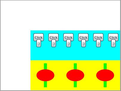
Here is the XAML code:

<UserControl x:Class="LayoutControls.Page"
    xmlns="http://schemas.microsoft.com/winfx/2006/xaml/presentation"
    xmlns:x="http://schemas.microsoft.com/winfx/2006/xaml"
    Width="400" Height="300">
    <Grid x:Name="grRoot" Background="White">
        <Grid.RowDefinitions>
            <RowDefinition Height="*"></RowDefinition>
            <RowDefinition Height="100"></RowDefinition>
            <RowDefinition Height="100"></RowDefinition>
        </Grid.RowDefinitions>
        <Grid.ColumnDefinitions>
            <ColumnDefinition Width="*"></ColumnDefinition>
            <ColumnDefinition Width="300"></ColumnDefinition>
        </Grid.ColumnDefinitions>
        <StackPanel Background="Aqua" x:Name="spSecondRow" Grid.Row="1" Grid.Column="1" Orientation="Horizontal">
            <Canvas Width="50" Height="100">
                <Button Content="Click" Canvas.Left="10" Canvas.Top="10" Canvas.ZIndex="0"></Button>
                <Button Content=":)" Canvas.Left="20" Canvas.Top="30" Canvas.ZIndex="1"></Button>
            </Canvas>
            <Canvas Width="50" Height="100">
                <Button Content="Click" Canvas.Left="10" Canvas.Top="10" Canvas.ZIndex="0"></Button>
                <Button Content=":)" Canvas.Left="20" Canvas.Top="30" Canvas.ZIndex="1"></Button>
            </Canvas>
            <Canvas Width="50" Height="100">
                <Button Content="Click" Canvas.Left="10" Canvas.Top="10" Canvas.ZIndex="0"></Button>
                <Button Content=":)" Canvas.Left="20" Canvas.Top="30" Canvas.ZIndex="1"></Button>
            </Canvas>
            <Canvas Width="50" Height="100">
                <Button Content="Click" Canvas.Left="10" Canvas.Top="10" Canvas.ZIndex="0"></Button>
                <Button Content=":)" Canvas.Left="20" Canvas.Top="30" Canvas.ZIndex="1"></Button>
            </Canvas>
            <Canvas Width="50" Height="100">
                <Button Content="Click" Canvas.Left="10" Canvas.Top="10" Canvas.ZIndex="0"></Button>
                <Button Content=":)" Canvas.Left="20" Canvas.Top="30" Canvas.ZIndex="1"></Button>
            </Canvas>
            <Canvas Width="50" Height="100">
                <Button Content="Click" Canvas.Left="10" Canvas.Top="10" Canvas.ZIndex="0"></Button>
                <Button Content=":)" Canvas.Left="20" Canvas.Top="30" Canvas.ZIndex="1"></Button>
            </Canvas>
        </StackPanel>
        <StackPanel Background="Yellow" x:Name="spThirdRow" Grid.Row="2" Grid.Column="1" Orientation="Horizontal">
            <Canvas Width="100" Height="100">
                <Rectangle Canvas.Top="10" Canvas.Left="45" Canvas.ZIndex="0" Fill="Lime"  Width="10" Height="80"></Rectangle>
                <Ellipse Canvas.Top="30" Canvas.Left="20" Canvas.ZIndex="1" Fill="Red" Width="60" Height="40"></Ellipse>
            </Canvas>
        </StackPanel>
    </Grid>
</UserControl>

We have a Grid, two StackPanels in the Grid and several Canvases in every StackPanel and several controls in every Canvas. You can put another Grid in the existing for example, or in a StackPanel or Canvas. It depends on the result you want to achieve.

You saw that we put a Background property of the two StackPanels. You can set it in the XAML as an attribute using one of the Colors enumeration but you also can use a Brush object for it. The following examples demonstrates its use with several different brushes:

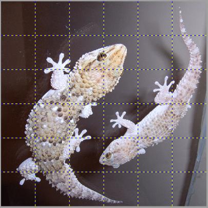
Using the ImageBrush for a Grid Background:

XAML:

<UserControl x:Class="LayoutControls.Page"
    xmlns="http://schemas.microsoft.com/winfx/2006/xaml/presentation"
    xmlns:x="http://schemas.microsoft.com/winfx/2006/xaml"
    Width="400" Height="400">
    <Grid x:Name="grMain" ShowGridLines="True">
        <Grid.RowDefinitions>
            <RowDefinition></RowDefinition>
            <RowDefinition></RowDefinition>
            <RowDefinition></RowDefinition>
            <RowDefinition></RowDefinition>
            <RowDefinition></RowDefinition>
            <RowDefinition></RowDefinition>
        </Grid.RowDefinitions>
        <Grid.ColumnDefinitions>
            <ColumnDefinition></ColumnDefinition>
            <ColumnDefinition></ColumnDefinition>
            <ColumnDefinition></ColumnDefinition>
            <ColumnDefinition></ColumnDefinition>
            <ColumnDefinition></ColumnDefinition>
            <ColumnDefinition></ColumnDefinition>
        </Grid.ColumnDefinitions>
        <Grid.Background>
            <ImageBrush x:Name="backgroundImageBrush" Stretch="UniformToFill">
                <ImageBrush.ImageSource>
                    <BitmapImage x:Name="bmpBackground" UriSource="http://terraristic.net/ photos/Pachydactylus_bibroni/Pachydactylus_bibroni_couple.jpg">
                    </BitmapImage>
                </ImageBrush.ImageSource>
            </ImageBrush>
        </Grid.Background>
    </Grid>
</UserControl>

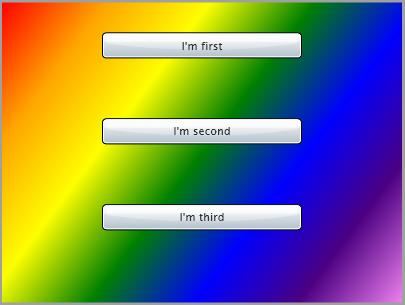
Using the LinearGradientBrush for a StackPanel Background:

XAML:

<UserControl x:Class="LayoutControls.Page"
    xmlns="http://schemas.microsoft.com/winfx/2006/xaml/presentation"
    xmlns:x="http://schemas.microsoft.com/winfx/2006/xaml"
    Width="400" Height="300">
    <StackPanel x:Name="spLayout">
        <Button Margin="30" Width="200" Content="I'm first"></Button>
        <Button Margin="30" Width="200" Content="I'm second"></Button>
        <Button Margin="30" Width="200" Content="I'm third"></Button>
        <StackPanel.Background>
            <LinearGradientBrush x:Name="backgroundLinearGradientBrush" MappingMode="RelativeToBoundingBox" StartPoint="0,0" EndPoint="1,1">
                <LinearGradientBrush.GradientStops>
                    <GradientStop Color="Red" Offset="0" />
                    <GradientStop Color="Orange" Offset="0.167" />
                    <GradientStop Color="Yellow" Offset="0.333" />
                    <GradientStop Color="Green" Offset="0.5"/>
                    <GradientStop Color="Blue" Offset="0.667" />
                    <GradientStop Color="Indigo" Offset="0.833" />
                    <GradientStop Color="Violet" Offset="1" />
                </LinearGradientBrush.GradientStops>
            </LinearGradientBrush>
        </StackPanel.Background>
    </StackPanel>
</UserControl>

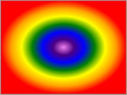
Using the RadialGradientBrush for a Canvas Background:

XAML:

<UserControl x:Class="LayoutControls.Page"
    xmlns="http://schemas.microsoft.com/winfx/2006/xaml/presentation"
    xmlns:x="http://schemas.microsoft.com/winfx/2006/xaml"
    Width="400" Height="300">
    <Canvas x:Name="cnvMain">
        <Canvas.Background>
            <RadialGradientBrush x:Name="backgroundRadialGradientBrush" MappingMode="RelativeToBoundingBox" Center="0.5, 0.5" RadiusX="0.5" RadiusY="0.5">
                <RadialGradientBrush.GradientStops>
                    <GradientStop Color="Violet" Offset="0" />
                    <GradientStop Color="Indigo" Offset="0.167" />
                    <GradientStop Color="Blue" Offset="0.333" />
                    <GradientStop Color="Green" Offset="0.5"/>
                    <GradientStop Color="Yellow" Offset="0.667" />
                    <GradientStop Color="Orange" Offset="0.833" />
                    <GradientStop Color="Red" Offset="1" />
                </RadialGradientBrush.GradientStops>
            </RadialGradientBrush>
        </Canvas.Background>
    </Canvas>
</UserControl>

It’s just amazing how you can use brushes in the XAML without writing a single line in the code behind.

Conclusion

This article covers the key features of the Panel class which are inherited in all layout controls. It targets the developer who has just started with the Silverlight controls. Any comments are welcome.

Reference

http://silverlight.net/learn/tutorials.aspx
http://msdn2.microsoft.com/en-us/library/system.windows.controls.panel(VS.95).aspx


Subscribe

Comments

  • -_-

    RE: Layout controls in Silverlight 2


    posted by John "Z-Bo" Zabroski on Jul 01, 2008 11:42
    • There are also four more ancestors of the Panel Class: DataGridCellsPresenter, DataGridColumnHeadersPresenter, DataGridDetailsPresenter, DataGridRowsPresenter.

    these are not "ancestors".  these are "descendants".  ancestors = parents, not children

  • nikolayraychev

    RE: Layout controls in Silverlight 2


    posted by nikolayraychev on Jul 01, 2008 23:33

    Thanks for your remark, John. I corrected it.

  • -_-

    RE: Layout controls in Silverlight 2


    posted by amruta on Jul 07, 2008 03:30

    Its really useful but want to know how scrolling of page is working in SL2

  • -_-

    RE: Layout controls in Silverlight 2


    posted by Arun on Oct 02, 2009 10:16

    Very nice article. 

    But I don't like to background image. :(

  • -_-

    RE: Layout controls in Silverlight 2


    posted by Jonathan on Mar 05, 2010 05:33
    Thank you for posting these simple articles. It helps n00bs like me :)
  • -_-

    RE: Layout controls in Silverlight 2


    posted by Passionate about Silverlight on Mar 29, 2010 10:26
    Nice article,,, just the right dose of information i needed for a startup
  • -_-

    RE: Layout controls in Silverlight 2


    posted by Kareem on Apr 24, 2010 23:17
    Thanks for the article.
  • -_-

    RE: Layout controls in Silverlight 3


    posted by Abhijit Mane on Nov 15, 2010 11:30

    Hay i did this using silverlight 3,
    Bue while execution error has occured...
    Error 1 Unexpected ATTRIBUTE in parse rule PropertyElement ::= . PROPERTYELEMENT Content? ENDTAG.. C:\Documents and Settings\Abhijit\My Documents\Visual Studio 2010\Projects\basic s controls\basic s controls\MainPage.xaml basic s controls

    please sugest me the soln...
    my MainPage,Xaml Code as fallow,

    <UserControl x:Class="basic_s_controls.MainPage" 
                 xmlns:x="http://schemas.microsoft.com/winfx/2006/xaml" 
                 xmlns:d="http://schemas.microsoft.com/expression/blend/2008" 
                 xmlns:UserControl="clr-namespace:System.Windows.Controls;assembly=System.Windows.Controls.Data" 
                 mc:Ignorable="d" 
                 d:DesignWidth="400" d:DesignHeight="300">
        <Grid x:Name="grroot" Background="White" Height="300" Width="400">
            <Grid.RowDefinitions Height="*">
                <RowDefinition Height="*"></RowDefinition>
                <RowDefinition Height="100"></RowDefinition>
                <RowDefinition Height="100"></RowDefinition>
            </Grid.RowDefinitions>
            <Grid.ColumnDefinitions>
                <ColumnDefinition Width="*"></ColumnDefinition>
                <ColumnDefinition Width="300"></ColumnDefinition>
            </Grid.ColumnDefinitions>
            <StackPanel x:Name="firstrowfirstcolumn" Background="Aquamarine" Grid.Column="1" Grid.Row="1" Orientation="Horizontal">
                <Canvas Width="50" Height="100">
                    <Button Content="Insert" Canvas.Left="10" Canvas.Top="10" Canvas.ZIndex="0"></Button>
                    <Button Content="-:)" Canvas.Left="20" Canvas.Top="30" Canvas.ZIndex="1"></Button>
                </Canvas>
                <Canvas Height="100" Width="50">
                    <Button Content="Update" Canvas.Left="5" Canvas.Top="10" Canvas.ZIndex="0"></Button>
                    <Button Content=":)" Canvas.Left="20" Canvas.Top="30" Canvas.ZIndex="1"></Button>
                </Canvas>
                <Canvas Height="100" Width="50">
                    <Button Content="Delete" Canvas.Left="5" Canvas.Top="10" Canvas.ZIndex="0"></Button>
                    <Button Content=":)" Canvas.Left="20" Canvas.Top="30" Canvas.ZIndex="1"></Button>
                </Canvas>
                <Canvas Height="100" Width="50">
                    <Button Content="Search" Canvas.Left="5" Canvas.Top="10" Canvas.ZIndex="0"></Button>
                    <Button Content=":)" Canvas.Left="20" Canvas.Top="30" Canvas.ZIndex="1"></Button>
                </Canvas>
                <Canvas Height="100" Width="50">
                    <Button Content="Back" Canvas.Left="10" Canvas.Top="10" Canvas.ZIndex="0"></Button>
                    <Button Content=":)" Canvas.Left="20" Canvas.Top="30" Canvas.ZIndex="1"></Button>
                </Canvas>
                <Canvas Height="100" Width="50">
                    <Button Content="Next" Canvas.Left="10" Canvas.Top="10" Canvas.ZIndex="0"></Button>
                    <Button Content=":)" Canvas.Left="20" Canvas.Top="30" Canvas.ZIndex="1"></Button>
                </Canvas>
            </StackPanel>
            <StackPanel x:Name="ThirdRowSecColumn" Grid.Row="2" Grid.Column="1" Background="Honeydew" Orientation="Horizontal">
                <Canvas Height="100" Width="100">
                    <Rectangle Canvas.Left="10" Canvas.Top="10" Canvas.ZIndex="0" Height="70" Width="20" Fill="BlanchedAlmond"></Rectangle>
                    <Ellipse Canvas.Left="8" Canvas.Top="45" Canvas.ZIndex="1" Height="20" Width="70" Fill="Gold"></Ellipse>
                </Canvas>
                <Canvas Height="100" Width="100">
                    <Rectangle Canvas.Left="10" Canvas.Top="10" Canvas.ZIndex="0" Height="70" Width="20" Fill="LightBlue"></Rectangle>
                    <Ellipse Canvas.Left="8" Canvas.Top="20" Canvas.ZIndex="1" Height="20" Width="70" Fill="Moccasin"></Ellipse>
                </Canvas>
                <Canvas Height="100" Width="100">
                    <Rectangle Canvas.Left="10" Canvas.Top="10" Canvas.ZIndex="0" Height="70" Width="20" Fill="Lavender"></Rectangle>
                    <Ellipse Canvas.Left="8" Canvas.Top="55" Canvas.ZIndex="1" Height="30" Width="70" Fill="Lime"></Ellipse>
                </Canvas>
                <StackPanel x:Name="FirstRowSecColumn" Background="Aqua" Grid.Row="0" Grid.Column="1" Orientation="Horizontal">
                    <TextBlock Text="I Did this"></TextBlock>
                </StackPanel>
            </StackPanel>
        </Grid>
    </UserControl>

    pppppppplllllllllllllleeeeeeeaaaasssssseeeeee.....

  • lnikolov

    RE: Layout controls in Silverlight 2


    posted by lnikolov on Dec 16, 2010 11:35

    Hi Abhijit,

    The problem is in the following row:

    <Grid.RowDefinitions Height="*">

    Note that Grid.RowDefinitions has no Height property, although its child elements have.

    You should use this to achieve what you intend:

    <Grid.RowDefinitions>
        <RowDefinition Height="*"></RowDefinition>
        <RowDefinition Height="100"></RowDefinition>
        <RowDefinition Height="100"></RowDefinition>
    </Grid.RowDefinitions>

Add Comment

Login to comment:
  *      *