This article is compatible with the latest version of Silverlight.
Introduction
One of the main concepts, when you work over a complex (or not so) project, is “divide and conquer”. This is the need of splitting the whole project into small and reusable parts, called controls. Having lots of these smaller parts, you can easily manage them in a view (page, window, etc).
People who have worked with WinForms and ASP.NET are already familiar with this idea. It is realized both in WPF and Silverlight as well. Each control has its own behavior and style. The look and feel of each control can be tweaked through styles or can be entirely redesigned through templates, and the behavior of controls can be modified through event handlers. In the rare cases when none of that is enough, you can create (or derive) your own customized controls as well.
In this post and the next one I will show you how to create your own custom controls and how to apply different skins to them. If you don’t feel the difference between styling and skinning, you can have a look at the following section, otherwise – just ignore it. This post is introductive. It aims to give you the basic steps when building a custom control in a Silverlight project. Be sure to distinguish well controls in your projects and define each of them a specific role. In this case you will be able to designate well its behavior and functionality. This is the right point, you should start with, when working over different projects (not only Silverlight applications, but ASP.NET, WinForms, etc).
Styling vs. Skinning
People often do not make any difference between those two terms. Although, they are very similar, there is a big difference between them. Styling is called the process of applying different visual properties to your control like font size, font family, foreground color, etc. Skinning is more general, because it allows you to completely change the control template. This is not only changing its font, color, etc, but changing its view.
For example, you have a control with a circular form. If you change only the border thickness of the control, that is styling. But if you also change the form to a rectangle, that is skinning. The control’s behavior does not change, only its look. This article will cover both of these - styling and skinning. I will, of course, focus on skinning.
Our Custom Control
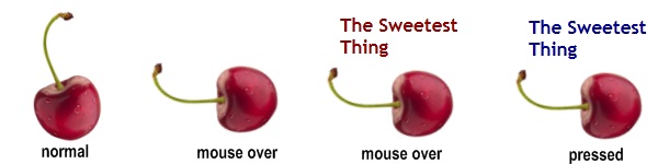
Our custom control will be called CherryButton. It consists of one very sappy cherry and a heading. Normally, the heading is not shown. When you go over the control with your mouse, the cherry changes its position and the text is shown over it.
You can run the online demo before you read the article just to see the control in action.
The control will have a few common states:
- Normal – the default one
- MouseOver – when a use goes over the control with the mouse
- Pressed – when a user presses the control
These states are default for any button-like control. We will define two more states for our custom control:
- Mature – the default one (the cherry looks so delicious like in the above screenshot)
- Immature – makes the cherry looks immature
The Beginning
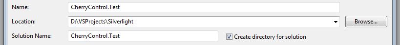
Let’s create a new Silverlight project, called CherryControl.Test

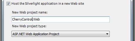
Then, select Visual Studio to create a new ASP.NET project to host your new Silverlight application. Call this web project CherryControl.Web.
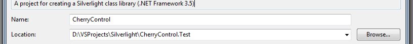
Now, we will add a new project of type Class Library to our solution. This project will hold our cool control. We will call it CherryControl.

Controls Architecture
Before creating a custom control, you should understand the whole control architecture in Silverlight. A look at MSDN shows us the following structure:
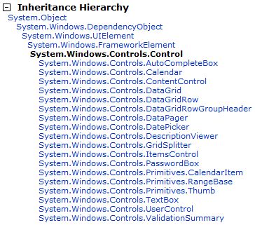
Each control inherits from DependencyObject. Dependency objects participate in the dependency property system, which is integrated in both WPF and Silverlight. A dependency property extends the normal property of a class, by letting it being set by more than one source via data bindings.
The UIElement class is responsible for giving a look to a control. Much of the input behavior for objects in a Silverlight UI is defined in the UIElement class. This includes the events for keyboard, mouse and stylus input, and focus events.
FrameworkElement provides support for a control to be laid out. It extends UIElement and adds the following capabilities: layout, object lifetime events, support for data binding.
Control is the base class for many of the controls in Silverlight. It defines very little behavior, but it is very important. The Template property specifies the appearance of the Control. Many of the controls that ship with Silverlight use a ControlTemplate and inherit from Control. If you want to change the appearance of a control but retain its functionality, you should consider creating a new ControlTemplate instead of creating a new class. This will be described in this article in details.
One Step Further
Now, we have the freedom to choose the base class for our control. Its behavior is button-like so it’s natural to inherit from Button and then add the necessarily functionality. But, we will use Control as a base class and we will implement our behavior.
Add a new class to our Class Library project and call it CherryButton.cs.


| public class CherryButton : Control |
| { |
| … |
| } |
By default, each control in Silverlight is lookless. Its look is set by its Template property. We define this property in a predefined file, called generic.xaml. Its path is also predefined. It should be in a folder, named Themes.
Well, now we have to establish the connection between our style definitions (which we will place in generic.xaml) and the control itself (which is defined in our c# class). In generic.xaml file we have to create a new style definition and set its target type to be our custom control. This declaration looks like this:
| <ResourceDictionary |
| xmlns="http://schemas.microsoft.com/winfx/2006/xaml/presentation" |
| xmlns:x="http://schemas.microsoft.com/winfx/2006/xaml" |
| xmlns:controls="clr-namespace:CherryControl.Library" |
| xmlns:vsm="clr-namespace:System.Windows;assembly=System.Windows" |
| xmlns:d="http://schemas.microsoft.com/expression/blend/2008" |
| xmlns:mc="http://schemas.openxmlformats.org/markup-compatibility/2006" mc:Ignorable="d"> |
| |
| <Style TargetType="controls:CherryButton"> |
| <Setter Property="Template"> |
| <Setter.Value> |
| <ControlTemplate TargetType="controls:CherryButton"> |
| … |
| </ControlTemplate> |
| </Setter.Value> |
| </Setter> |
| </Style> |
| </ResourceDictionary> |
A resource dictionary contains all the style definitions, which are to be applied in a Silverlight project. Each style should have a target type, which indicates that all controls of this type will have this style set on. Each style may also have a key. If so, the style won’t be applied automatically, but user can set it vie the Style property of the control. Do not forget, that only controls of type TargetType may have the style set on.
Do not forget to add a namespace reference to our class library project. In this way we will be able to access our control.
The first part of establishing connection between the visual styles and the functionality is done. Now, in the c# file, we have to make our control use this style definition. This is done by setting its DefaultStyleKey property.
| public class CherryButton : Control |
| { |
| public CherryButton() |
| { |
| this.DefaultStyleKey = typeof(CherryButton); |
| } |
| } |
| |
In this way we set the default style, which should be applied to our control, if no other styles are set.
Give it Look
Well, let’s give our control look.
| <ControlTemplate TargetType="controls:CherryButton"> |
| <Grid> |
| <Grid.RowDefinitions> |
| <RowDefinition /> |
| <RowDefinition /> |
| </Grid.RowDefinitions> |
| |
| <TextBlock x:Name="CherryText" Grid.Row="0" Opacity="0" VerticalAlignment="Center" |
| FontSize="17" FontFamily="Trebuchet MS" TextWrapping="Wrap" |
| HorizontalAlignment="Center" FontWeight="Bold" /> |
| |
| <Image Source="/CherryControl;component/Images/cherry.png" Stretch="None" |
| RenderTransformOrigin="0.5,0.75" x:Name="CherryImage" Grid.Row="0" Grid.RowSpan="2" |
| VerticalAlignment="Bottom" HorizontalAlignment="Right" /> |
| </ControlTemplate> |
As I mentioned in the beginning, our control is very simple. It consists of one image and a text block. To see it in action, we have to add it to a page. That is what we will use the Silverlight project CherryControl.Test for. First, you have to add a reference to the class library project in order to access the control.

Then in MainPage.xaml, add a namespace declaration to the library.
| xmlns:ctrl="clr-namespace:CherryControl.Library;assembly=CherryControl" |
Now, we can access our control and use it as any other Silverlight control.
| <Grid> |
| <ctrl:CherryButton VerticalAlignment="Center" HorizontalAlignment="Center" /> |
| </Grid> |
| |
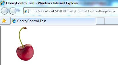
This is the result. Our control is static now, because we have not defined any behavior. No matter of that, our cherry looks very delicious.
Conclusion
In this first article you see how custom controls in Silverlight “bear”. These are the initial steps in the algorithm. You should always think before you create a custom control. You have to establish its role in the whole project. This way you will surely know what its behavior should be. Another important thing is to make your controls reusable. That means: DO NOT encapsulate everything in a control, but rather make it customizable via dependency properties.
In the following article, which is part II, I will show you how to distinguish different parts, which form your control, and how to manage its states. A control may have many states, which are placed in different groups. A control can be in many states from different groups only. It cannot be in two states, which are parts of the same group. You can put a control in different states based on any events or user input. More on this, I will write in the following post.
Source Code
Feel free to download the source code of the examples and give it a try yourself.
References
- http://silverlight.net/learn/videos/silverlight-videos/building-a-skinnable-custom-control-part-1/
- http://www.silverlightshow.net/tips/Tip-What-is-the-difference-between-styling-and-skinning.aspx
- http://msdn.microsoft.com/en-us/library/system.windows.controls.control(VS.95).aspx