This article is compatible with the latest version of Silverlight.
Introduction
Silverlight has introduced easily creating and manipulating rich data forms. These series of posts will help you when creating rich data forms in Silverlight in your projects. Silverlight introduces a new control, called DataForm. It enables various methods for display, edit, update and navigation through data.
The DataForm control is like the DataGrid control in Silverlight 2. But while the DataGrid control is used to manipulate a list of items, the DataForm control focuses on the item itself.
In this article I will show you the basics of the DataForm control – what you can do with it and why you should use it. I will show you how you can bind an item or a collection of items to a data form. Microsoft guys have done a great job with this control, so there are many features that you can use directly without much pain.
You can run the online demo before you read the article just to see what it is.
Beginning
Let’s create a new Silverlight application and call it DataFormTest.

In order to use the DataForm control, we have to add a reference to System.Windows.Controls.Data.DataForm assembly in our project. Then in the XAML declaration of the main page you should add a new namespace in order to access this assembly. Your XAML will look like this:
| <UserControl x:Class="DataFormTest.MainPage" |
| xmlns="http://schemas.microsoft.com/winfx/2006/xaml/presentation" |
| xmlns:x="http://schemas.microsoft.com/winfx/2006/xaml" |
| xmlns:df="clr-namespace:System.Windows.Controls;assembly=System.Windows.Controls.Data.DataForm" |
| Width="400" Height="300"> |
| … |
| </UserControl> |
Now you can add the DataForm control.
| <df:DataForm x:Name="myDataForm" /> |
One-Item Binding
Well, we have our DataForm control in our project. Now, let’s learn how to expose its features. Let’s create a simple class, which we will bind to our DataForm control. I will call this class Movie. It represents a movie in the real life. Here is its declaration:
| public enum Genres |
| { |
| Comedy, |
| Fantasy, |
| Drama, |
| Thriller |
| } |
| |
| public class Movie |
| { |
| public int MovieID { get; set; } |
| public string Name { get; set; } |
| public int Year { get; set; } |
| public DateTime AddedOn { get; set; } |
| public string Producer { get; set; } |
| public Genres Genre { get; set; } |
| } |
Now in the Loaded event of our UserControl we can create a new Movie object and bind it to the DataForm control like this:
| Movie movie = new Movie(); |
| … |
| myDataForm.CurrentItem = movie; |
When you build the project and start it, you will see it all in action.
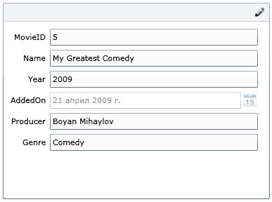
Great! You have a data form with fields which correspond to the properties of your class with minimal efforts. Now the form is read-only so you cannot change anything. In order to make changes, you have to click the button in the right top corner (the pencil).
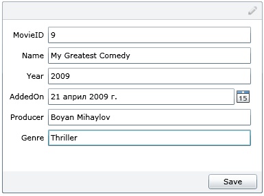
When clicking the pencil, you go in edit mode. You can make changes to each of the fields. If your field is of type DateTime, you can change its value by selecting a date from the calendar. Isn’t this cool? So, you edit the data of the object and press the Save button. The changes are successfully committed. But what if you type illegal characters in a field of type integer?
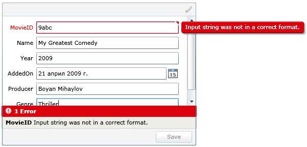
If you enter invalid data in some of the fields, you will get a validation summary, which shows the errors. In this case you are not able to save the changes until you don't fix the problems. If you position your mouse on the small red triangle in the upper right corner of a field, which has an error, you will see the error message.
Multiple-Items Binding
We saw how we can bind an item to the DataForm control. But this is just a simple case. You can bind a collection of items and navigate through them. Let’s create our own collection, which will represent a set of movies.
| public class MoviesCollection : ObservableCollection<Movie> { … } |
We use ObservableCollection, because it inherits from INotifyCollectionChanged and INotifyPropertyChanged. The second interface is used when you want your object (of a specific type) to notify for each change of its properties. This interface is commonly used when you want to make your object bindable.
In the Loaded event of the UserControl we will bind an instance of our collection to the DataForm control.
myDataForm.ItemsSource = Repository.GetMovies();
Repository is a simple class with one static method, which returns a collection of movies. When you build and run you get the following screen.
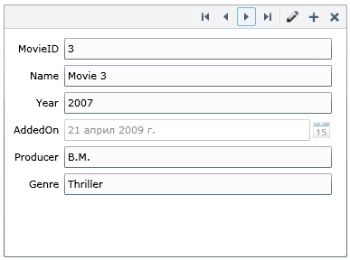
New buttons have been added in the top bar of the form. You have buttons which let you navigate through each of the movies. You can edit each of them, too. Even more, you can add or delete movies with one click. Well, you have fully functional data form with almost no efforts. Everything is built-in the DataForm control.
Now, let’s have a look over the properties of the DataForm control. I bet that Microsoft have put something interesting there, which can help us modify the form to suit our application more and more.
Events
- AddingItem - occurs just before an item is added to the collection
- DeletingItem – occurs just before an item is deleted
- BeginningEdit – occurs when you begin to edit an item
- ItemEditEnding – occurs just before an item (which is being edited) is saved
- ItemEditEnded – occurs just after an item (which has been edited) is saved
- CurrentItemChanged – occurs when you change the selected item (like SelectionChanged in a ListBox control)
- ValidatingItem – occurs when we are validating an item
Properties
- AutoCommit – indicates whether to save the changes if the user presses the next (or the previous) button without pressing the Save button
- AutoEdit – indicates whether to go into Edit mode automatically when you select a record
- CancelButtonContent – lets the user set a content for the Cancel button
- CommitButtonContent – lets the user set the content for the Commit button
- CanUserAddItems – determines whether the user can add new items or not
- CanUserDeleteItems – determines whether the user can delete an existing item or not
- DescriptionViewerPosition – sets the position of description (each field may have a description, but we will see this in the following part of these series of posts)
- Auto
- BesideContent
- BesideLabel
- FieldLabelPosition – sets the position of labels for fields
- Auto - automatically chooses the best position
- Left - default, places the labels on the left side of the fields
- Top - places the labels over the fields
- Header – sets the header of the form
- AutoGenerateFields – indicates whether fields should be automatically generated or not. In the next article of these series of articles I will show you how you can manipulate the style of a DataForm control.
In Action
Now, let’s see the data form in action with some modifications made to its properties.
| <df:DataForm x:Name="myDataForm" |
| CancelButtonContent="Cancel Me!" CommitButtonContent="Save Me!" |
| AutoCommit="False" AutoEdit="False" FieldLabelPosition="Top" |
| Header="My First Rich Data Form" CanUserDeleteItems="False"/> |
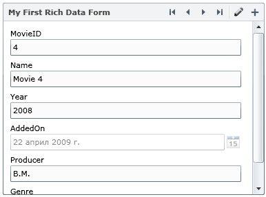
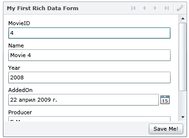
You can see, there is no Delete button, because we set CanUserDeleteItems to false. When you are editing an item, you cannot navigate through other items, because AutoCommit is set to false. If AutoEdit is set to true, you will immediately go in edit mode when you “open” an item. Now, labels are positioned over the fields, because we changed the FieldLabelPosition property.
But there is something strange. We have set a property, called CancelButtonContent, but such a button does not exist. Actually, a cancel button exists, but you have to make your class (Movie in our case) derive from an interface, called IEditableObject. This interface enables your class to respond to specific edit events via public methods -BeginEdit, CancelEdit and EndEdit. I will tell you more about this interface in the next article of these series of articles.
Conclusion
The DataForm control is a perfect solution for your application if you want to let the user manipulate a collection of data, focusing on each item. The DataForm control will save you a lot of time, because it has all of the necessary features to let you show and manipulate data collections.
In your projects you may need to change the style of the DataForm to fit your own application. You will ask, “How to do this?” Well, there is a very simple solution to your problem. The DataForm control supports template properties (such as HeaderTemplate, DisplayTemplate, EditTemplate and InsertTemplate). In my next article I will show you how you can manipulate these properties in order to change the structure of the control. I will also show you how to style your data form controls in order to make them fit better in your applications.
In the third article of these series of articles I will show you how to validate your data to achieve better results. You can specify on your class (this is the Movie class in our case) different attributes to tell the DataForm control how to validate each of its properties. This feature is very powerful and you will see it in action in one of the next articles.
Source Code
The source code is available for you free of charge. You can download the source code for all of the examples and check it by yourself.
References
- http://silverlight.net/learn/learnvideo.aspx?video=187317
- http://pendsevikram.blogspot.com/2009/03/silverlight-3-dataform-control-features.html
- http://microapplications.com/blog/archive/2009/03/27/328.aspx