This article is compatible with the latest version of Silverlight.
See also part 1, part 2 and the update.
Introduction
In the last part of our article series about the weather control we take a look at the templates and the web service we use.
Making the templates
Common resources
We try to make the control change its look easy and without retemplating everything. That is why we define text styles and brushes and we use them throughout the templates we create.
<Color x:Name="DarkColor">DodgerBlueColor>
<Color x:Name="MediumColor">LightSkyBlueColor>
<Color x:Name="LightColor">WhiteSmokeColor>
<SolidColorBrush x:Name="DarkBrush" Color="{StaticResource DarkColor}"/>
<SolidColorBrush x:Name="MediumBrush" Color="{StaticResource MediumColor}"/>
<SolidColorBrush x:Name="LightBrush" Color="{StaticResource LightColor}"/>
<Style x:Name="TextStyle" TargetType="TextBlock">
<Setter Property="HorizontalAlignment" Value="Center"/>
<Setter Property="FontSize" Value="12"/>
<Setter Property="Foreground" Value="{StaticResource DarkBrush}"/>
</Style>
<Style x:Name="TextHeading" TargetType="TextBlock">
<Setter Property="HorizontalAlignment" Value="Center"/>
<Setter Property="FontSize" Value="14"/>
<Setter Property="Foreground" Value="{StaticResource LightBrush}"/>
<Setter Property="FontWeight" Value="Bold"/>
</Style>
Thus by editing those few styles and brushes we can very easily change the look of the control, even though not that dramatically.
ItemTemplate
To change the look of the buttons and the text box we use Expression Blend and the brushes we have already defined. For the weather data we have min,max temperature, city and image data. Creating the template for each item is very simple.
<c:AnimatedSlider.ItemTemplate>
<DataTemplate>
<Border BorderBrush="{StaticResource DarkBrush}" BorderThickness="1">
<StackPanel Background="{TemplateBinding Background}" >
<Grid Background="{StaticResource DarkBrush}" Height="20">
<TextBlock Text="{Binding City}" Style="{StaticResource TextHeading}"
FontWeight="ExtraBold" />
</Grid>
<Image Source="{Binding ConditionBitmap}" Stretch="None" />
<TextBlock Text="{Binding High}" Style="{StaticResource TextStyle}" FontWeight="Bold"/>
<TextBlock Text="{Binding Low}" Style="{StaticResource TextStyle}" />
</StackPanel>
</Border>
</DataTemplate>
</c:AnimatedSlider.ItemTemplate>
ContainerStyle
The containers of the items will always fill the height of the control. To have space between the items we make the height smaller then that of the control. The sizes of a container and an item are always proportional. That means the width of a container in this case is 128,(3)
<c:AnimatedSlider x:Name="Slider" Height="140" Width="500"
ItemHeight="120" ItemWidth="110"
...
/>
The template of the container has a rectangle to indicate the selection. For the background we define separate brush because we use it in the animation of the selected item.
<Rectangle x:Name="Indicator" Fill="{StaticResource LightBrush}" Height="0" />
<Grid x:Name="ContentContainer" RenderTransformOrigin="0,0" >
<Grid.Background>
<SolidColorBrush Color="{StaticResource LightColor}"/>
<Grid.Background>
<ContentControl x:Name="ContentPresenter">
<ContentPresenter />
<ContentControl>
</Grid>
We have states for the selection and mouse events. For the MouseOver state we make the rectangle, indicating the selection, stretches. And for the selection we change the background of the content to opaque.
Note: The Storyboards for the states can't be set as static resources, because the VisualStateManager throws an error with message "Element is already the child of another element.", so you have define them inside the VisualSate tag.
<vsm:VisualStateManager.VisualStateGroups>
<vsm:VisualStateGroup x:Name="CommonStates">
<vsm:VisualState x:Name="MouseOver">
<Storyboard x:Name="MouseOverStoryboard" >
<DoubleAnimation Duration="0:0:.2"
Storyboard.TargetName="Indicator"
Storyboard.TargetProperty="Height"
To="160">
</DoubleAnimation>
</Storyboard>
</vsm:VisualState>
<vsm:VisualState x:Name="Normal">
<Storyboard x:Name="NormalStoryboard" >
<DoubleAnimation Duration="0:0:.3"
Storyboard.TargetName="Indicator"
Storyboard.TargetProperty="Height"
To="0">
</DoubleAnimation>
</Storyboard>
</vsm:VisualState>
<vsm:VisualState x:Name="Pressed">
<Storyboard x:Name="PressedStoryboard" >
<DoubleAnimation Duration="0:0:.2"
Storyboard.TargetName="Indicator"
Storyboard.TargetProperty="Height"
To="153">
</DoubleAnimation>
</Storyboard>
</vsm:VisualState>
<vsm:VisualStateGroup.Transitions>
<vsm:VisualTransition GeneratedDuration="0:0:.1"/>
<vsm:VisualTransition From="Normal" To="MouseOver" GeneratedDuration="0:0:.2"/>
<vsm:VisualTransition From="MouseOver" To="Pressed" GeneratedDuration="0:0:.025"/>
</vsm:VisualStateGroup.Transitions>
</vsm:VisualStateGroup>
<vsm:VisualStateGroup x:Name="SelectionStates">
<vsm:VisualState x:Name="Selected">
<Storyboard x:Name="SelectedStoryboard">
<ColorAnimation Duration="0:0:.02"
Storyboard.TargetName="BackgroundGrid"
Storyboard.TargetProperty="(Panel.Background).(SolidColorBrush.Color)"
To="{StaticResource LightColor}"/>
<DoubleAnimation Duration="0:0:.02"
Storyboard.TargetName="Indicator"
Storyboard.TargetProperty="Height"
To="153"/>
</Storyboard>
</vsm:VisualState>
<vsm:VisualState x:Name="Deselected">
<Storyboard x:Name="DeselectedStoryboard">
<ColorAnimation Duration="0:0:.02"
Storyboard.TargetName="BackgroundGrid"
Storyboard.TargetProperty="(Panel.Background).(SolidColorBrush.Color)"
To="{StaticResource SemiTransparentColor}"/>
<DoubleAnimation Duration="0:0:.02"
Storyboard.TargetName="Indicator"
Storyboard.TargetProperty="Height"
To="0">
</DoubleAnimation>
</Storyboard>
</vsm:VisualState>
</vsm:VisualStateGroup>
</vsm:VisualStateManager.VisualStateGroups>
Weather Forecast Web Service
Creating adapter service
We use the service provided by WebseviceX.NET. More information for it you can find at http://www.webservicex.net/WS/WSDetails.aspx?WSID=68&CATID=12. Silverlight doesn't support cross domain web service references so we have to make an adapter web service in our web application and link it to the Silverlight app. Martin Mihaylov has an article on
consuming web service in Silverlight.
First we add reference to the online web service.
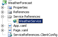
We name our adapter service WeatherService.
It only transmits data from the real web service.
[WebMethod]
public net.webservicex.www.WeatherForecasts GetForecastByPlaceName( string PlaceName )
{
net.webservicex.www.WeatherForecast client = new WeatherForecastWeb.net.webservicex.www.WeatherForecast();
net.webservicex.www.WeatherForecasts results = client.GetWeatherByPlaceName( PlaceName);
return results;
}
We add reference to our web service in the Silverlight application.
Using the adapter service
We want to edit the data from the weather service we use so we create a class to accept the data - WeatherDataPresentation. We create the client for the service.
private WeatherForecast.WeatherService.WeatherServiceSoapClient client;
When initializing we send requests for the weather forecast for some cities.
client.GetForecastByPlaceNameCompleted += new EventHandler( client_GetForecastByPlaceNameCompleted );
for ( int i = 0 ; i < CityNames.Length ; ++i )
{
client.GetForecastByPlaceNameAsync( CityNames[ i ] );
}
When the data is recieved we put it in an ObservableCollection - citiesForecastData - that has the week forecast for all the cities.
void client_GetForecastByPlaceNameCompleted( object sender, GetForecastByPlaceNameCompletedEventArgs e )
{
WeatherForecasts results = e.Result;
if ( e.Cancelled == false && results != null && results.PlaceName != null )
{
WeatherService.WeatherData data = results.Details[ 0 ];
WeatherDataPresentation item = new WeatherDataPresentation();
item.City = results.PlaceName;
item.Day = data.Day.Split( ',' )[ 0 ];
item.High = "Max:" + data.MaxTemperatureC;
item.Low = "Min:" + data.MinTemperatureC;
if ( data.WeatherImage != null )
item.ConditionBitmap = new BitmapImage( new Uri( data.WeatherImage ) );
citiesTodayForecast.Add( item );
citiesForecastData.Add( results );
}
}
The today's weather data for each city is bound to the slider.
Slider.ItemsSource = citiesTodayForecast;
And when the selection is changed we put the data for the selected city in the collection bound to the displaying ItemsControl.
private void Slider_SelectionChange( object sender, ControlsLibrary.SelectionChangedEventArgs e )
{
City.Text = citiesTodayForecast[ e.selectedItemIndex ].City;
cityWeekForecast.Clear();
foreach ( WeatherService.WeatherData data in citiesForecastData[ e.selectedItemIndex ].Details )
{
if ( data.Day != null )
{
WeatherDataPresentation item = new WeatherDataPresentation();
item.City = citiesForecastData[ e.selectedItemIndex ].PlaceName;
if ( data.Day != null )
item.Day = data.Day.Split( ',' )[ 0 ];
item.High = "Max:" + data.MaxTemperatureC;
item.Low = "Min:" + data.MinTemperatureC;
if ( data.WeatherImage != null )
item.ConditionBitmap = new BitmapImage( new Uri( data.WeatherImage ) );
cityWeekForecast.Add( item );
}
}
}
Download source
Conclusion
We tried to create a real life example of custom build control. In future we can improve the mouse dragging of the slider so there may be an article about that.
Reference
Part 1
http://www.silverlightshow.net/items/Custom-controls-Weather-forecast-control-Part-1-Introduction.aspx
Part 2
http://www.silverlightshow.net/items/Custom-Controls-Weather-control-Part-2-The-Slider.aspx