The challenge for a completely new user experience, based on the touch-based interaction in metro style applications, requires a complete set of new controls that simplify developer's life. This is the reason why, compared with Silverlight and WPF, Metro offers some the controls that implement this new kind of interaction, giving a lot of features and customization points.
GridView, ListView and FlipView togheter makes a new deal for developers because they have a higher level of perception over the commonly used Controls in xaml. In this article I would like to explore this level and go deep on some of the fundamental aspect of this triumvirate.
Understand those three
The first met with GridView, List View and FlipView is not so easy like someone can think. The problem is that they appear to be not so much like an ItemsControl - as they are effectively - but they behave is a way that is not so "natural", also for an experienced "XAMLer". As an example if you use a ListView, you will notice that it does not honour the alignment (horizontal and vertical) as expected. This control always behaves as it is aligned as Stretch also if you use Center. This happens because it always try to get the full space available in the direction it is oriented. So a ListView, that is commonly used vertically, automatically try to take all the space horizontally (in the side the scroll is not enabled). This behavior comes from the internal VirtualizingStackPanel that is attributed by default. This means that ListView always try to give the better experience, not only from the interface point of view but also from the performance. Effectively, the most strange behavior is from the FlipView, because it always try to fill the entire page also if it is enclosed in a container. Please believe me if I say I'm not able to give it an explanation.
Also if they are all ItemsControl - so they are able to present a list of items - the controls have its own role in the metro applications: GridView is mostly for presenting layout similar to the tiles in Windows 8 start screen and ListView apply to list that are vertically scrollable. The most usual example of ListView is the list of messages in the email app. FlipView instead presents the items one by one, allowing the user to move backward or forward over the list.
All the controls have specular features also if they are tailored to the specific visualization made by the control. They support flat list of items, display of grouped items and single and multiple selection and mostly they can be exchanged each other without lot of changes in the markup. Firstly we would like to load items in each control:
1: <FlipView x:Name="fvItems" ItemsSource="{StaticResource data}" />
2:
3: <ListView x:Name="lvItems" ItemsSource="{StaticResource data}" />
4:
5: <GridView x:Name="gvItems" ItemsSource="{StaticResource data}" />
Then you have to provide a template for the item. This is accomplished as usual with the ItemTemplate property. The template you provide can use the {Binding} markup extension and is applied in respect of the aspect of the control:
1: <!-- create a common DataTemplate -->
2: <DataTemplate x:Key="TheItemTemplate">
3: <Border Width="150" Height="150" BorderThickness="1" BorderBrush="Orange">
4: <TextBlock Style="{StaticResource BigText}" Text="{Binding Name}" />
5: </Border>
6: </DataTemplate>
7:
8: <!-- assigned to the specific property -->
9: <FlipView x:Name="fvItems" ItemsSource="{StaticResource data}"
10: ItemTemplate="{StaticResource TheItemTemplate}">
11: </FlipView>
12:
13: <ListView x:Name="lvItems" ItemsSource="{StaticResource data}"
14: ItemTemplate="{StaticResource TheItemTemplate}">
15: </ListView>
16:
17: <GridView x:Name="gvItems" ItemsSource="{StaticResource data}"
18: ItemTemplate="{StaticResource TheItemTemplate}">
19: </GridView>
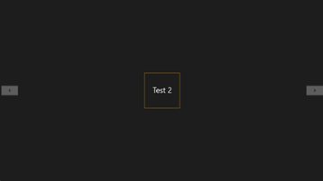
 On the left side I've attached an image that shows how each control represents the list I provided. The Flip view let you use all the available space to present a single item. It shows two button on the left and right side to let the user move forward and backward. If you use a touch enabled device the arrows are not showed and you can simple swipe horizontally to move.
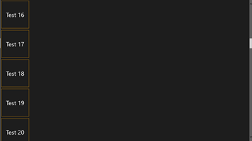
The ListView instead shows a list of items one under the other as we usually get with a ListBox. The control try to fill all the available space horizontally and the item is aligned to left. To move, the control  shows a vertical scrollbar or you can drag vertically in touch enabled devices.
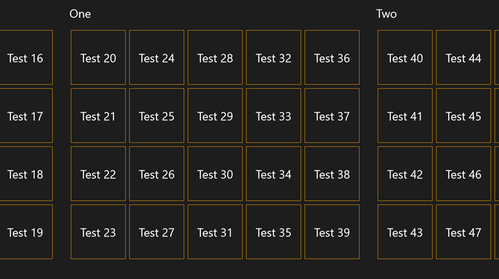
Finally the GridView diplay the items with a Wrap layout, creating a table that scroll horizontally, dividing elements in a number of rows that fill the space vertically. The GridView also shows a horizontal scrollbar but you can use the touch to scroll horizontally.
All these control behave perfectly in both touch and non touch devices without any concern by the developer. Scrollbars or handles are automatically 
displayed or hidden when required.
All the controls support selections but they behave in a slight differently way. Since GridView and ListView allow to multiple selection, they display a coloured selection artifact and the developer can switch between different modes of selection using the SelectionMode property. He can disable the selection or enable single and multiple selection. The FlipView instead support only single selection and it represents the item that is currenly shown.
Each one of the controls bases its own work on a special control that represents an item. This control is named with the "Item" suffix so The ListView has a ListViewItem, the GridView has a GridViewItem and as you may expect the FlipView has a FlipViewItem. This control represents the container of the element generated by the DataTemplate. It can be changed acting on the ItemContainerStyle property. Since it is a control, the best you can do is to override its template to completely change the aspect of container, selection artifacts and margins. As an example the GridView always apply a 4 pixel margin around each item and a layer that respond to the mouse hover. Changing the ItemContainerStyle you can get rid of them an completely remove the margins and layer.
Enable Grouping
The most beautiful and effective feature of this controls is grouping. You have an example of grouping directly on the start screen of Windows 8 since tiles are splitted in groups that are one on the side of the other. Thanks to grouping the user can explore large collections in an easy way. Each group can have an Header and usually this header is the good place for a big title. Grouping items in a FlipView is possible but the result is not so useful since it means having a title on top of the control that is shown only for the first item of each group.
ListView and GridView instead are really most effective in presenting grouping and both supports exactly the same markup. The first step to enable grouping is to create a grouped source. If you get a flat list of items you can use a CollectionViewSource and a linq query to create your grouped source:
<CollectionViewSource x:Name="GroupedSource" IsSourceGrouped="True" />
Then in the codebehind you retrieve your flat collection and create the grouping on the base of the key you want. In this sample I retrieve a list of GridItem and create a grouping on the GroupName property:
1: protected override void OnNavigatedTo(NavigationEventArgs e)
2: {
3: SampleCollection data = Application.Current.Resources["data"] as SampleCollection;
4:
5: this.GroupedSource.Source = (from i in data
6: group i by i.GroupName into g
7: select new GroupItem
8: {
9: Items = g.ToArray(),
10: Name = g.Key
11: }).ToArray();
12: }
Now that the grouped source is ready it is time to connect the CollectionViewSource to the GridView (or ListView). To accomplish this task you have to use a combination of Binding and StaticResource since the CollectionViewSource is usually part of the resources of a page:
1: <GridView x:Name="gvItems"
2: ItemsSource="{Binding Source={StaticResource GroupedSource}}"
3: Visibility="Visible" SelectionMode="None"
4: ItemTemplate="{StaticResource TheItemTemplate}">
5: </GridView>
The assignment to the ItemsSource at the row number 2 let the GridView to pump the elements to display from the CollectionViewSource but it doesn't suffice. To have the GridView to diplay groups you have to provide the placeholder for the header and a place where items are grouped. Using the GroupStyle property you can easily define these elements and customize spacing between groups that otherwise appear attached one to the other. Here it is:
1: <GridView x:Name="gvItems"
2: ItemsSource="{Binding Source={StaticResource GroupedSource}}"
3: Visibility="Visible" SelectionMode="None"
4: ItemTemplate="{StaticResource TheItemTemplate}">
5: <GridView.GroupStyle>
6: <GroupStyle>
7: <GroupStyle.HeaderTemplate>
8: <DataTemplate>
9: <TextBlock Margin="20,20,0,0" Text="{Binding Name}" Style="{StaticResource BigText}" />
10: </DataTemplate>
11: </GroupStyle.HeaderTemplate>
12: <GroupStyle.Panel>
13: <ItemsPanelTemplate>
14: <VariableSizedWrapGrid Margin="20" />
15: </ItemsPanelTemplate>
16: </GroupStyle.Panel>
17: </GroupStyle>
18: </GridView.GroupStyle>
19: </GridView>
In the Header template I specify a TextBlock that is used to display the title. Using the margin I align this element with the group that is defined in the GroupStyle.Panel. Inside of this element I provide a VariabledSizedWrapGrid that is used to host generated items. The groups are spaced of 20 pixels each other. Here is an image illustrating the result:

Using ItemPanel
GridView, ListView and FlipView allow to fine tune the layout of the items displayed. Thanks to the fact they derives from ItemsControl you can provide some kind of ItemPanelTemplate using the ItemsPanel property and have the items distributed differently. Inside the ItemsPanel property you can use Canvas, StackPanel, VirtualizingStackPanel, WrapGrid and VariableSizedWrapGrid. Since probably Canvas is not useful StackPanel and VirtualizingStackPanel allow to stack items horizontally or vertically. Here is a sample of the use of VirtualizingStackPanel:
1: <GridView x:Name="gvItems"
2: ItemsSource="{StaticResource data}"
3: ItemTemplate="{StaticResource TheItemTemplate}"
4: Visibility="Visible" SelectionMode="None">
5: <GridView.ItemContainerStyle>
6: <Style TargetType="GridViewItem">
7: <Setter Property="HorizontalContentAlignment" Value="Stretch" />
8: <Setter Property="VerticalContentAlignment" Value="Stretch" />
9: <Setter Property="Margin" Value="0,20,20,20" />
10: </Style>
11: </GridView.ItemContainerStyle>
12: <GridView.ItemsPanel>
13: <ItemsPanelTemplate>
14: <VirtualizingStackPanel Orientation="Horizontal" />
15: </ItemsPanelTemplate>
16: </GridView.ItemsPanel>
17: </GridView>
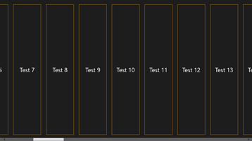
In the code in this snippet the items are side by side horizontally and fill all the space available. It produces the following result:
 Thanks to the use of the ItemsContainerStyle I'm able to define a margin outside the elements. This should be a beautiful layout for a grouped view in a SemanticZoom.
Another interesting control is the VariableSizedWrapGrid. It simple creates a grid and the items can be attached using columnspan and rowspan attached properties. So an item can flow across 2 columns and 3 rows. Here is the reason why this grid is called "variable sized".
Do your experiments.
Being in control of these controls requires lot of exercise. The first time for sure one have to deal with spacing, grouping, alignment, layouts and so on and it may appear an hard task. After some training the result you can achieve are for sure amazing. In this article I've only scratched the surface of them. In the next part I will go deep analizing incremental loading and the wonderful SemanticZoom.