(X) Hide this
    • Login
    • Join
      • Generate New Image
        By clicking 'Register' you accept the terms of use .

Basic customizations of the DataGrid

(1 votes)
Martin Mihaylov
>
Martin Mihaylov
Joined Oct 29, 2007
Articles:   50
Comments:   70
More Articles
9 comments   /   posted on Sep 15, 2008
Categories:   Controls

This article is compatible with the latest version of Silverlight.

Here is my next article about the DataGrid control in Silverlight. The previous one was a brief introduction of the control and explained things like populating it with data and defining its columns. If you've missed it you can find it here. In this one we're going to take a look at some properties that can be used to change the look of our grid and modify a bit the basic functionality. There will be nothing too complicated but things like alternating rows, headers, gridlines, column resizing can prove to be very useful. At the end of the article you can find a live demo and a source code.

Alternating rows

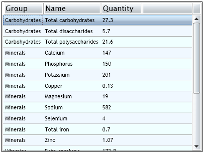
To change the colors of the alternating rows we use the AlternatingRowBackground and the RowBackground properties:

<my:DataGrid x:Name="Foods" AutoGenerateColumns="False" AlternatingRowBackground="AliceBlue"
 RowBackground="Azure">...


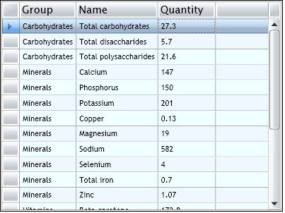
If you don't want the rows to alternate just set the two properties to the same color.

Headers visibility

In the DataGrid we have Column and Row headers. Thanks to the HeadersVisibility property we can easily hide all of them or show them depending on their type. By default all headers are shown.


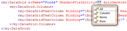
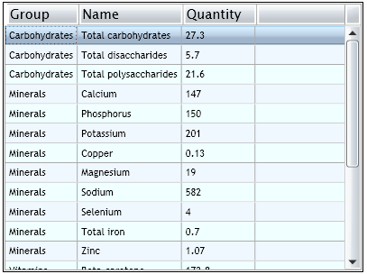
If we set only the column headers to be shown, here is the result:

<my:DataGrid x:Name="Foods" 
             HeadersVisibility="Column" 
             AutoGenerateColumns="False" 
             AlternatingRowBackground="AliceBlue" 
             RowBackground="Azure">...

Gridlines visibility

As you probably noticed that by default the cells of the grid have borders - that's gridlines. With the GridlinesVisibility property we can manipulate their visibility. By default all are shown, but we can also set only the horizontal or the vertical gridlines or none of them to be shown.


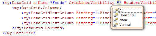
Let's set this property to Horizontal and here is how it looks:

<my:DataGrid x:Name="Foods" 
             GridLinesVisibility="Horizontal" 
             HeadersVisibility="Column" 
             AutoGenerateColumns="False" 
             AlternatingRowBackground="AliceBlue" 
             RowBackground="Azure">...

Selection mode 

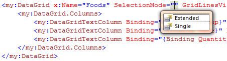
We've mentioned in the previous article that the DataGrid has embedded selection functionality. When clicking on a row we can select it. By default we can select multiple rows, but thanks to the SelectionMode property we can limit it to just one.


Reordering the columns 

By default the user can reorder the columns of the grid by dragging and dropping the headers. We can control that behavior of the DataGrid with the CanUserReorderColumns property.

<my:DataGrid x:Name="Foods" 
             CanUserReorderColumns="False" 
             HeadersVisibility="Column" 
             GridLinesVisibility="Horizontal" 
             AutoGenerateColumns="False" 
             AlternatingRowBackground="AliceBlue" 
             RowBackground="Azure">...

Resizing the columns

By default the columns of the grid can be resized. But if you don't want the user to change their size you can set the CanUserResizeColumns to false:

<my:DataGrid x:Name="Foods" 
             CanUserResizeColumns="False" 
             HeadersVisibility="Column" 
             GridLinesVisibility="Horizontal" 
             AutoGenerateColumns="False" 
             AlternatingRowBackground="AliceBlue" 
             RowBackground="Azure">...

Demo

Here is a little demo so you can try and see how the properties work in real time. The source code can be downloaded here.

Summary

These were the most important properties that we can use to change the look of our grid. Nothing complicated again, but we're just at the start, so stay tuned for the next article about the DataGrid.


Subscribe

Comments

  • -_-

    RE: Basic customizations of the DataGrid


    posted by JacobE on Nov 13, 2008 05:03

    Is there a way to set the style/background of the currently selected row?

  • Enrai

    RE: Basic customizations of the DataGrid


    posted by Enrai on Nov 14, 2008 01:28

    Yes, there is a way to change the background  of the currently selected row. To do that you have to set the RowStyle property of the DataGrid and in this style you have to make some changes to the template of the DataGridRow. The TargetType of the style should be "prefix:DataGridRow". I think this is a very interesting case, so expect an article later today that will explain the things more clearly.

    P.S. I'll add a link as comment when the article is ready!

    Update: I couldn't manage to finish the article for today, so it will be ready in the start of the next week, probably on Monday.

  • Enrai

    RE: Basic customizations of the DataGrid


    posted by Enrai on Nov 18, 2008 02:50

    The article about customizing the selection in the DataGrid can be found here - Changing the style of the selected row of the DataGrid control.

  • -_-

    RE: Basic customizations of the DataGrid


    posted by John on Dec 16, 2008 09:46

    Why no example of how to change the column header background color?

  • Enrai

    RE: Basic customizations of the DataGrid


    posted by Enrai on Dec 20, 2008 05:46

    To modify the column header you have to set the ColumnHeaderStyle property to an appropriate style. The default style is:

    <Style TargetType="prefix:DataGridColumnHeader">
        <Setter Property="Foreground" Value="#FF444444" />
        <Setter Property="HorizontalContentAlignment" Value="Center" />
        <Setter Property="VerticalContentAlignment" Value="Center" />
        <Setter Property="FontSize" Value="10.5" />
        <Setter Property="FontWeight" Value="Bold" />
        <Setter Property="IsTabStop" Value="False" />
        <Setter Property="SeparatorBrush" Value="#FFC9CACA" />
        <Setter Property="Padding" Value="4,4,5,4" />
        <Setter Property="Template">
            <Setter.Value>
                <ControlTemplate TargetType="prefix:DataGridColumnHeader">
                    <Grid Name="Root">
                        <vsm:VisualStateManager.VisualStateGroups>
                            <vsm:VisualStateGroup x:Name="CommonStates">
                                <vsm:VisualStateGroup.Transitions>
                                    <vsm:VisualTransition GeneratedDuration="00:00:0.1" />
                                </vsm:VisualStateGroup.Transitions>
                                <vsm:VisualState x:Name="Normal" />
                                <vsm:VisualState x:Name="MouseOver">
                                    <Storyboard>
                                        <ColorAnimationUsingKeyFrames BeginTime="0" Duration="0" Storyboard.TargetName="BackgroundRectangle" Storyboard.TargetProperty="(Shape.Fill).(SolidColorBrush.Color)">
                                            <SplineColorKeyFrame KeyTime="0" Value="#FF448DCA"/>
                                        </ColorAnimationUsingKeyFrames>
                                        <ColorAnimationUsingKeyFrames BeginTime="0" Duration="0" Storyboard.TargetName="BackgroundGradient" Storyboard.TargetProperty="(Shape.Fill).(GradientBrush.GradientStops)[3].(GradientStop.Color)">
                                            <SplineColorKeyFrame KeyTime="0" Value="#7FFFFFFF"/>
                                        </ColorAnimationUsingKeyFrames>
                                        <ColorAnimationUsingKeyFrames BeginTime="0" Duration="0" Storyboard.TargetName="BackgroundGradient" Storyboard.TargetProperty="(Shape.Fill).(GradientBrush.GradientStops)[2].(GradientStop.Color)">
                                            <SplineColorKeyFrame KeyTime="0" Value="#CCFFFFFF"/>
                                        </ColorAnimationUsingKeyFrames>
                                        <ColorAnimationUsingKeyFrames BeginTime="0" Duration="0" Storyboard.TargetName="BackgroundGradient" Storyboard.TargetProperty="(Shape.Fill).(GradientBrush.GradientStops)[1].(GradientStop.Color)">
                                            <SplineColorKeyFrame KeyTime="0" Value="#F2FFFFFF"/>
                                        </ColorAnimationUsingKeyFrames>
                                    </Storyboard>
                                </vsm:VisualState>
                            </vsm:VisualStateGroup>
                            <vsm:VisualStateGroup x:Name="SortStates">
                                <vsm:VisualStateGroup.Transitions>
                                    <vsm:VisualTransition GeneratedDuration="00:00:0.1" />
                                </vsm:VisualStateGroup.Transitions>
                                <vsm:VisualState x:Name="Unsorted" />
                                <vsm:VisualState x:Name="SortAscending">
                                    <Storyboard>
                                        <DoubleAnimation Storyboard.TargetName="SortIcon" Storyboard.TargetProperty="Opacity" Duration="0" To="1.0"/>
                                    </Storyboard>
                                </vsm:VisualState>
                                <vsm:VisualState x:Name="SortDescending">
                                    <Storyboard>
                                        <DoubleAnimation Storyboard.TargetName="SortIcon" Storyboard.TargetProperty="Opacity" Duration="0" To="1.0"/>
                                        <DoubleAnimation Storyboard.TargetName="SortIconTransform" Storyboard.TargetProperty="ScaleY" Duration="0" To="-.9"/>
                                    </Storyboard>
                                </vsm:VisualState>
                            </vsm:VisualStateGroup>
                        </vsm:VisualStateManager.VisualStateGroups>
     
                        <Grid.RowDefinitions>
                            <RowDefinition Height="*" />
                            <RowDefinition Height="*" />
                            <RowDefinition Height="Auto" />
                        </Grid.RowDefinitions>
                        <Grid.ColumnDefinitions>
                            <ColumnDefinition Width="Auto" />
                            <ColumnDefinition Width="*" />
                            <ColumnDefinition Width="Auto" />
                        </Grid.ColumnDefinitions>
     
                        <Rectangle x:Name="BackgroundRectangle" Stretch="Fill" Fill="#FF1F3B53" Grid.ColumnSpan="2" Grid.RowSpan="2"/>
                        
                        <Rectangle x:Name="BackgroundGradient" Stretch="Fill" Grid.ColumnSpan="2" Grid.RowSpan="2">
                            <Rectangle.Fill>
                                <LinearGradientBrush StartPoint=".7,0" EndPoint=".7,1">
                                    <GradientStop Color="#FFFFFFFF" Offset="0.015" />
                                    <GradientStop Color="#F9FFFFFF" Offset="0.375" />
                                    <GradientStop Color="#E5FFFFFF" Offset="0.6" />
                                    <GradientStop Color="#C6FFFFFF" Offset="1" />
                                </LinearGradientBrush>
                            </Rectangle.Fill>
                        </Rectangle>
     
                        <ContentPresenter
                            Grid.RowSpan="2"
                            Content="{TemplateBinding Content}"
                            Cursor="{TemplateBinding Cursor}"
                            HorizontalAlignment="{TemplateBinding HorizontalContentAlignment}"
                            VerticalAlignment="{TemplateBinding VerticalContentAlignment}"
                            Margin="{TemplateBinding Padding}"/>
                        
                        <Rectangle Name="VerticalSeparator" Grid.RowSpan="2" Grid.Column="2" Width="1" VerticalAlignment="Stretch" Fill="{TemplateBinding SeparatorBrush}" Visibility="{TemplateBinding SeparatorVisibility}" />
                        
                        <Path Grid.RowSpan="2" Name="SortIcon" RenderTransformOrigin=".5,.5" HorizontalAlignment="Left" VerticalAlignment="Center" Opacity="0" Grid.Column="1" Stretch="Uniform" Width="8" Data="F1 M -5.215,6.099L 5.215,6.099L 0,0L -5.215,6.099 Z ">
                            <Path.Fill>
                                <SolidColorBrush Color="#FF444444" />
                            </Path.Fill>
                            <Path.RenderTransform>
                                <TransformGroup>
                                    <ScaleTransform x:Name="SortIconTransform" ScaleX=".9" ScaleY=".9" />
                                </TransformGroup>
                            </Path.RenderTransform>
                        </Path>
                        
                    </Grid>
                </ControlTemplate>
            </Setter.Value>
        </Setter>
    </Style>

    To change the color of the headers just change the colors of the rectangles with names "Background" and "BackgroundGradients" in the ControlTemplate . Also don't miss the ViewStates as they also manipulate these two elements.

    The same can be done with the row headers, except you have to get the default style for the DataGridRowHeader from the generic.xaml using the .Net Reflector.

  • -_-

    RE: Basic customizations of the DataGrid


    posted by Aong on Jan 17, 2009 00:18

    move " SelectionMode="" " code in Page.xaml for develop with Silverlight 2.


    Thank you and Best Regards,


  • -_-

    RE: Basic customizations of the DataGrid


    posted by Aong on Jan 17, 2009 00:24

    Remove " SelectionMode="" " code in Page.xaml for develop with Silverlight 2.

     :)

    Thank you and Best Regards

  • nathanp812

    RE: Basic customizations of the DataGrid


    posted by nathanp812 on Jan 18, 2009 20:42

    I am trying to develop a skin for a Silverlight 2 datagrid using expression blend, I can change everything in the template (located in app.xaml) except for the column headings.

    I tried using the above example but it doesnt appear to work for me, probably something totally basic that I am overlooking but I am a Silverlight 2 noob when it comes to the skinning side of things...

    Any assistance would be much appreciated. :)

  • -_-

    RE: Basic customizations of the DataGrid


    posted by derfez on Jun 24, 2010 14:50

    Is there a way to display the columns and resulting rows the following way ?  Meaning to display the gridview in "rows" rather than in columns by selecting for example only a single row of the complete gridview.

    My wished display (row 0 selected for example)

    Group        Carbohydrates

    Name        Total carbohydrates

    Quantity    27.3

    Thanks in advance


Add Comment

Login to comment:
  *      *