Hi and welcome to a new series of articles here on SIlverlightShow where we will give an overview of the new concepts and changes in the first big update of Windows 8, known to mankind as Windows 8.1. Over the next couple of articles, we will take a look at the things that have changed. You’ll soon understand that while the changes you’ll have to do in your code are often subtle, they will lead to a much better user experience which is in-line with the new version of the OS.
In this first part, we are going to introduce the new version and see what has changed. After that, we’ll explore how we can use these new functions from a developer’s perspective!
Welcome to 8.1
As mentioned, we are first going to take a look at all the new stuff in this release of Windows. We’re going to do that from the end-user’s perspective. Of course, we’ll explore the dev features, but that’s for later.
I want to start with this important statement, which I’m going to refer back to from the rest of the articles several times: Windows 8.1 is JUST an update, nothing more. The update is “almost non-breaking”. With “almost non-breaking”, I mean the following. Code-wise, all your Windows 8 code will still run, there’s no problem there. Some Windows 8 APIs are deprecated, but they aren’t removed from the API. However, in terms of user experience, things have changed. If you don’t update your application code to 8.1, your users will get a less-than-optimal experience from your app, which is something I assume you don’t want. So, code-wise, no breaking changes, but in terms of user experience, there are some things you need to take into consideration to make sure that your users are getting the best experience you can create.
The new Start screen
The very first thing you’ll see after you have upgraded to (or for that matter, just installed) Windows 8.1, is the new Start screen. I’ve posted a screenshot of my current Start screen, which should give you an idea of what has changed in that area.
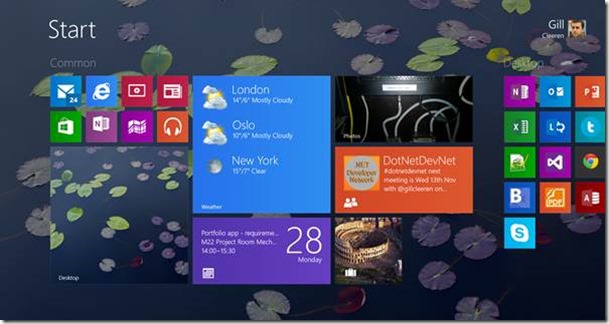
Probably the most string thing here is the background. Indeed, that is not one of the included Start screen backgrounds we had with Windows 8. Instead, this is the background of my desktop environment. One of the main complaints that people had with Windows 8 was that it somehow felt as if we had 2 operating systems running next to each other. Just by adding this – let’s face it – small change, the “two operating systems” already look a lot more integrated!
New tile sizes
Another thing we can get from the screenshot above is that we can now have several types of tiles which weren’t previously available in Windows 8. With Windows Phone 8, Microsoft allowed phone users to create small and large tiles, in addition to the previously available square and wide tiles. In Windows 8.1, Microsoft did the same for Windows 8: we now have 4 tile sizes available. This allows the user to customize his Start screen more easily to his needs.
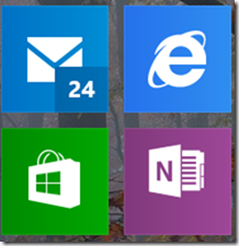
The small tile size allows us to create an area in the Start screen where we pin tiles of which we don’t expect (or basically care for) live tile updates. Indeed, the small tile size doesn’t support tile updates, they only support badge updates. In the above screenshot, you can see my mail tile having a badge update: the number 24 indicates I have to get back reading my email since I have 24 unread mails! In general, this small tile size is ideal for apps such as Internet Explorer or regular desktop apps which don’t utilize the tile functionality.
The other new tile size is the large tile, as shown below.
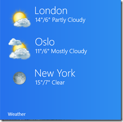
This new size allows apps to give more information to the user, such as in the case of the weather apps, give an overview of the weather in more cities.
The new tile sizes have an effect on existing apps: the tile template names have changed, causing some minor issues if your app already uses tiles now. We’ll take a look at what we need to do to fix all this in a later article.
The Return of the Start button
The above header sounds a bit like a bad Hollywood movie but again it’s in important aspect when it comes to giving the users what they want. A lot of fuzz was created with Windows 8 regarding the fact that the user experience was too different from what we had previously. Probably the silliest of all the remarks being made was the fact that the Start button (and the Start menu) had gone. Although they hadn’t. They were simply replaced by a) the lower left pixels on your screen and b) the Start screen.
Many internet-fights have been fought over this matter and Microsoft decided in Windows 8.1 that the change was perhaps a bit too dramatic. They have created a compromise: the Start button is back and it takes us to the modern (and in my opinion, much better) Start screen.
From a developer’s perspective, there’s really no value here. But for many users, this might be a big deal, resulting in a higher adoption rate for Windows 8 and thus resulting in more app installs for you! So good news anyway!
The new app sizes
One of the cool features of Windows 8 was the ability to run an application in Snap view. When snapped, the application was always 320px wide (x scale factor if any). This view was certainly interesting to allow the user to have more than one app open on-screen. Typically, apps that offer a monitoring activity such as a Twitter app included this view (it’s a Store requirement to have this view but not all apps did something useful with it). Also media apps often had this view to allow the user to continue viewing a video while doing some work.
In this area, an application could thus be in Full screen mode, in Snapped mode or in Filled mode (the remainder of the screen when having an another app snapped on screen).
Windows 8.1 gives us more flexibility in this area. It’s now possible to have 2 (or more, depending on your screen size and resolution) apps on screen with different resolutions. The minimum supported size is now 500px, instead of 320px. This means that your app should give the user a great experience on any resolution from 500px upwards. Take a look at the screenshots below.
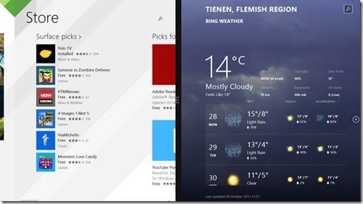
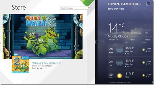
On my Surface here, I can have 2 apps running side-by-side, resizing them like I want. If I attach more external displays, I can run more (up to 10 apps) at the same time.
This is another aspect where I reckon that the change is almost non-breaking. If you run a Windows 8 app on Windows 8.1, the snap view will still work, but in a compatibility more (using black bars for all sizes between 320 and 500px). It’s therefore recommended that you upgrade your app so it supports and handles these new size options correctly. We’ll show how to do that later!
Search has changed
In Windows 8, Microsoft recommended that searching was done using the Search charm. This way, we can offer the user a unified searching model. While the idea was great, a lot of people struggled with the Search in Windows 8. They couldn’t find it, which was probably because it was hidden behind a charm and when no one tells the user to look there for the Search option, he simply dismisses the app.
In Windows 8.1, Microsoft has cut back on the guidelines around Search, now allowing us to add a regular search box in our apps. The options we have with this new control are still pretty much the same but they are now wrapped in a control instead of being addressable through the Search Pane. This effectively means that we can still send suggestions and recommendations to the search control.
Take for example the Music app, which now features a Search box control.
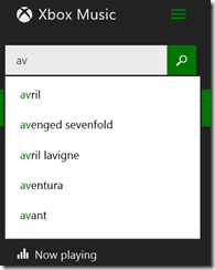
We can see that the control is indeed part of the regular page UI and still offers the same experience as before.
In one of the coming articles, we’ll see that how we can work with the new Search. We’ll explore what happens when you still want to support the Search contract as well or what happens when you run a Windows 8 app that’s built around Search on Windows 8.1.
More chrome
This last topic is a bit more design-linked than the previous ones. You probably know that for Windows 8, Microsoft has developed a design language (first known as Metro, later on renamed to Modern UI). This language was quite strict and one of the main aspects of the language was the limitation of use of chrome, the so-called content-before-chrome principle. This basically said that the user should see content, that’s what the user is using the application for. Don’t bother showing the user all kinds of buttons and toolbars, they create nothing more than a distraction and take away screen estate that should be used to display content.
For Windows 8.1, Microsoft has created an evolution of these guidelines. Content is still very important, but some more chrome is making its way into the applications. We can even see that even in the built-in apps that come with a default Windows 8.1 installation.
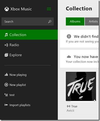
Take again the music app and notice that we now have a sort of tab navigation on the left. That wasn’t a recommendation to use before in Windows 8.
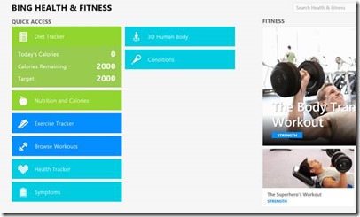
Another app where this is clearly visible, is the Health and Fitness app. Take a look at the screenshot below. The part on the left is nothing short of a menu of buttons/options that allow us to navigate to different parts of the application.
Even the Search control we saw in the previous topic is an evolution. Previously, Microsoft recommended against using a Search box within the app; now they recommend doing so.
Again, for existing applications, this is not really an issue. However, once more apps start changing their UI slightly, it’s recommended doing so for your apps as well. Otherwise, the user may find your app difficult to navigate, resulting in less positive reviews.
Summary
In this first part of this new article series, we’ve looked at the user’s perspective of what changed in Windows 8.1. Starting with the next article, we’re going to see how we can use these from our own apps. Stay tuned!
About the author
Gill Cleeren is Microsoft Regional Director, Silverlight MVP, Pluralsight trainer and Telerik MVP. He lives in Belgium where he works as .NET architect at Ordina. Gill has given many sessions, webcasts and trainings on new as well as existing technologies, such as Silverlight, ASP.NET and WPF at conferences including TechEd, TechDays, DevDays, NDC Oslo, SQL Server Saturday Switzerland, Silverlight Roadshow in Sweden, Telerik RoadShow UK… Gill has written 2 books: “Silverlight 4 Data and Services Cookbook” and Silverlight 5 Data and Services Cookbook and is author of many articles for magazines and websites. You can find his blog at www.snowball.be. Twitter: @gillcleeren