This is Day # 3 in the Windows 8 development article series on common tips & tricks towards real-world Metro apps. We’ve gotten past our initial idea & layout hurdles and your first Windows 8 Metro app is slowly coming together. Time to give your Metro app some typical Windows 8 character & its own brand. Over the next several weeks, you’ll see 8 articles talk about some must-do things for Windows 8 Metro app developers. Simple & to the point, with some code examples on XAML/C# stack. Here’s the indexed list for the series:
Day 1: Know the ecosystem; Start
Day 2: Layout, Navigation & Visual States
Day 3: Semantic Zoom
Day 4: Controls & Styling
Day 5: Search, Share & Settings Contracts
Day 6: Data Persistence & Application Life-Cycle Management
Day 7: Use of OData or Web Services
Day 8: Live Services integration
Day 3: Semantic Zoom
The Collections View:
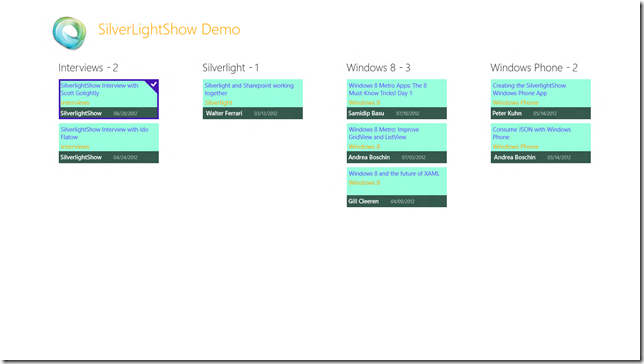
Let’s take a good look at the Windows 8 Start screen; then at the Windows 8 Store Metro app. Also, try out some of the many RSS/news/aggregator type apps available now. Do you see a common trend? They all present a ton of information without making the end-user experience seem too busy. Just because we have a bigger form factor, does not mean that we will fill up all the available space with content. In Metro design language, white space is our friend – it provides for breathing room for a smooth UX. So, many of the Windows 8 Metro UIs which present a lot of content revert to using GridView type layouts: long list of well-spaced rectangles with inviting content & an overlay text at the bottom with some description. We usually get to pan around horizontally to discover more content. Let’s take our little demo SilverlightShow Article app as an example. This is the kind of UI you would see a lot when the data being presented is a collection of items:

This type of UI could also be generalized when presenting any type of repeated or similar controls in a Metro app. Say, you have a list of User Controls in your page, which is making for a busy UI. Or a BookShelf of items. Or a virtual Shopping Cart full of items, ready for review or checkout.
The Discoverability Problem:
As nice as it is to pan around for discoverability when content is presented as above, there is one little glitch. What if the collection of items being displayed is huge? Envision the above screen when bound to hundreds or more items in the collection. Even if we took the last 100 articles published by SilverlightShow, it would possibly take 20-25 horizontal swipes to get to the 100th article. One could argue that the collection of items could be grouped based on some parameter, as in the article topic above. But even with that, we are literally presenting a large number of items in each group, resulting in a lot of panning around to discover content. Clearly not optimal.
The Solution:
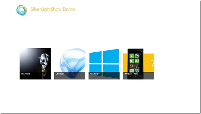
Windows 8 presents a new UX paradigm to get around the discoverability problem when presented with a large collection of items. Logically thinking would lead us to group the items into buckets, based on some criteria, so that it is a little easier to find a specific item. Now, if the data is being grouped in logical units, why not the UI? Check out the same screen of SilverlightShow articles above, this time grouped into article categories and only the high-level groups showing:

This is what Windows 8 calls Semantic Zooming. A new UX paradigm, particularly suited for touch-based PCs. How do we get from the busy layout to the zoomed-out view of grouped categories? Simple – Pinch in with two fingers on screen; Pinch out to go back to normal layout. In a PC with traditional keyboard & mouse setup, hold down CTRL key & scroll mouse wheel up/down or use CTRL plus +/- to achieve the same result. Semantic zoom is quite different from optical zoom; unlike changing magnification, it shows a different slice of grouped data.
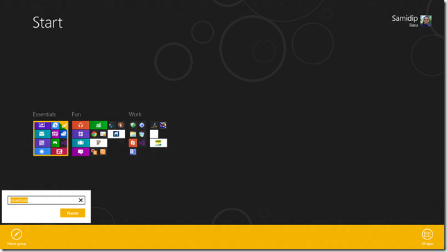
So, it is pretty clear that Semantic Zoom uses data grouping into buckets & simply flips the view to alter the level of detail shown. This is visually delightful UX, if done right and aids big time towards discoverability of content. Zoom out to a high-level view, pick what interests you & dive back in exactly where you desire. In case you did not know & found your Windows 8 Start screen starting to get cluttered, just use Semantic Zooming to organize your Tiles. Each group can actually be named for easy of organization & personalization, as evident below:

Implementing Semantic Zoom:
So, enough descriptive talk; let’s see how we can enable Semantic Zooming in our applications. Let’s take the example of the SilverlightShow Article app and walk you through the few steps it takes to get this working.
First, the data. Your custom objects, of which you would have a collection of. Let’s define a simple class for articles:
1: public partial class SLShowArticle
2: {
3: public int ArticleID { get; set; }
4: public string ArticleName { get; set; }
5: public string ArticleTopic { get; set; }
6: public string AuthorName { get; set; }
7:
8: public DateTime PublishDate { get; set; }
9: public string DisplayablePublishDate
10: {
11: get
12: {
13: return PublishDate.ToString("MM/dd/yyyy");
14: }
15: }
16: }
Next is grouping. Remember we need to categorize our data in buckets for easy finding? So, let’s define our class to hold a collection of grouped articles:
1: public class SLShowGroupedArticles : BindableBase
2: {
3: #region "Members"
4:
5: private string _SLShowArticleGroupName;
6: private int _SLShowArticleGroupCount;
7:
8: private ObservableCollection<SLShowArticle> _articleCollection;
9:
10: #endregion
11:
12: #region "Properties"
13:
14: public string SLShowArticleGroupName
15: {
16: get { return _SLShowArticleGroupName; }
17: set { SetProperty(ref _SLShowArticleGroupName, value); }
18: }
19:
20: public int SLShowArticleGroupCount
21: {
22: get { return _SLShowArticleGroupCount; }
23: set { SetProperty(ref _SLShowArticleGroupCount, value); }
24: }
25:
26: public ObservableCollection<SLShowArticle> ArticleCollection
27: {
28: get { return _articleCollection; }
29: set { SetProperty(ref _articleCollection, value); }
30: }
31:
32: public string ImageURI
33: {
34: get
35: {
36: string imageUri = string.Empty;
37: switch (SLShowArticleGroupName)
38: {
39: case "Windows 8":
40: imageUri = "/Assets/Windows8.png";
41: break;
42: case "Interviews":
43: imageUri = "/Assets/Interview.png";
44: break;
45: case "Windows Phone":
46: imageUri = "/Assets/WindowsPhone.png";
47: break;
48: case "Silverlight":
49: imageUri = "/Assets/Silverlight.png";
50: break;
51: }
52:
53: return imageUri;
54: }
55: }
56:
57: #endregion
58:
59: #region "Constructor"
60:
61: public SLShowGroupedArticles()
62: {
63: ArticleCollection = new ObservableCollection<SLShowArticle>();
64: }
65:
66: #endregion
67: }
Did you notice the use of BindableBase? This is nothing but an ObservableCollection wrapper that makes it even easier to mark properties for INotifyPropertyChanged event bubbling. This is just to take advantage of data-binding so that we can change the underlying collection and the UI updates itself. So, every article group is given a group name, a count for number of articles in the group, an ArticleCollection to actually hold the child articles and an ImageURI tied to the type of group. We’ll do all our data binding to the UI based on this class.
So, now that we have the containers laid out, let’s get the data. This is where you get to write your custom logic to build a collection of items. Get it from the web or read from some database – your needs dictate how the collection is hydrated. In our case, we’ll have a collection of latest articles from SilverlightShow. Next, let’s define a collection of grouped article sets to hold our categorized buckets of items and see how we actually group the articles:
1: // Defined for global access in app.
2: private ObservableCollection<SLShowArticle> _articleCollection = new ObservableCollection<SLShowArticle>();
3: private ObservableCollection<SLShowGroupedArticles> _groupedArticleCollection;
4:
5: public ObservableCollection<SLShowArticle> ArticleCollection
6: {
7: get { return _articleCollection; }
8: set { _articleCollection = value; }
9: }
10:
11: public ObservableCollection<SLShowGroupedArticles> GroupedArticleCollection
12: {
13: get
14: {
15: if (_groupedArticleCollection == null)
16: _groupedArticleCollection = new ObservableCollection<SLShowGroupedArticles>();
17:
18: // Put Articles into Grouped buckets based on Topic.
19: var query = from individualArticle in ArticleCollection
20: orderby individualArticle.ArticleTopic
21: group individualArticle by individualArticle.ArticleTopic into g
22: select new SLShowGroupedArticles
23: {
24: SLShowArticleGroupName = g.Key,
25: SLShowArticleGroupCount = g.Count(),
26: ArticleCollection = new ObservableCollection<SLShowArticle>(g.ToList())
27: };
28:
29: _groupedArticleCollection = new ObservableCollection<SLShowGroupedArticles>(query.ToList());
30:
31: return _groupedArticleCollection;
32: }
33: set
34: {
35: _groupedArticleCollection = value;
36: }
37: }
Simple LINQ, right? Now that we have grouped data, let’s hand it off to our UI as is. But how about the smooth interaction of zooming in & out? Thankfully, there is a Metro control that has all that built in. Enter the Semantic Zoom control! Works on GridView or ListView that is bound to grouped data. We need to do two little things – define the zoomed in & zoomed out view of the data; the control would take care of the rest. A smooth cross-fade and scale animation is used for the transition from one semantic zoom level to another. This is the default Windows touch behavior and cannot be customized. Essentially, this is what we need to fill in:
1: <SemanticZoom>
2:
3: <SemanticZoom.ZoomedOutView>
4: <!-- Put the GridView/Listview to make the zoomed-out view here. -->
5: </SemanticZoom.ZoomedOutView>
6:
7: <SemanticZoom.ZoomedInView>
8: <!-- Put the GridView/Listview to make the zoomed-in view here. -->
9: </SemanticZoom.ZoomedInView>
10:
11: </SemanticZoom>
Now, before we step into that, let's look at one other control, which doesn’t have an UI but is super helpful. That is the CollectionViewSource. A container to hold our grouped items collection. Here’s some code:
1: <Page.Resources>
2:
3: <!-- Collection of grouped Articles displayed by this page -->
4: <CollectionViewSource
5: x:Name="groupedItemsViewSource"
6: Source="{Binding GroupedArticles}"
7: IsSourceGrouped="true"
8: ItemsPath="ArticleCollection"/>
9:
10: </Page.Resources>
Notice the ItemsPath .. it points to the same named collection of articles as in our SLShowGroupedArticles class. So, if this control is bound to the collection of grouped articles, it will keep track of each article group, as well as the articles inside each group. If this could be reused across pages, you could consider defining it in App.xaml for global accessibility. So, how do we feed data to this control?
1: protected override void OnNavigatedTo(NavigationEventArgs e)
2: {
3: base.OnNavigatedTo(e);
4:
5: // Set the Data-Binding context to the Grouped Article collection.
6: this.DefaultViewModel["GroupedArticles"] = ((App)Application.Current).GroupedArticleCollection;
7:
8: // Support zoomed-out semantics.
9: var groupedArticles = groupedItemsViewSource.View.CollectionGroups;
10: (Zoomer.ZoomedOutView as ListView).ItemsSource = groupedArticles;
11: }
As you can see, in the code behind & at run-time, we are handing off our data to the CollectionViewSource XAML control on the page and also to the zoomed-out view of the Semantic Zoom(Zoomer) . Also, notice the DefaultViewModel used in the hand-off? This little bit of magic comes as a benefit from the common LayoutAwarePage – take a peek in it to realize how every page is being wired up to have a default view model that acts as the DataContext for it’s UI. Next check the top of your XAML page, for a tiny bit of wire-up:
1: <common:LayoutAwarePage
2: x:Name="pageRoot"
3: x:Class="SilverLightShowDemo.ArticleList"
4: DataContext="{Binding DefaultViewModel, RelativeSource={RelativeSource Self}}"
5: .....
6: ..... />
Now, we are one step closer to using the grouped data in our Semantic Zoom control. First, let’s define the zoomed in view. Here’s some XAML:
1: <SemanticZoom.ZoomedInView>
2: <GridView
3: x:Name="itemGridView"
4: AutomationProperties.AutomationId="ItemGridView"
5: AutomationProperties.Name="Grouped Items"
6: Margin="20,0,40,46"
7: ItemsSource="{Binding Source={StaticResource groupedItemsViewSource}}"
8: ItemTemplate="{StaticResource SLShow250x100ArticleTemplate}">
9:
10: <GridView.ItemsPanel>
11: <ItemsPanelTemplate>
12: <VirtualizingStackPanel Orientation="Horizontal"/>
13: </ItemsPanelTemplate>
14: </GridView.ItemsPanel>
15: <GridView.GroupStyle>
16: <GroupStyle>
17: <GroupStyle.HeaderTemplate>
18: <DataTemplate>
19: <Grid Margin="1,0,0,6">
20: <StackPanel Orientation="Horizontal">
21: <Button AutomationProperties.Name="Group Title" Content="{Binding SLShowArticleGroupName}" Style="{StaticResource SLShowTextButtonStyle}"/>
22: <TextBlock Text="-" Style="{StaticResource SubheaderTextStyle}" VerticalAlignment="Top" Margin="5,0,5,0"/>
23: <TextBlock Text="{Binding SLShowArticleGroupCount}" Style="{StaticResource SubheaderTextStyle}" VerticalAlignment="Top"/>
24: </StackPanel>
25: </Grid>
26: </DataTemplate>
27: </GroupStyle.HeaderTemplate>
28: <GroupStyle.Panel>
29: <ItemsPanelTemplate>
30: <VariableSizedWrapGrid Orientation="Vertical" Margin="0,0,100,0"/>
31: </ItemsPanelTemplate>
32: </GroupStyle.Panel>
33: </GroupStyle>
34: </GridView.GroupStyle>
35: </GridView>
36: </SemanticZoom.ZoomedInView>
Let’s highlight a few things. First, the GridView’s ItemSource is actually bound to our CollectionViewSource defined before. Group headers can be custom constructed in the GridView.GroupStyle. How about the actual binding & rendering of individual items? This is done in the ItemTemplate as usual and is defined in the StandardStyles.xaml file for consistency & reusability. Here’s what I use; notice how the template starts out as a copy of the default template, but everything is customizable:
1: <!-- Zoomed-in Article List View -->
2: <DataTemplate x:Key="SLShow250x100ArticleTemplate">
3: <Grid HorizontalAlignment="Left" Width="250" Height="100">
4: <Border Background="#99FFDD" Opacity="1">
5: <StackPanel Orientation="Vertical">
6: <TextBlock Text="{Binding ArticleName}" Foreground="#6655FF" Margin="5,5,15,2" VerticalAlignment="Top" TextWrapping="Wrap"/>
7: <TextBlock Text="{Binding ArticleTopic}" Foreground="Orange" Margin="5,0,15,10" VerticalAlignment="Top" FontSize="16"/>
8: </StackPanel>
9: </Border>
10: <StackPanel VerticalAlignment="Bottom" Background="{StaticResource ListViewItemOverlayBackgroundThemeBrush}" Height="30" Orientation="Horizontal">
11: <TextBlock Text="{Binding AuthorName}" Foreground="{StaticResource ListViewItemOverlayForegroundThemeBrush}" Style="{StaticResource TitleTextStyle}" Margin="5,0,15,0"/>
12: <TextBlock Text="{Binding DisplayablePublishDate}" Foreground="{StaticResource ListViewItemOverlaySecondaryForegroundThemeBrush}" Style="{StaticResource CaptionTextStyle}" TextWrapping="NoWrap" Margin="15,0,15,10"/>
13: </StackPanel>
14: </Grid>
15: </DataTemplate>
And now, let’s define the zoomed-out view to show the group categories with overlay text:
1: <SemanticZoom.ZoomedOutView>
2: <ListView VerticalAlignment="Center" ItemTemplate="{StaticResource SLShow250x250ArticleTemplate}">
3: <ListView.ItemsPanel>
4: <ItemsPanelTemplate>
5: <StackPanel Orientation="Horizontal" VerticalAlignment="Center" Margin="30,0,0,0"/>
6: </ItemsPanelTemplate>
7: </ListView.ItemsPanel>
8: </ListView>
9: </SemanticZoom.ZoomedOutView>
The ItemTemplate is again abstracted out to StandardStyles.xaml for reusability:
1: <!-- Zoomed-out Article List View -->
2: <DataTemplate x:Key="SLShow250x250ArticleTemplate">
3: <Grid HorizontalAlignment="Left" Width="250" Height="250">
4: <Border Background="{StaticResource ListViewItemPlaceholderBackgroundThemeBrush}">
5: <Image Source="{Binding Group.ImageURI}" Stretch="UniformToFill" />
6: </Border>
7: <StackPanel VerticalAlignment="Bottom" Background="{StaticResource ListViewItemOverlayBackgroundThemeBrush}">
8: <TextBlock Text="{Binding Group.SLShowArticleGroupName}" Foreground="{StaticResource ListViewItemOverlayForegroundThemeBrush}" Style="{StaticResource TitleTextStyle}" Height="60" Margin="15,0,15,0"/>
9: </StackPanel>
10: </Grid>
11: </DataTemplate>
Voila! Your data is now grouped into buckets & semantic zoom control is data bound and ready to delight the end user.
Conclusion
That’s it for today. The crux of this article was to talk about the need for Semantic Zooming in Windows 8 Metro apps and how to implement one in your application. We ended with ways you could customize the data templates to give your semantic zooming it’s own brand for a delightful UX.
See you next time as we dive into some more controls & custom styling in Windows 8 Metro apps. Thanks for reading!
About Author
 Samidip Basu (@samidip) is a technologist, gadget-lover and MSFT Mobility Solutions Lead for Sogeti USA working out of Columbus OH. With a strong developer background in Microsoft technology stack, he now spends much of his time in spreading the word to discover the full potential of Windows Phone/Windows 8 platforms & cloud-supported mobile solutions in general. He passionately helps run the Metro Developer User Group (http://themetrodeveloperusergroup.com/), labors in M3 Conf (http://m3conf.com/) organization and can be found with at-least a couple of hobbyist projects at any time. His spare times call for travel and culinary adventures with the wife. Find out more at http://samidipbasu.com.