So, you have heard the buzz about the brave new world of Windows 8 from MSFT’s BUILD Conference!
May be you even attended the wonderful SilverlightShow webinar about “
Getting Started with XAML Development in Windows 8” by Gill Cleeren. Ready to get your hands muddy? In this short 2-part article series, we talk about how to get started towards writing data-driven (specifically OData) Windows 8 Metro apps with XAML & C#. Here’s what we’ll cover:
As always, the demo solution, along with all code samples is available for download through the link below:
Introduction
At the BUILD Conference in August 2011, Microsoft launched Windows 8 .. the next iteration of Windows. It isn’t a forked world between desktop & mobile/tablet Operating Systems; rather “One OS to rule them all..” which runs on variety of form factors with touch-based interaction being a first-class citizen. We could obviously talk a lot about Windows 8; but for the sake of the length of this post, let me refer you to 2 valuable resources:
- BUILD Website @ http://www.buildwindows.com/. Great place to start would be the 5 Keynotes, followed by tons of recorded Session content.
- Windows 8 Developer Home @ http://msdn.microsoft.com/en-us/windows/home. On this site is a link to download the Windows 8 Developer Preview – the latest Windows 8 bits along with Development tools. Also, as you get into serious Windows 8 Metro development, the samples from Microsoft & contributions from our fabulous community should be very valuable.
In Part 1 of this article series, we talked about how to get started with building a Windows 8 Metro App with XAML/C# and how to consume OData in our application. While we might have a functional data-driven application, we developers should strive to make our native applications feel at home in the target operating system. Windows 8 is Windows re-imagined with Metro UI, and as such, introduces some new paradigms that most Metro applications should adhere by. In this post, we talk about how to ensure our application does not produce a jarring UX for the Windows 8 user; in essence, how to make our application a well-behaved citizen in Window 8.
Prerequisites
To follow along or to try the Demo or build something similar yourself, you need the following:
- Windows 8 Developer Preview running “on the metal” on some laptop/tablet.
- Alternatively, you could also run Windows 8 in a VM (VirtualBox being the best fit at this time) or off a VHD.
- Visual Studio 11 included as a part of Windows 8 Developer Preview. At this point, the templates to build Metro Apps aren’t available outside the Windows 8 bits.
- Curiosity
The Application Bar
Remember our UI to show/manipulate our list of Team members? Here it is again:
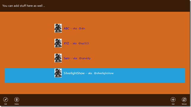
You’ll notice that the main UI has been kept clean with minimal controls. You can obviously add much much more to utilize the real estate; but the point is, commonly used actions should be tucked away in what’s called the Application Bar at the bottom & also at the top. If you have a touch-enabled tablet or PC, you could get to the Application Bars in any Metro App by swiping a little from the top or bottom of the screen. If using Windows 8 in a traditional mouse/keyboard computer, we need to right-click in the App to bring up the Application Bars.
Please note that these Application Bars are optional – you can add an Application Bar at the bottom, top, both or none, as per your App’s needs. Commonly used App functionality tucked away in Application Bars like this just makes your App sit well with the rest of the Windows 8 OS & utilizes the UX the end-users are already used to.
Quick Trivia – Why do you think the Application Bar buttons are at either end & not at the center ?? The answer lies is some detailed research Microsoft conducted to figure out what portion of the tablet form-factor’s screen is most accessible with thumbs when holding the tablet in both hands. See the point now?
So, let’s take a look at what we had to do to build our Application Bar. The round Metro-looking icons are nothing but regular buttons with click-handlers behind them. Here’s how we add the Application Bars to our MainPage.xaml UI:
1: <UserControl x:Class="TeamMetro.MainPage"
2: xmlns="http://schemas.microsoft.com/winfx/2006/xaml/presentation"
3: xmlns:x="http://schemas.microsoft.com/winfx/2006/xaml"
4: xmlns:d="http://schemas.microsoft.com/expression/blend/2008"
5: xmlns:mc="http://schemas.openxmlformats.org/markup-compatibility/2006"
6: mc:Ignorable="d"
7: d:DesignHeight="768" d:DesignWidth="1366">
8:
9: <!--Content-->
10: <Grid x:Name="LayoutRoot" Background="Chocolate">
11:
12: // All the other content stuff ..
13:
14: <!--Application Bar-->
15: <ApplicationBar x:Name="BottomAppBar" VerticalAlignment="Bottom" Height="100" Opacity=".8" IsPersistent="False" DismissMode="LightDismiss">
16: <Grid>
17: <Grid.ColumnDefinitions>
18: <ColumnDefinition Width="*"/>
19: <ColumnDefinition Width="Auto"/>
20: </Grid.ColumnDefinitions>
21: <StackPanel Grid.Column="0" Orientation="Horizontal" HorizontalAlignment="Left" VerticalAlignment="Center">
22: <Button Content="Edit" Style="{StaticResource EditButtonStyle}" Click="EditButton_Click"/>
23: <Button Content="Delete" Style="{StaticResource DeleteButtonStyle}" Click="DeleteButton_Click"/>
24: </StackPanel>
25: <StackPanel Grid.Column="1" Orientation="Horizontal" HorizontalAlignment="Right" VerticalAlignment="Center">
26: <Button Content="Add" Style="{StaticResource AddButtonStyle}" Click="AddButton_Click" />
27: <Button Content="Refresh" Style="{StaticResource RefreshButtonStyle}" />
28: </StackPanel>
29: </Grid>
30: </ApplicationBar>
31:
32: <ApplicationBar x:Name="TopAppBar" VerticalAlignment="Top" Height="100" Opacity=".8" IsPersistent="False" DismissMode="LightDismiss">
33: <StackPanel Margin="20,0,0,0" VerticalAlignment="Center">
34: <TextBlock x:Name="topBarText" Text="You can add stuff here as well .." FontSize="26" />
35: </StackPanel>
36: </ApplicationBar>
37:
38: </Grid>
39:
40: </UserControl>
And here’s the button template defined in our App.xaml as a global resource. You could obviously have one template for all buttons and include any other styles you want re-used. If you overlook the story-board, each Application Bar is essentially an image icon inside an ellipse. Makes sense?
1: <Application xmlns="http://schemas.microsoft.com/winfx/2006/xaml/presentation"
2: xmlns:x="http://schemas.microsoft.com/winfx/2006/xaml"
3: x:Class="TeamMetro.App">
4:
5: <Application.Resources>
6:
7: <ResourceDictionary>
8:
9: <Style x:Key="EditButtonStyle" TargetType="Button">
10: <Setter Property="Background" Value="Transparent"/>
11: <Setter Property="Foreground" Value="White"/>
12: <Setter Property="BorderBrush" Value="Transparent"/>
13: <Setter Property="FontFamily" Value="Segoe UI"/>
14: <Setter Property="FontSize" Value="9"/>
15: <Setter Property="Template">
16: <Setter.Value>
17: <ControlTemplate TargetType="Button">
18: <Grid>
19: <VisualStateManager.VisualStateGroups>
20: <VisualStateGroup x:Name="CommonStates">
21: <VisualState x:Name="Normal"/>
22: <VisualState x:Name="MouseOver"/>
23: <VisualState x:Name="Pressed">
24: <Storyboard>
25: <ColorAnimation Duration="0" To="White" Storyboard.TargetProperty="(Ellipse.Fill).(SolidColorBrush.Color)" Storyboard.TargetName="ButtonEllipse" />
26: <ColorAnimation Duration="0" To="Black" Storyboard.TargetProperty="(TextBlock.Foreground).(SolidColorBrush.Color)" Storyboard.TargetName="Glyph" />
27: </Storyboard>
28: </VisualState>
29: </VisualStateGroup>
30: </VisualStateManager.VisualStateGroups>
31: <StackPanel Orientation="Vertical">
32: <Grid Margin="0,14,0,5" >
33: <Ellipse x:Name="ButtonEllipse" Height="40" Width="40" Fill="Transparent" HorizontalAlignment="Center"
34: Stroke="White" StrokeThickness="2" VerticalAlignment="Center"/>
35: <Image Source="/Images/appbar.edit.png" HorizontalAlignment="Center" VerticalAlignment="Center"/>
36: </Grid>
37: <TextBlock Text="{TemplateBinding Content}" HorizontalAlignment="Center"
38: FontFamily="Segoe UI" FontSize="12"/>
39: </StackPanel>
40: </Grid>
41: </ControlTemplate>
42: </Setter.Value>
43: </Setter>
44: </Style>
45:
46: </ResourceDictionary>
47:
48: </Application.Resources>
49:
50: </Application>
UI Modes
Windows 8, being a hybrid OS supporting multiple form factors, will have enough hardware horsepower to support true multi-tasking even in Metro UI mode.. And the additional real estate offered by tablets form factors means that people should be allowed to run multiple applications side by side. Yes, you can do that, unlike the competition
So, if are running Windows 8, try a few Metro Apps one after another .. and then swipe from left or hover mouse-cursor on left edge. What you should see pop-out is the last running application, which you can drag out onto the viewable area & also dock it. Accordingly, all Windows 8 Metro applications support three UI modes:
- FullScreen – This is when the App has the full center-stage & nothing else is in the foreground.
- Filled – This happens when a Metro App consumes about 75% of the screen real-estate and another App has been snapped to one side.
- Snapped – This is the mode where the App in question is actually the one that has been snapped and has about 25% of screen real estate.
It is important to note that supporting these modes is very highly recommended for Metro Apps, lest you do not care about the UX when users snap your App. So, we have seen how our Demo application looks in full-screen mode; here’s how it would be if another application was snapped to the side:
And here’s how our App would look if snapped:
So, let’s see what one has to do to support this snapping behavior. First up, in our application, we need to notified as when these layout changes happen so we can take appropriate action. So, let’s subscribe, as below:
1: #region "Constructor"
2:
3: public MainPage()
4: {
5: InitializeComponent();
6:
7: // Subscribe to Layout changes.
8: ApplicationLayout.GetForCurrentView().LayoutChanged += new TypedEventHandler<ApplicationLayout,ApplicationLayoutChangedEventArgs>(MainPage_LayoutChanged);
9:
10: // Other stuff.
11: }
12:
13: #endregion
Did you notice the ApplicationLayout object? Yeah, we subtly tap into a WinRT namespace called using Windows.UI.ViewManagement and trust the OS to inform us about layout changes in current view.
And here’s how we respond to the change in Layout:
1: private void MainPage_LayoutChanged(ApplicationLayout sender, ApplicationLayoutChangedEventArgs args)
2: {
3: if (args.Layout == ApplicationLayoutState.Filled || args.Layout == ApplicationLayoutState.FullScreen)
4: {
5: this.fullMode.Visibility = Windows.UI.Xaml.Visibility.Visible;
6: this.snappedMode.Visibility = Windows.UI.Xaml.Visibility.Collapsed;
7:
8: this.BottomAppBar.Visibility = Windows.UI.Xaml.Visibility.Visible;
9: this.topBarText.Text = "You can add stuff here as well ..";
10: }
11: else if (args.Layout == ApplicationLayoutState.Snapped)
12: {
13: this.fullMode.Visibility = Windows.UI.Xaml.Visibility.Collapsed;
14: this.snappedMode.Visibility = Windows.UI.Xaml.Visibility.Visible;
15:
16: this.BottomAppBar.Visibility = Windows.UI.Xaml.Visibility.Collapsed;
17: this.topBarText.Text = "Snapped Mode:";
18: }
19: }
A few things happened .. so let’s dig in. For my demo application, I am not really limited in real estate in Filled mode .. so I treat that the same as in FullScreen mode. If however the App is snapped, we swap out controls for a more streamlined look. I chose to bind my results to 2 different ListBoxes in the UI that I toggle based on layout .. if you can have one Listbox & adjust through DataTemplates, that is totally desirable. So, here are my UI elements:
1: <StackPanel Background="Transparent" VerticalAlignment="Center" x:Name="fullMode">
2: <ListBox Name="fullTeamList" Margin="40" ItemsSource="{Binding WCFTeam}" Foreground="Blue" Background="Transparent">
3: <ListBox.ItemTemplate>
4: <DataTemplate>
5: <StackPanel Margin="400,0,0,40" VerticalAlignment="Center" Orientation="Horizontal">
6: <Image Source="ninja.png" Height="75" Width="75"/>
7: <TextBlock Text="{Binding Name}" Margin="10,0,0,0" FontSize="26" VerticalAlignment="Center"/>
8: <TextBlock Text=" -- aka " FontSize="22" VerticalAlignment="Center"/>
9: <TextBlock Text="{Binding TwitterHandle}" Margin="10,0,0,0" FontSize="22" VerticalAlignment="Center"/>
10: </StackPanel>
11: </DataTemplate>
12: </ListBox.ItemTemplate>
13: </ListBox>
14: </StackPanel>
15:
16: <StackPanel Background="Transparent" VerticalAlignment="Center" Width="320" x:Name="snappedMode" Visibility="Collapsed">
17: <ListBox Name="snappedTeamList" Margin="5" ItemsSource="{Binding WCFTeam}" Foreground="Blue" Background="Chocolate">
18: <ListBox.ItemTemplate>
19: <DataTemplate>
20: <StackPanel Margin="10,0,0,40" VerticalAlignment="Center" Orientation="Horizontal">
21: <TextBlock Text="{Binding Name}" Margin="10,0,0,0" FontSize="26"/>
22: </StackPanel>
23: </DataTemplate>
24: </ListBox.ItemTemplate>
25: </ListBox>
26: </StackPanel>
So, I chose to only display Team member names in Snapped mode and adjust the Application Bars accordingly. It is totally up to you & your application to decide on what information you want to display in Snapped mode .. I would guess people would go for either minimalistic views for social media type applications or dense views conveying a lot of information for sustained Snapped view usage. The point is this is totally customizable through the XAML UI .. so let’s make the most of it.
Contracts
Windows 8 introduces this concept of Contracts, which can be thought of as System Interfaces. You may also think of them as Let-Us-Not-Reinvent-The-Wheel mechanisms. If your App needs to let the user share something through Social media, why would you write interface code to post to Twitter/Facebook when another application in the system already knows how to do that? This also results in a consistent UX and less clutter in Apps. This concept of Contracts, when expanded to most common tasks, and the powerful WinRT APIs does give the developer a lot of flexibility. While there are lots of Contracts (details found on doing MSDN searches), let’s look at a couple of contracts which should highly recommended for most Metro Apps.
Sharing
The Share contracts enforces a requester-listener pattern .. one application says “I need to share this”, while another says “I know how to do that”. The application which actually implements the Share contract need to know how to receive data from other applications through the OS and share it through whatever medium the application is built to use.
For our demo application, we will not be actually implementing the Share contract; but do the much easier, frequently needed utilization of the Share pattern. What if we need to share some information about our Team members on social media .. can we get away with simply providing the data to share? Yes .. let’s see how.
First, if you need your application to share some information, please please please (3 times’ the charm ) do not add anything inside your App or the Application Bar to enable this. The key is consistency. You see, there are these shortcuts called Charms accessible to Windows 8 users. Set of quick access tasks accessible when touch-enabled user swipes from the right edge of screen or the mouse user hovers at the left lower corner. Here’s what the user sees:
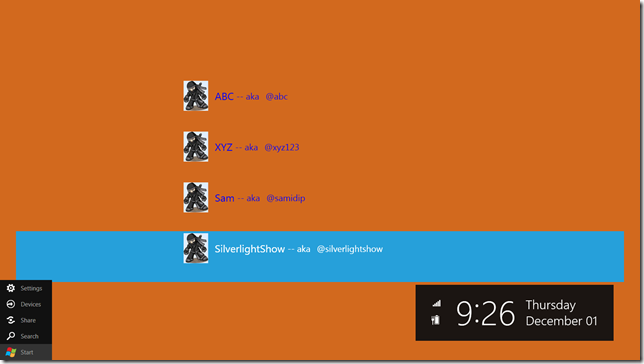
So, what happens when we have a selected Team member selected & which we wish to share, and then we hit the Share Charm. Well, something like this:
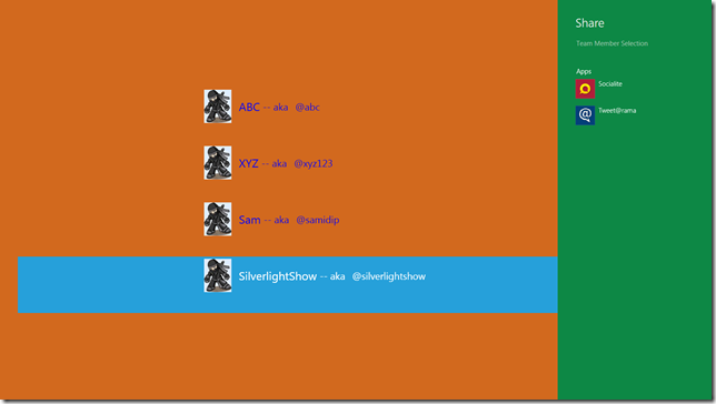
What you see is the list of applications that have implemented the Share contracts .. in other words, declared to the OS that they can handle sharing of information from other Apps. Exactly, what we need! Now, let’s try TwitterRama which is a simple Twitter client for Windows 8 built by some very smart MSFT interns. This App clearly knows how to talk/post to Twitter .. so we may not need to integrate with Twitter API directly. Here’s what we get when we try to share through TwitterRama:
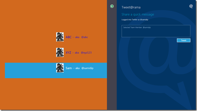
Did you notice that our App passed data to TwitterRama? Let’s see how we do that .. first, let us sign up for sharing by allowing the OS interfaces to request data from our application:
1: using Windows.ApplicationModel.DataTransfer;
2:
3: #region "Constructor"
4:
5: public MainPage()
6: {
7: InitializeComponent();
8:
9: // Sign up to Share.
10: var dataTransferManager = Windows.ApplicationModel.DataTransfer.DataTransferManager.GetForCurrentView();
11: dataTransferManager.DataRequested += new TypedEventHandler<DataTransferManager,DataRequestedEventArgs>(dataTransferManager_DataRequested);
12: }
13:
14: endregion
Next, when data is actually requested (this happens when the user hits the Share Charm), we get to respond to the event in our application and make up what data element to share. Here’s how:
1: private void dataTransferManager_DataRequested(DataTransferManager sender, DataRequestedEventArgs args)
2: {
3: if (this.fullTeamList.SelectedItem != null)
4: {
5: // Set what to share.
6: Team selectedMember = (Team)this.fullTeamList.SelectedItem;
7: string textToShare = "Selected Team Member: " + selectedMember.TwitterHandle;
8: args.Request.Data.Properties.Title = "Team Member Selection";
9: args.Request.Data.SetText(textToShare);
10: }
11: }
That’s it .. easy to share, right? You may learn more about the Share contract from this BUILD sessions HERE.
Implementing Contracts
Now, how would we go about actually implementing a Contract? Simple, most common ones are available in the “Add New Item” project wizard, as shown here:
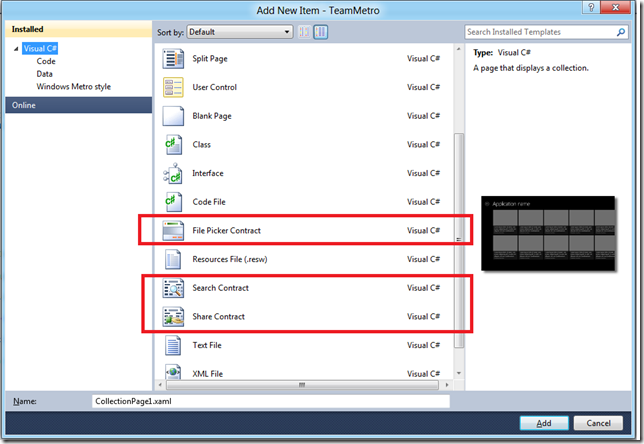
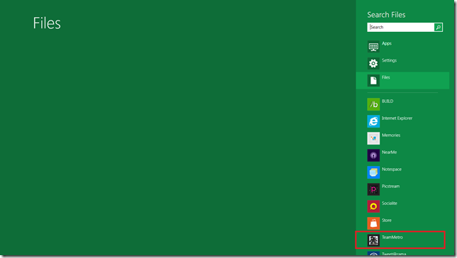
Now, let us say our application has some interesting data/files to search on. So, if we implement the Search contract, the end user may search for our application’s data directly from Windows Search, even if our application is not running. The user gets to see our App in the list for Search & search query parameters get passed directly into our application. Here’s how:
If our application does implement the Search contract, the App Manifest file gets updated with Declarations .. others can be added from the same screen below along with implementation:
So, now when the user searches contextually within your application from Windows Search, your application gets to respond showing a custom Search results view. The basics of this are added as a SearchResultsPage.xaml when we add the Search contract, as displayed below:
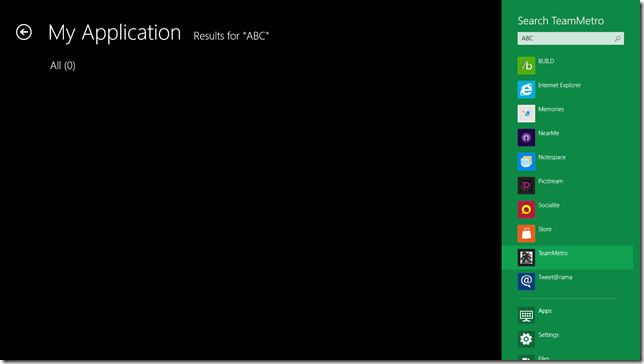
And we get to respond to Search queries from the user within our view as follows:
1: public sealed partial class SearchResultsPage
2: {
3: public SearchResultsPage()
4: {
5: InitializeComponent();
6: }
7:
8: public void Activate(SearchActivatedEventArgs args)
9: {
10: var queryText = args.QueryText;
11:
12: // Application-specific searching logic.
13: // Bind Search results to UI.
14:
15: // Display the results
16: this.PreviousContent = Window.Current.Content;
17: Window.Current.Content = this;
18: Window.Current.Activate();
19: }
20: }
Much more details about the Search contract can be found in this BUILD session recording HERE.
Artwork
Last but possibly the most important – let’s make nice looking Apps, shall we? Let’s take care of the user’s UX and they in turn, would take care of us developers, right? So, just like in Windows Phone, we developers need to put our Designer caps on, since graphics & artwork is of paramount importance. Let us follow Metro design guidelines to make our application feel right at home in Windows 8. Here’s our demo application on start screen:
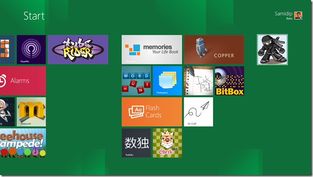
Here are some things not to miss:
- Inviting App logo on Start screen
- Inviting & Contextual App logo in App Store, along with great screenshots & description
- Branded Splash screen if using one as your App launches
- Rich but minimal graphics & backgrounds in App
- Maintain consistency
- Enable Live Tiles with Push Notifications (topic for another post someday)
- Contract implementations through consistent UI to keep inviting your users back into the App
- Metro, Metro, Metro
Still waiting .. c’mon let’s get started! Let’s play a part in Windows re-imagined.
Summary
In this 2 part article, we talked about how to get started with Windows 8 Metro Apps with XAML/C# and we went on to consumption/updates of OData from a Windows 8 Metro application. In Part 1, we looked at a few techniques on how to do asynchronous programming in Windows 8 using the new C# 5.0 constructs of Async-Await. In Part 2, we talked about taking the first steps towards making your Metro Apps feel at home in the Windows 8 Operating System.
I would appreciate any comments or concerns or how things could be done better. Thanks for reading & happy coding.
Cheers SilverlightShow!
About the Author
 Samidip Basu (@samidip) is a technologist & gadget-lover working as a Manager & Solutions Lead for Sogeti out of the Columbus Unit. Having worked on WP7 since CTP days, he now spends much of his time in spreading the word to discover the full potential of the Windows Phone platform & cloud-based mobile solutions in general. He passionately runs the Central Ohio Windows Phone User Group (http://cowpug.org/), labors in M3 Conf (http://m3conf.com//) organization and can be found with at-least a couple of hobbyist projects at any time. His spare times call for travel and culinary adventures with the wife. Find out more at http://samidipbasu.com/.