This article is compatible with the latest version of Silverlight for Windows Phone 7.
This is part 5 from the article series on Windows Phone 7.
Speaking with people and showing them my beloved Windows Phone 7 device, it appear evident one of the main surprises about this new operating system is the easy user experience and the completely unexpected singularity of its interface. It is true for sure the interface of Windows Phone 7 is deeply studied to be something that breaks most of the rules that have been pillars on other devices before their birth, not for the only will of being unique and distinguished by the competitors, but also because the feedback, the user may have from the phone, is something completely different from a laptop or desktop computer and it worth an user experience specifically tailored for it.
After the first meeting with the live tiles on the main screen, there are also two common experiences for the user of the phone that are becoming symbolic of the great effort Microsoft made to make the Windows Phone 7 a device that helps the final user to easily accomplish the tasks on its device. They are the Panorama and Pivot control that are two innovative ways to present information taking advantage of the touch feedback and the peculiar size of the screen.
At the first sight these controls appear to be very similar and also watching the markup that describes their appearance this feeling is confirmed. Actually, also if there are few differences in the markup, their inner functioning is deeply different and makes every control specifically targeted to give to the user an experience that is designed for specific purposes. While the pivol control slices the space horizontally and creates panels that can be viewed one at a time and scrolled vertically, the panorama have the intent of give the feeling of a big screen over which we can scroll horizontally. It may be compared to watching a big room from the keyhole, when we move from a side to another we see little part of the whole view.
To illustrate the differences between these controls in the following part we will write two versions of a little application that uses first the Pivot and then the Panorama to present some data collected from a public source published by the U.S. Geological Survey. It will call them the Earthquake catalog.
The earthquakes and the Pivot control
The Pivot control is perfect to present collections of informations sliced into several subsets. The common meaning of the term "Pivot" is usually used by business intelligence people to identify a similar grouping of collections of data. So, in the first part of the example I will collect the stream of earthquakes coming from the USGS RSS feed and I will try to slice it in several ways. The result will be a series of lists presenting high magnitude earthquakes, medium, low and to demonstrate that the slicing is not binded to one sole dimension, I will also show a chronological slice of earthquakes happened today.
The data source from the USGS is wrapped by a DataSource class that has the responsibility of read the RSS feed and convert it into instances of EarthquakeInfo, a class specifically designed to represent a single event pulled from the feed. So the informations to be slices are a collection of EarthquakeInfo that I save into an ObservableCollection collection into a ViewModel.
using System;
using System.Net;
using System.Linq;
using System.Windows;
using System.Windows.Controls;
using System.Windows.Documents;
using System.Windows.Ink;
using System.Windows.Input;
using System.Windows.Media;
using System.Windows.Media.Animation;
using System.Windows.Shapes;
using System.ComponentModel;
using SilverlightPlayground.EarthquakeCatalog.Code;
using SilverlightPlayground.EarthquakeCatalog.ObjectModel;
using System.Collections.ObjectModel;
using System.Collections.Generic;
using System.Diagnostics;
namespace SilverlightPlayground.EarthquakeCatalog.ViewModels
{
public class MainPageViewModel : INotifyPropertyChanged
{
private ObservableCollection<EarthquakeInfo> Earthquakes { get; set; }
public MainPageViewModel()
{
this.Earthquakes = new ObservableCollection<EarthquakeInfo>();
this.Load();
}
public void Load()
{
DataSource.Current.GetShakeMap(
result =>
{
this.Earthquakes.Clear();
foreach (EarthquakeInfo eq in result)
this.Earthquakes.Add(eq);
this.RaisePropertiesChanged();
},
ex =>
{
MessageBox.Show(ex.Message);
});
}
}
}
Since I have to present different views of the same dataset, I take advantage of LINQ adding to the ViewModel a set of properties that makes a query on the entire set, extracting only the elements that match the requirements. So I have the MediumEarthquakes property that pulls only the shakes from 3.5 to 5.0 of magnitude, the TodayEarthquakes that takes only the shakes that happened today, etc.
/// omissis
public IEnumerable<EarthquakeInfo> MediumEarthquakes
{
get
{
Debug.WriteLine("MediumEarthquakes");
return (from eq in this.Earthquakes
where eq.Magnitudo >= 3.5 && eq.Magnitudo < 5.0
select eq).ToArray();
}
}
public IEnumerable<EarthquakeInfo> LowEarthquakes
{
get
{
Debug.WriteLine("LowEarthquakes");
return (from eq in this.Earthquakes
where eq.Magnitudo < 3.5
select eq).ToArray();
}
}
public IEnumerable<EarthquakeInfo> TodayEarthquakes
{
get
{
Debug.WriteLine("TodayEarthquakes");
return (from eq in this.Earthquakes
where eq.PublishDate.Date == DateTime.Now.Date
select eq).ToArray();
}
}
/// omissis
The debug instruction I added to any property will help us to understand an important feature of the Pivot control about whom I will speak in a few paragraphs. For now it suffice to understand that every time something is pulled from the feed I call a RaisePropertiesChanged method that triggers a PropertyChanged event for every property and force the UI to update.
private void RaisePropertiesChanged()
{
this.OnPropertyChanged("AllEarthquakes");
this.OnPropertyChanged("HighEarthquakes");
this.OnPropertyChanged("MediumEarthquakes");
this.OnPropertyChanged("LowEarthquakes");
this.OnPropertyChanged("TodayEarthquakes");
this.OnPropertyChanged("LastQuake");
}
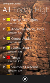
Now the time has come to prepare the XAML to consume the data handled by the ViewModel. The code to display the Pivot control is pretty simple. The control contains a series of PivotItem and each one represent a single slice of the same dimension of the screen. Inside a PivotItem I add a Listbox that I bind to every property in the ViewModel. Each ListBox shares an ItemTemplate that shows the Magnitudo in a colored box, the location and the date and time of the event. Here a snippet of the code
<Grid x:Name="LayoutRoot">
<Grid.Background>
<ImageBrush ImageSource="/Icons/sanandreas.jpg" />
</Grid.Background>
<controls:Pivot Grid.Row="0" Title="Earthquake Catalog">
<controls:PivotItem Header="All" Foreground="White">
<ListBox Margin="0,0,-12,0" ItemsSource="{Binding AllEarthquakes}" ItemTemplate="{StaticResource ListRowTemplate}" />
</controls:PivotItem>
<controls:PivotItem Header="Today" Foreground="Black">
<ListBox Margin="0,0,-12,0" ItemsSource="{Binding TodayEarthquakes}" ItemTemplate="{StaticResource ListRowTemplate}" />
</controls:PivotItem>
<controls:PivotItem Header="High" Foreground="Red">
<ListBox Margin="0,0,-12,0" ItemsSource="{Binding HighEarthquakes}" ItemTemplate="{StaticResource ListRowTemplate}" />
</controls:PivotItem>
<controls:PivotItem Header="Medium" Foreground="Orange">
<ListBox Margin="0,0,-12,0" ItemsSource="{Binding MediumEarthquakes}" ItemTemplate="{StaticResource ListRowTemplate}" />
</controls:PivotItem>
<controls:PivotItem Header="Low" Foreground="Green">
<ListBox Margin="0,0,-12,0" ItemsSource="{Binding LowEarthquakes}" ItemTemplate="{StaticResource ListRowTemplate}" />
</controls:PivotItem>
</controls:Pivot>
</Grid>
I've also added a scenic background image that shows a photo of the San Andreas Fault. The list will float over this beautiful image. With these few rows of code, I got a fully functional application that shows the informations in a way that let me easily  navigate and reach the view I mostly require in a breeze.
If you compile and run the application, using the code attached at the article, you will appreciate the fluidity of the control. Also with a huge number of items it is very stable and does not appear to slow down so much. The secret behind the Pivot control becomes evident if you try to run the application, in debug mode, into Visual Studio and watch at the output window. You will see something interesting: the control is optimized to show a number of panels because when it runs only loads the current panel, one to the right and another to left. When you scroll in a direction it immediately triggers the l oading of the missing part according with the direction you moved to. This behavior is specific of the Pivot control and is also the main structural difference between it and the Panorama. As we will see in a few, this one loads everything when it is displayed.
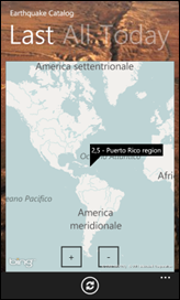
Just before switch to the Panorama version, it is important to understand that also if it is common to see the Pivot control used to present list of items, it is not locked down to this type of view. Inside a PivotItem you can easily put almost everything. It is often used to present settings pages, giving to every panel the meaning of a category of settings fields. To better explain what I'm saying I've added a LastQuake property to the ViewModel. This property extracts the most recent event from the list as a single item. So I've added another PivotItem containing a Bing Map instance binded to this property. The map is centered to the GeoCoordinate of the event and shows a PushPin with description and magnitude of the event. In the following figure you can see the result of the change, that you can see scrolling up to the Last panel.
A Panorama on earthquakes
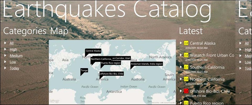
Given that the Panorama control has a completely different meaning you have to find a different key of reading for your application interface. While the Pivot control is more analytic, the feedback to the user of the Panorama control is much more impressive and targeted to display summarized informations to be explored with additional pages. In the application I've attached to this article I used the Panorama control to display a list of categories, connected with the Pivot page of the previous paragraph. I've also added a big map presenting the last 10 event world wide and a list with the same items. In the following figure you can see a composition of the screens taken from the running application.

Take this screenshot was not an easy task because of the behavior of the Panorama control. The title, the background image and the content are all actors of an impressive parallattic scrolling that shifts the elements separately to give a deepness feeling. The presence of a list of element make you understand that the aspect of the Pivot control and Panorama may be very similar but if you watch at the output window you will see that all the elements of each part of the view are loaded simultaneously so it is important optimize the loading to avoid blocking of the UI. Also the code used to describe the Panorama control in the markup is very similar to the Pivot control:
<controls:Panorama Title="Earthquakes Catalog">
<controls:Panorama.Background>
<ImageBrush ImageSource="Icons/sanandreas_h.jpg" />
</controls:Panorama.Background>
<controls:PanoramaItem Header="Categories" Orientation="Vertical">
<ListBox ItemsSource="{Binding Categories}" ItemTemplate="{StaticResource CategoryRowTemplate}" />
</controls:PanoramaItem>
<controls:PanoramaItem Header="Map" Orientation="Horizontal">
<Border BorderThickness="1" Width="960" BorderBrush="#FF666666" Background="Azure">
<my:Map CredentialsProvider="xxxxxxxxxxxxxxxxxxxxxxxxxxxxxxxxxxxxxxxxxxxxxxxxxxxxxxxxxxxxxxxx">
<my:MapItemsControl ItemsSource="{Binding LatestEarthquakes}">
<my:MapItemsControl.ItemTemplate>
<DataTemplate>
<my:Pushpin Content="{Binding Location}" Location="{Binding Position}" />
</DataTemplate>
</my:MapItemsControl.ItemTemplate>
</my:MapItemsControl>
</my:Map>
</Border>
</controls:PanoramaItem>
<controls:PanoramaItem Header="Latest" Orientation="Vertical">
<ListBox Margin="0,0,-12,0" ItemsSource="{Binding LatestEarthquakes}" ItemTemplate="{StaticResource ListRowTemplate}" />
</controls:PanoramaItem>
</controls:Panorama>
The Orientation property of the PanoramaItem determines if the element will show horizontally or vertically. In my example I've used the Vertical layout for the category and the list panels and the Horizontal layout for the map. I've also fixed the Width of the map to 960 pixels and this make it stretching across multiple screens. The earthquake Panorama is an introductive screen. Tapping on the categories you will enter the Pivot view for a more analytic view of the informations. This is a pattern you often see in many applications like the Marketplace, the Music hub and so on.
Details, tips and thanks
As we have seen in the samples I've illustrated, the use of these controls is straightforward and you can take advantage of their amazing interface to improve the usability of your applications in many ways. I think they can considered one of the many point of strenght in the development with Silverlight on Windows Phone 7. Please feel free to download the included example, but remember you have to register to the Bing developer portal to put your own key in the CredentialProvider property and use a not watermarked map. Finally let me thanks the U.S. Geological Survey website for the astounding source of informations they publish. It is for sure an important source for geologists but they also gave me a perfect collection of data of which I often abused in many presentations I made.
Download the source code (803 K)
About the Author
 Andrea Boschin is 41 years old from Italy and currently lives and works in Treviso, a beautiful town near Venice. He started to work in the IT relatively late after doing some various jobs like graphic designer and school teacher. Finally he started to work into the web and learned by himself to program in VB and ASP and later in C# and ASP.NET. Since the start of his work, Andrea found he likes to learn new technologies and take them into the real world. This happened with ASP.NET, the source of his first two MVP awards, and recently with Silverlight, that he started to use from the v1.0 in some real projects.