After reading part 2 of this article series, you should have a solid understanding of the data aspect in LightSwitch. Data is the foundation for a LightSwitch application on which the rest of the application is built. In this third part, we’ll look at the visualization of the data: the screens. As with other development, screens are used to allow the user to interact with the data. We will see that to a certain extent, LightSwitch generates screens for us. But, as you can see by the length of this very article, we can do a whole lot more with screens than just have LightSwitch generate them for us. So fasten your seatbelt as I’ll be showing you screens in detail!
We are continuing to use the MoviePolis sample. Remember, the people from MoviePolis had an old COBOL application to manage their cinema complex with. They asked us to create a new solution which we are building using LightSwitch. The code for the MoviePolis application (as it looks at the end of this part) can be downloaded here.
The “Screen Machine”: screen templates
OK, perhaps I got carried away with this title… However, LightSwitch really has a built-in screen generator, based on the concept of screen templates. A screen template is really nothing more than a template to which we “feed” the data we want to be able to edit using the screen. When we look later at creating screen templates (yes, screen templates are another extensibility point of LightSwitch), we’ll see that a screen template consists out of XAML code.
Creating a screen is simple. By right-clicking on the Screens folder in the Solution Explorer, we can indicate that we want to add another screen to the application. LightSwitch opens a dialog, as shown below, which lists the available templates. LightSwitch comes out-of-the-box with 5 installed templates.

Quite logically, we can give the screen a name (a default name is generated for you if you omit doing so). In the Screen Data section, we can select which table (or global query - we’ll learn about those in the next article) we want to base the screen on. In the above screenshot, we selected a List and Details Screen for the Movies data. This screen template however is capable of showing related tables as well. Here, LightSwitch found that Movie ShowTimes are related so it proposes it as well, so that we can manage that data from the same screen.
What happens when hitting the OK button , is that LightSwitch will generate code that makes up the screen. Indeed, code-generation is taking place behind the scenes. That effectively means that updating the table ( for example adding a field) afterwards will not be reflected automatically in the screen, this needs to be updated manually.
Let’s look at the generated screen.
Parts of the screen
The screenshot below shows a generated screen.
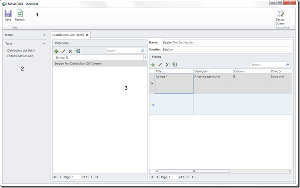
At the very top (1), the Screen Command Bar resides. This bar has 2 buttons by default, allowing us to save data or refresh data. On the left (2), the navigation bar is placed under the Menu item (this arrow can be used to collapse the menu pane). Under the Tasks item, the available screens are placed. Clicking on an item in the Tasks list will open the corresponding screen in (3), which is by default a tab control. Note that not all screens are shown here: if we have a detail screen, which is opened from another screen using a parameter (ex an editable grid), this screen won’t be shown here.
This is the default layout. By saying default, I’m of course implying that we can change this screen. In fact, we can change this a lot. Some modifications can be done from the screen designer, which we’ll look at next. Changes to the general layout (that is, the shell of the screen) can be done by using another extensibility hook: the shell template. If we want to change colors, we can build a custom theme extension, which is another extensibility point. We’ll be looking at extensibility later in this series.
Screen and runtime designer
After generating a screen from a template, LightSwitch opens the Screen Designer. Using this designer, we can change the screen, although not using a drag-and-drop feature as we’re used in Visual Studio. Instead, we are shown a screen hierarchy to which we can add, change and remove items.
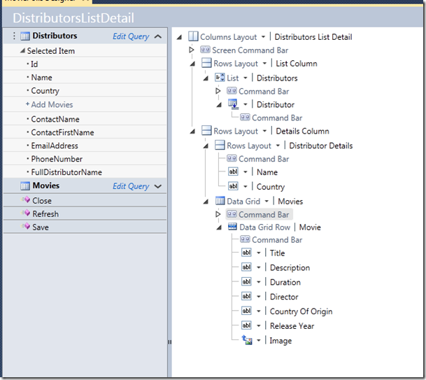
On the left, we see the data; on the right, the screen hierarchy is shown. Thinking in terms of MVVM, the data can be considered being the ViewModel, while the screen hierarchy is the View. Both parts are linked using data binding.
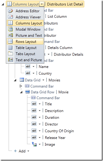
In the screen designer, we can change how the screen is built. By default, a Columns layout is generated, which places the master and detail screen next to one another. Assume we want to view them below each other, we can change this to be a Rows Layout, as shown next.
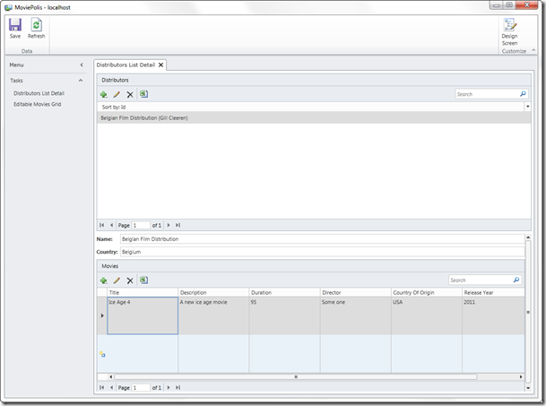
When running the application now again, we see that the screen layout has changed.
Now having a preview of what our changes look like inside Visual Studio can be seen as a limitation. However, a solution exists in the form of the runtime screen designer, which can be used in roughly the same way as the designer in Visual Studio. However, since it is part of the application (it’s a Silverlight page in fact), it shows the preview of the running application.
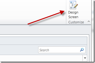
Accessing the runtime screen designer is possible using the Design Screen button at the top right of the screen. This button is of course only shown when running the application from Visual Studio.
Clicking this button takes us to the designer, which is shown on the next screenshot.
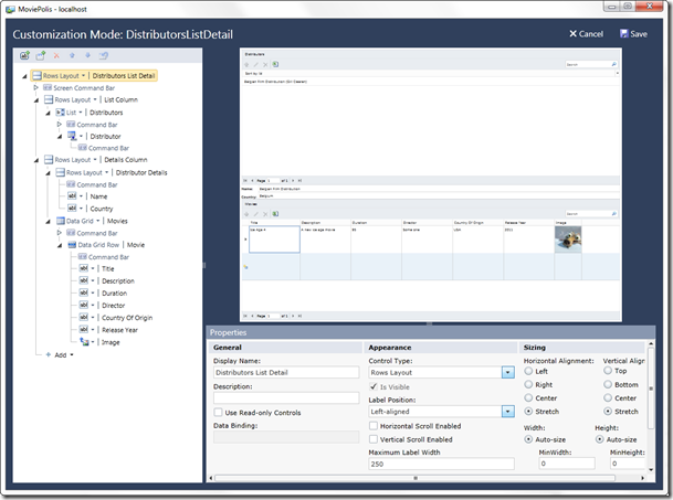
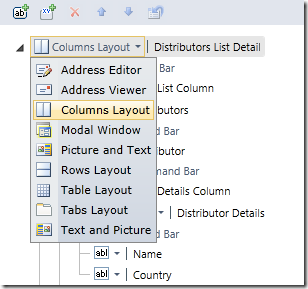
Assume that we aren’t happy with our previous change; we can then change the rows layout back into a Columns layout. This is done in the same way as previously inside VS.
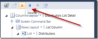
Of course, other changes can be done here as well. Using the buttons at the top of the screen, we can move items and remove them.
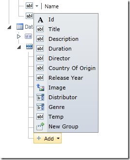
Using the Add function, we can choose to add more available fields.
Using the properties window at the bottom, we can change layout properties such as alignment, sizing and display name.
One might ask: what is the use of this, we’re running the application, we aren’t inside Visual Studio. Will all of our changes be lost? Of course not! When hitting the Save button, the changes are sent back to Visual Studio, which will reflect the changes we made after exiting the debug session.
Control and layout types
In the screen hierarchy, we can add elements as well as change the representation of elements. Several control types are available.
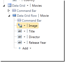
Assume for the DistributorsListDetail screen that we also want the Grid with the related movies to include only a couple of fields. Additionally, we want to add a Movie detail screen. Here’s how we can do so.
1. First, in the Data Grid Movies, select the items you want to remove, so that only the following are left. Also, drag the Image field to be the first column in the Data Grid.
2. Select the Rows Layout Details Column and click on the Add button at the very bottom. Select Movies à Selected Item.
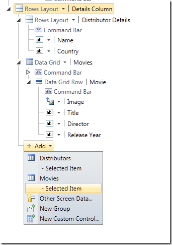
You should now have the following:
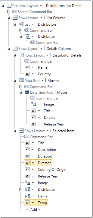
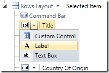
Next to adding items, we can also change the type that specifies how a particular item will be shown. For example, if we don’t want the title to be edited from this screen (and just use the field to display data), we can select the Label type.
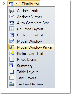
Some other types have a more advanced way of being displayed. Take for example the Distributor field, which is displayed by default as a ComboBox. We can select various other options, including a Modal Window Picker.
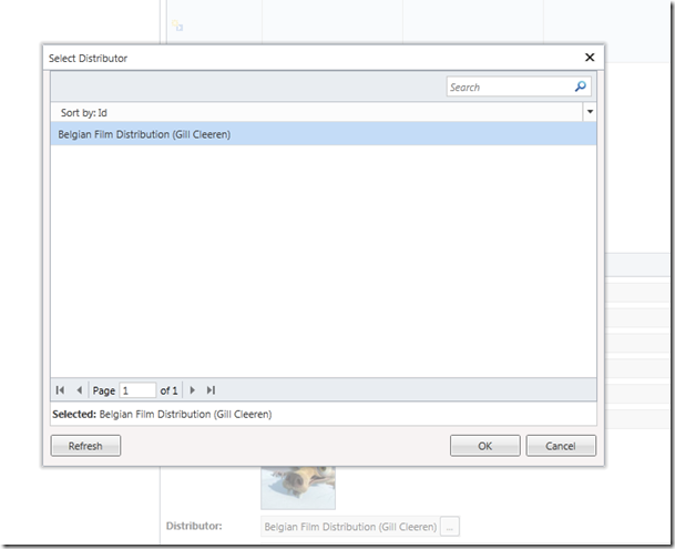
When using this type, a modal dialog is shown:
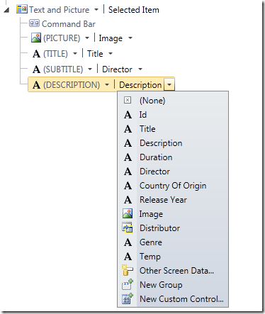
Finally, composite controls can be used for a more advanced type of data visualizations. Let’s look again at the Movie Selected item. Instead of showing a grid of controls, we can select a composite control, such as the Text and Picture layout. When selecting this layout type, LightSwitch shows us the available placeholders. In each placeholder, we can select which field we want to display, as shown below:
When running the application, the composite control looks like this:
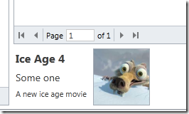
Let’s now take a look in some more detail at the available screen templates and their use.
Screen templates
Without adding any ourselves, LightSwitch has 5 screen templates available:
- List and details screen: a master-detail screen. Both master and detail are shown in one single screen. We can also build a master-detail implementation spanning multiple screens ourselves if required.
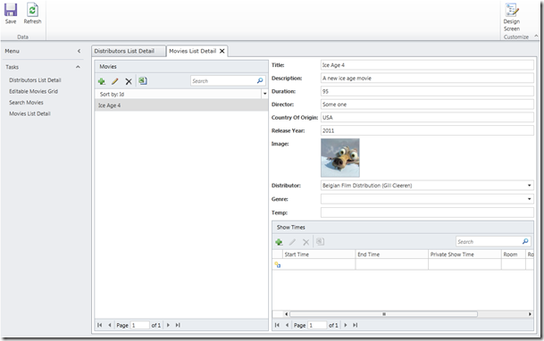
This screen can be configured to included related entities, such as in the above screenshot where Movie ShowTimes are also being shown.
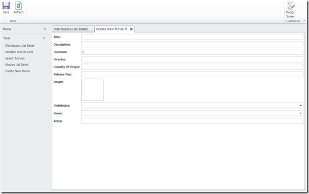
- New data screen: the New Data screen allows us to configure the screen to add a new entity. If we don’t create one, LightSwitch will generate one for us on the fly.
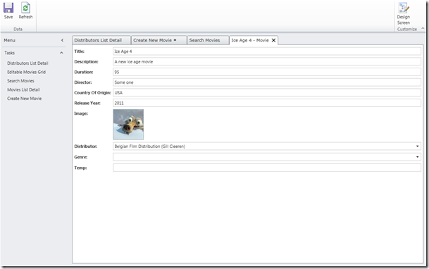
- Details screen: Similar to the new data screen, the Details screen can be used to override the default visualization LightSwitch generates for a detail of an entity.
- Editable grid screen: This screen is composed out of a DataGrid which allows inline editing and adding entities. It can also edit via dialogs.
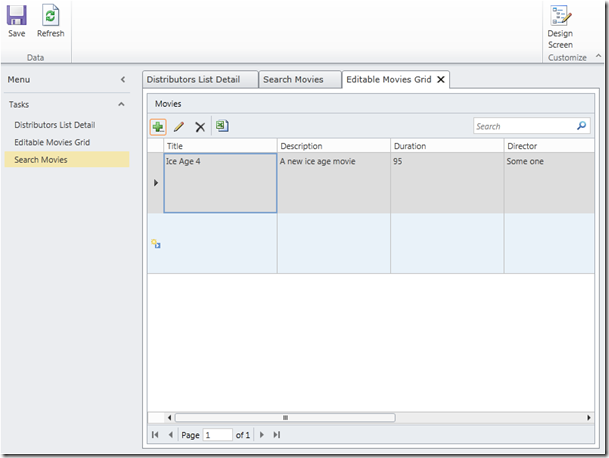
Although we can search from this screen, a more specific template is available.
- Search screen: as the name implies, the search screen allows us to search data. This screen is very similar to the editable grid, although there are some differences.
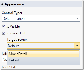
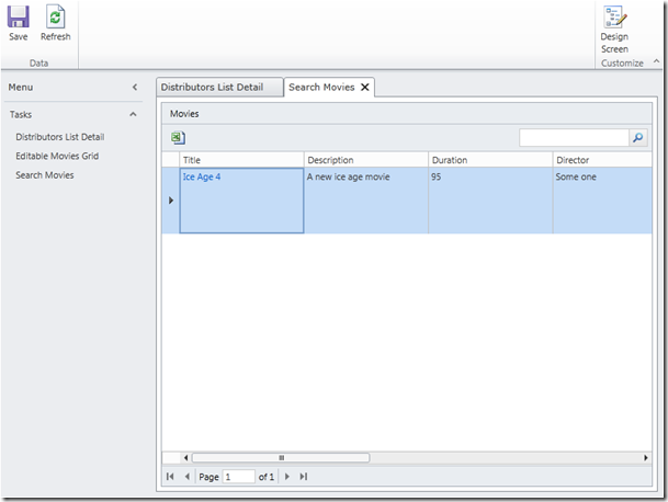 Notice that there are no buttons to add or edit data and the Grid data itself is not editable. The title, which is the summary property, is shown as a link, allowing us to navigate to the detail of a Movie. If we have a detail screen created for Movie, we can make this screen the default detail screen for that entity when clicking on a link. To do so, in the Properties window of the Title field of the search screen, we can specify which detail screen we want to use as shown below.
Exporting to Excel
Several screen templates such as the editable grid and the search screen allow us to export to Excel. At the top of the grid, an Excel icon winks at us to export to that all so important tool in the eyes of every manager!
Creating a screen ourselves
After seeing screen templates, we might get the idea that we can create a screen from scratch in LightSwitch. Well, that certainly isn’t true. Let’s take a look at how we can create an entirely new screen.
1. In the Add new screen dialog, select any of the templates. However, don’t select any screen data. Here I’m creating a screen named MyNewScreen.
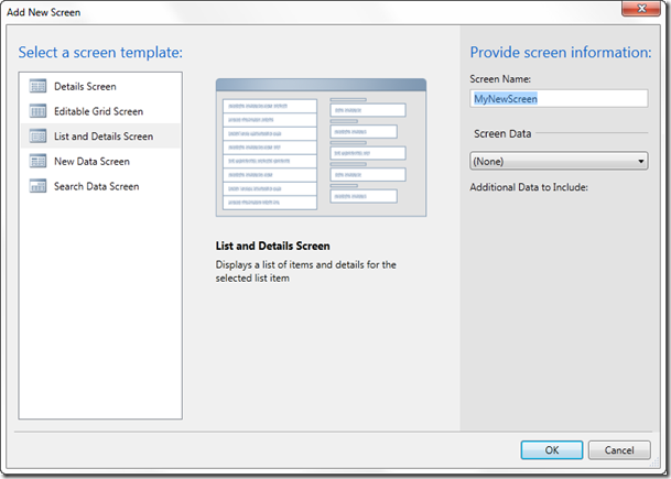
The result in the screen designer is, well… an empty screen!
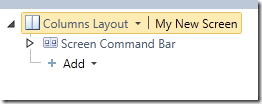
2. Next, click on the Add Data Item button. In the dialog that appears, we can choose to add methods, local properties or queries. For now, let’s add one of the proposed queries (we’ll look in more detail at queries). Select the Movies (all).
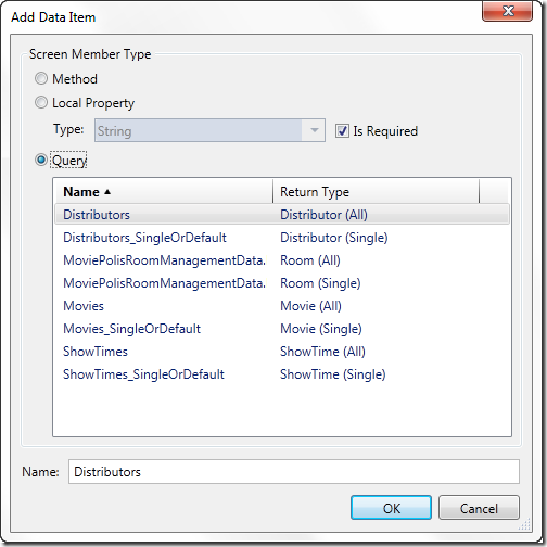
This query is now added to the data on the right.
3. In the Add button, select Movies. A Data Grid is added.
4. With the columns layout selected, select Add Layout item à Group. A new rows layout gets added.
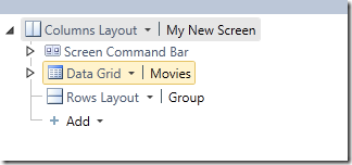
5. In the Rows layout, add the Selected Item for Movies.
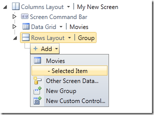
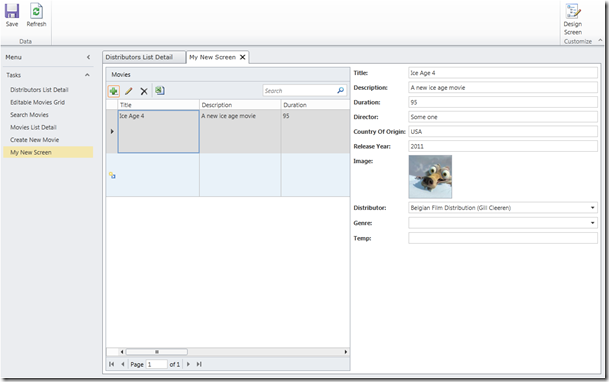
Our screen looks as follows:
Changing screen navigation
You may have noticed already that the screens in the Tasks window are shown in the sequence they were added to the solution. Of course, we can change this. To do so, right-click on the LightSwitch project and select Properties. Navigate to the Screen Navigation tab. Via this screen, we have full control over how the screens are shown.
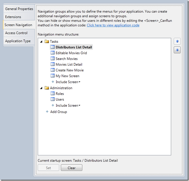
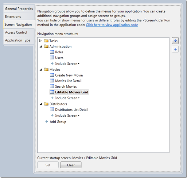
Screens are by default added to the Tasks node, which is a Group. Using the arrows on the right, we can move screens up and down within the Tasks group. We can also include screens that may not be in the list (they could have been removed earlier for example) using the Include Screen button. The screen also allows us to add groups using the Add Group button. Finally, by selecting a screen and hitting the Set button at the bottom, we can set a screen as the startup screen for the application. Below is a screenshot of changed navigation:
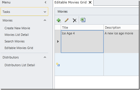
The result of this looks as follows:
Summary
After this third part of this article series, you should have a clear view of what screen can do in your application. We’ve explained the different ways of working with screens, the different screen templates and how we can build screens ourselves. We finished by looking at how we can change the navigation of a LightSwitch application.
In the next part, we’ll look at queries and we’ll start writing code in our applications.
About Gill Cleeren
Gill Cleeren is Microsoft Regional Director (www.theregion.com), Silverlight MVP (former ASP.NET MVP), INETA speaker bureau member and Silverlight Insider. He lives in Belgium where he works as .NET architect at Ordina. Passionate about .NET, he’s always playing with the newest bits. In his role as Regional Director, Gill has given many sessions, webcasts and trainings on new as well as existing technologies, such as Silverlight, ASP.NET and WPF at conferences including TechEd Berlin 2010, TechDays Belgium, DevDays NL, NDC Oslo Norway, SQL Server Saturday Switserland, Spring Conference UK, Silverlight Roadshow in Sweden… He’s also the author of many articles in various developer magazines and for SilverlightShow.net. He organizes the yearly Community Day event in Belgium.
He also leads Visug (www.visug.be), the largest .NET user group in Belgium. Gill recently published his first book: “Silverlight 4 Data and Services Cookbook” (Packt Publishing). You can find his blog at www.snowball.be.
Twitter: @gillcleeren