 In the previous article, we looked at the extensibility hooks we get in LightSwitch applications. We’ve also constructed a LightSwitch extension by building a custom Silverlight control that we added to the LightSwitch application.
In this part, we’ll use the extensibility toolkit to build extensions. The toolkit can be downloaded here: http://visualstudiogallery.msdn.microsoft.com/0dfaa2eb-3951-49e7-ade7-b9343761e1d2 .
Building a custom control
We can extend LightSwitch applications by creating custom controls. These can be value controls, which change or extend the way a value is represented inside the application. We can also construct collection controls, in which we can override how a collection is shown within the control. Other custom controls are group controls, which contain logic to organize their children. Group controls can contain for example a StackPanel, which will then stack its children horizontally or vertically, depending on how the StackPanel was specified. Another type of group control is a smart layout extension, which contains placeholders to place controls in. We’ll look at this type further in this article. Let’s first look at creating a value control extension.
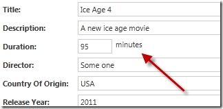
In the MoviePolis application, we can add movies. Assume that we want to make it clear to the users of the application that the movie length is to be added in minutes. We can do so by creating a custom control that shows a TextBlock with the text “minutes” after the TextBox containing the minutes value. Let’s walk through the steps for creating this control.
1. Create a LightSwitch extension project
First things first of course: we should start by creating the extension project first. Open Visual Studio with the Extensibility toolkit installed. Under the LightSwitch node, select “LightSwitch Extension Library (C#)” as the project template. Name the project CustomControls. The following screenshot shows this.
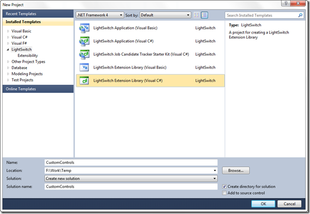
Visual Studio will execute the template and no less than 7 projects will be created for you. The following explains the most important aspects of these projects.
Client: In here, we’ll place UI elements, such as the XAML of the control.
Design: contains elements such as images, which are used by the IDE to display the control.
Common: contains elements that are to be shared between client and server. The *.lsml files are located here as well. We’ll work with these a lot more soon.
Server: contains for example server-side validation logic.
Vsix: is a package project. A LightSwitch extension gets packaged into a *.vsix file, which can be distributed within your organization. This way, other developers (or more in general, LightSwitch application builders) can use the extension you as a developer created in their own applications.
2. Create the LightSwitch extension
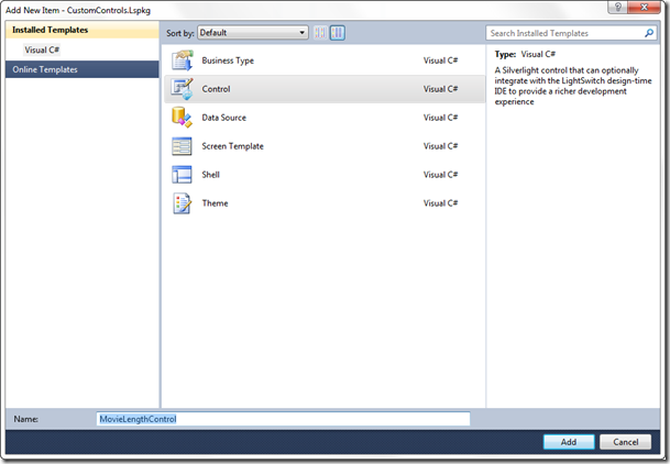
The project on itself doesn’t know anything about the extension yet. Indeed, we have to select the type of extension we are building here. To do so, right-click on the CustomControls.Lspkg project, select Add –> New Item. In the dialog, select Control. Name the control MovieLengthControl.
3. Change the icon for the control
By default, Visual Studio has added for you 2 images in the solution. These are used to represent the control inside the IDE. It’s recommended to change these: if you are using more than one custom control, things might get complicated if all these controls are using the same icon.
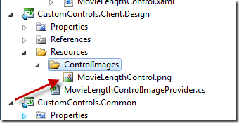
To change the icon, go to the CustomControls.Client.Design project and navigate to the Resources –> ControlImages –> MovieLengthControl.png image. Right-click on *.png file and select Open With. You can select Paint here to let your creative side come to life!
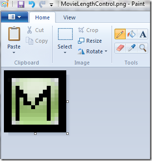
Here’s my best effort to creating the best icon: a black rectangle with an M from MoviePolis!
After saving, Visual Studio will notify you that the file changed. Copy the file to the CustomControls.Design à Resources à ControlImages as well.
4. Specify which types are supported by our control
The *.lsml file in the CustomControls.Common –> Metadata –> Controls directory contains the model of the extension. Open the file and notice that the root element is the ModelFragment. When using your extension in the project, the ModelFragment will be added in the ApplicationDefinition.lsml file, which contains the raw definition of the application. By default, the file looks as follows:
<?xml version="1.0" encoding="utf-8" ?>
<ModelFragment
xmlns="http://schemas.microsoft.com/LightSwitch/2010/xaml/model"
xmlns:x="http://schemas.microsoft.com/winfx/2006/xaml">
<Control Name="MovieLengthControl"
SupportedContentItemKind="Value"
DesignerImageResource="CustomControls.MovieLengthControl::ControlImage">
<Control.Attributes>
<DisplayName Value="MovieLengthControl" />
</Control.Attributes>
<Control.SupportedDataTypes>
<SupportedDataType DataType=":String"/>
</Control.SupportedDataTypes>
</Control>
</ModelFragment>
The SupportedDataType defines on which types the new control can be used. In other words, only when a field of an entity has the type specified in this field, the new control type will be shown. In our case, we want the control to be usable on the Minutes field, which is of type Integer. We can thus change this to become:
<Control.SupportedDataTypes>
<SupportedDataType DataType=":Int32"/>
</Control.SupportedDataTypes>
A single control may be used in some occasions on more than one type. If so, we can simply enumerate these types as follows:
<Control.SupportedDataTypes>
<SupportedDataType DataType=":Int32"/>
<SupportedDataType DataType=":String"/>
<SupportedDataType DataType=":Int64"/>
</Control.SupportedDataTypes>
5. Bind to the data in the control
In the CustomControls.Client, a XAML file was created when we created the control itself. This XAML file is the actual control as we’ll see it appear later in our application when we have installed the extension. By default, it contains the following code.
<UserControl
x:Class="CustomControls.Presentation.Controls.MovieLengthControl"
xmlns="http://schemas.microsoft.com/winfx/2006/xaml/presentation"
xmlns:x="http://schemas.microsoft.com/winfx/2006/xaml">
<TextBox Text="{Binding StringValue, Mode=TwoWay}"/>
</UserControl>
It is effectively nothing more than a simple Silverlight UserControl, which is bound to data, coming from LightSwitch. LightSwitch is actually providing the XAML UserControl with data. The DataContext for the control is of type IContentItem, which can be seen as the view-model class for our control. It contains quite a few properties that are being populated with data automatically so that the control can easily bind to it. For example, the StringValue property that the default TextBox is being bound to in the above sample, is a property which does conversion and validation automatically for the supported types of the control.
Swap the TextBox with the following code. It adds a TextBlock containing the minutes indication as well as some extra data bindings to the IContentItem properties.
<UserControl
x:Class="CustomControls.Presentation.Controls.MovieLengthControl"
xmlns="http://schemas.microsoft.com/winfx/2006/xaml/presentation"
xmlns:x="http://schemas.microsoft.com/winfx/2006/xaml">
<StackPanel Orientation="Horizontal">
<TextBox x:Name="MinutesTextBox"
Text="{Binding StringValue, Mode=TwoWay}"
TextAlignment="{Binding
Properties[Microsoft.LightSwitch:RootControl/TextAlignment]}"
Width="50"
ToolTipService.ToolTip="{Binding Description}"/>
<TextBlock Text="minutes" Margin="5 0 0 0"></TextBlock>
</StackPanel>
</UserControl>
6. Test the control
Finally, we have reached the point where we can test our work! Build the project and run it. A new instance of Visual Studio will open (called the Experimental instance). In this instance, open the MoviePolis application.
When the project is opened, we first have to enable the extension. Go to the Project properties and select Extensions. In the tab, you should see your extension appearing.

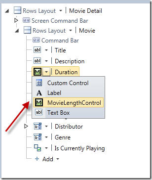
Now head over to the MovieDetail screen. For the Duration field, select the new control in the drop down list as shown below. LightSwitch will now use this new control to visualize the Duration field in this particular screen.
When we run the detail screen, we’ll see the following.
Great! We have created a custom control extension! Let’s take a look at another type of control extension: a smart layout extension.
Creating the Movie Smart Layout Extension
To finish this article, we’ll create another control: a smart layout control. As the word implies, this control does some layout, but in a smart way. We can define one or more (usually more than one) placeholders in a XAML user control. These placeholders will be replaced by a control in the screen designer. This way, we as extension developers are able to impose a certain layout on the extension user.
Next to smart layout control extensions, regular layout extensions exist, which for example can host an entire collection. A good example of this is a StackPanel extension, which simply places all its children horizontally or vertically.
For this sample, assume that in the MoviePolis application, we want to represent a movie by its thumbnail and the title. The title should go below the image. Let’s take a look how we can do so.
1. Create the extension project
Similarly to the previous example, create a new extension project. Name the extension CustomLayoutControls.
2. Create the LightSwitch extension
Again similar to step 2 in the previous example, create a new extension. The smart layout control is also a control, so we should select the Control template. Name the control MovieLayoutControl.
3. Change the icon for the control
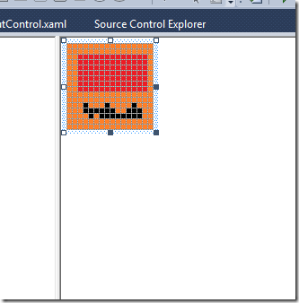
We can again similarly change the icon for the control using Paint or another editor. I’ve again done my very best to create something nice, but this failed again miserably as you can witness below.
4. Change the *.lsml file
The control definition in the *.lsml file (the meta data file) requires some more work this time. For starters, we need to specify that this control is a group control (by default, the control is set to support a value). To do so, open the MovieLayoutControl.lsml file in the Common project and change the SupportedContentItemKind to Group:
<Control Name="MovieLayoutControl"
SupportedContentItemKind="Group"
DesignerImageResource="CustomLayoutControls.MovieLayoutControl::ControlImage">
Next, we can delete the SupportedDataTypes node. Since this is a group control, it won’t appear in a single control field, it will only appear when we are working on a group level. Delete the following entirely.
<Control.SupportedDataTypes>
<SupportedDataType DataType=":String"/>
</Control.SupportedDataTypes>
Next, add placeholders. In these placeholders, we’ll place controls later. The following code should go between the <Control></Control>.
<Control.Placeholders>
<Placeholder DisplayName="MovieImage" Name="MovieImageTemplate" />
<Placeholder DisplayName="MovieTitle" Name="MovieTitleTemplate" />
</Control.Placeholders>
5. Create the actual control using the templates
We can change the layout of the control’s XAML code now. For this sample, we are using a simple Grid, but since this is again Silverlight code, we can go very far in the design of this control. Note that we are using a LightSwitch control here, we also need to add a reference to the Microsoft.LightSwitch.Client namespace.
<UserControl
x:Class="CustomLayoutControls.Presentation.Controls.MovieLayoutControl"
xmlns="http://schemas.microsoft.com/winfx/2006/xaml/presentation"
xmlns:x="http://schemas.microsoft.com/winfx/2006/xaml"
xmlns:framework="clr-namespace:Microsoft.LightSwitch.Presentation.Framework;assembly=Microsoft.LightSwitch.Client">
<Grid>
<Grid.RowDefinitions>
<RowDefinition Height="100"></RowDefinition>
<RowDefinition Height="40"></RowDefinition>
</Grid.RowDefinitions>
<framework:ContentItemPresenter ContentItem="{Binding ChildItems[0]}"
Grid.Row="0" Margin="3" />
<framework:ContentItemPresenter ContentItem="{Binding ChildItems[1]}"
Grid.Row="0" Margin="3" />
</Grid>
</UserControl>
6. Test the control
We’re ready to test the control. Run the extension project again and add the extension as before. We can now for a group control (for example by replacing the Rows Layout) select the new MovieLayoutControl as shown below.
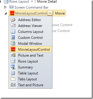
Once selected, we can see that the 2 placeholders we created earlier are appearing.
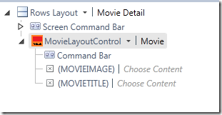
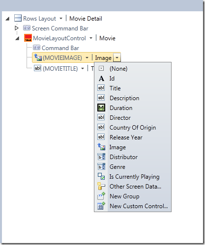
For both placeholders, we can select a field.
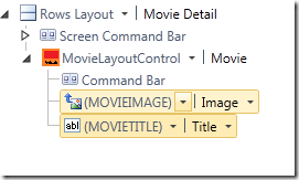
The final result inside the screen designer is the following:
After applying these changes, we can run the control again. We’ll see the following for the smart layout extension.
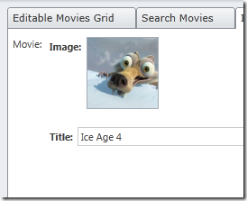
As can be seen, there are some labels being added automatically within the control. We can override this behavior. Go back to the MovieLayoutControl.lsml file and add the following code between the <Control></Control> tag. This will hide the labels for both levels.
<Control.PropertySources>
<ControlPropertySource
Property=":RootControl/Properties[AttachedLabelPosition]">
<ControlPropertySource.Source>
<ScreenExpressionTree>
<ConstantExpression ResultType=":String" Value="None" />
</ScreenExpressionTree>
</ControlPropertySource.Source>
</ControlPropertySource>
</Control.PropertySources>
<Control.ChildItemPropertySources>
<ControlPropertySource
Property=":RootControl/Properties[AttachedLabelPosition]">
<ControlPropertySource.Source>
<ScreenExpressionTree>
<ConstantExpression ResultType=":String" Value="None" />
</ScreenExpressionTree>
</ControlPropertySource.Source>
</ControlPropertySource>
</Control.ChildItemPropertySources>
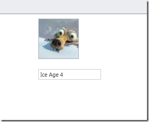
The following image shows the result.
Summary
In this part, we’ve built some extensions using the extensibility toolkit for LightSwitch. We’ve only touched on building controls in this part. In the next - and final - part of this series, we’ll look at some more extensions we can add to the MoviePolis application. Stay tuned!
About Gill Cleeren
Gill Cleeren is Microsoft Regional Director (www.theregion.com), Silverlight MVP (former ASP.NET MVP), INETA speaker bureau member and Silverlight Insider. He lives in Belgium where he works as .NET architect at Ordina. Passionate about .NET, he’s always playing with the newest bits. In his role as Regional Director, Gill has given many sessions, webcasts and trainings on new as well as existing technologies, such as Silverlight, ASP.NET and WPF at conferences including TechEd Berlin 2010, TechDays Belgium, DevDays NL, NDC Oslo Norway, SQL Server Saturday Switserland, Spring Conference UK, Silverlight Roadshow in Sweden… He’s also the author of many articles in various developer magazines and for SilverlightShow.net. He organizes the yearly Community Day event in Belgium.
He also leads Visug (www.visug.be), the largest .NET user group in Belgium. Gill recently published his first book: “Silverlight 4 Data and Services Cookbook” (Packt Publishing). You can find his blog at www.snowball.be.
Twitter: @gillcleeren