
In the previous articles (5 so far) in this series, we have covered most of the functions that are available in LightSwitch, right out-of-the-box. But LightSwitch is more than that.
Throughout the articles, there are several occasions where I mentioned that some topic is an extensibility point. This effectively means that we as developers can write components that we can plug into LightSwitch on those particular places to extend the behavior of the tool.
To build extensions, we have several options. We can build extensions as custom Silverlight controls or we can use the extensibility toolkit. In this article, we’ll look at the first solution. In the next one, we’ll take a look at the latter.
The code for this article can be downloaded from here.
Extending LightSwitch
With LightSwitch, a lot of ground is covered with the functionality offered by default. Using this, both developers and non-developers (read: people who are technically savvy but aren’t spending their days with coding) can build great applications. Behind the scenes, a Silverlight application is constructed that can run stand-alone or in-browser.
However, having just what’s in the box might be limiting. That is exactly what Microsoft thought of when they created the tool. Developers may be wanting to use other controls than the once that are coming with the default install. Or they may want to use a different data source (for example use an Oracle database as the data source). Or maybe use a different layout or shell for the application. These are all valid reasons why Microsoft has allowed extending LightSwitch.
When LightSwitch was released, an extra toolkit became available, named the Visual Studio LightSwitch 2011 Extensibility Toolkit (with LightSwitch installed, you can download this for free from http://visualstudiogallery.msdn.microsoft.com/0dfaa2eb-3951-49e7-ade7-b9343761e1d2). When installed, it offers you a project template and several item templates to create a particular extension.
Apart from using the toolkit, we can also use custom Silverlight controls and reference these from a LightSwitch application. This is the focus of this article.
Extensibility points
As mentioned, throughout the article series, we have touched on a couple of points where LightSwitch can be extended. Here’s an overview of the extensibility points.
Business type
A business type can be seen as an extra layer of validation and formatting on top of a normal database type. With LightSwitch, several business types come in the box, including Money, Phone Number and Email Address. Based on the type, new options can appear in the Properties window in Visual Studio. An example is the default domain for the Email Address type.
New business types can be created to wrap additional validation and formatting onto the type. An example can be a temperature in degrees Celsius (which adds “° C” behind the value). Validation could perhaps be that the value should never be lower than -100°C.
Control
A control in LightSwitch refers to several types of controls. A control can be used to group other controls or it can be used to tell LightSwitch how to represent a value. By default, LightSwitch comes with several grouping controls (Rows Layout for example) as well as several item controls (a TextBox).
With the extensibility toolkit, all these controls can be constructed. These controls provide a tight integration with the LightSwitch application.
As mentioned, we can also create custom Silverlight controls and reference these from a LightSwitch application.
Data Source
LightSwitch applications can connect with SQL Server, SharePoint lists and WCF RIA Services. If you need to connect to another data source, extensibility kicks in. Through the use of WCF RIA Services as service layer, you can write code that connects with the external data source. LightSwitch interfaces with the services layer. This way, connecting with external services is transparent for LightSwitch application developers.
Screen template
A screen template is used when building new screens. By merging data with a screen template, screen code gets generated. LightSwitch uses defaults to generate the different fields as a specific control.
We can create new screen templates as well using extensibility. We can define layout properties such as arrangement, colors etc. This way, we have complete control over how the generated screens will be displayed.
Shell
The default shell of a LightSwitch application contains the Save and Refresh buttons at the top and a menu on the left. If we aren’t satisfied with this, we can create a new shell and specify that we want this to be used for our screens. Only one shell can be used in one application. Things like the logo, navigation structure etc can be defined in the shell.
Theme
Silverlight applications can be themed: we can specify which styles are to be used by the controls. We can create a new theme to let the application match the company colors. Using themes, it’s also easy to change the colors for the entire application in one single place.
Using an extension
Creating one of these extensions is the work a developer should do, since quite a lot of coding is required. Once created, these extensions can be used by everyone creating the application, without requiring any additional coding effort.
Once developers start sharing extensions they have been building, we can import these into our application. Let’s take a look at how we can use an extension that’s already been built.
For this demo, we’ll use an extension uploaded to the Visual Studio Gallery (http://visualstudiogallery.msdn.microsoft.com). Download the extension from this page: http://visualstudiogallery.msdn.microsoft.com/58e0f1f4-d2d8-41f9-a4f9-dae70d5826e9. The download contains a *.vsix file that you need to run on your system without having Visual Studio open.
Once ran, open your LightSwitch project in which you want to use the extension and navigate to the Properties. In the extensions tab, if all goes well, your extension should be listed, as shown below. Here we are adding the Luminous controls.
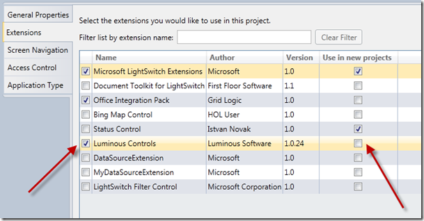
Note that we can select to use this control from now on in any new LightSwitch project we create.
These controls are now available in the application. For example, in the screen designer, we can add a new Group control as shown below.
Here’s an image showing the newly added control in action.
If we want to use an extension that contains shells or themes, we can work in a similar way. For example, download the Spursoft extension at http://visualstudiogallery.msdn.microsoft.com/18114b9a-5290-4766-991e-504ab6cfbda1. Install and activate the extension as explained above. This extension contains a new Shell and several themes. In the General tab of the Properties window, we can select these.
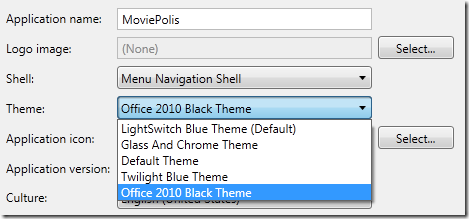
If we run the MoviePolis application now, we see the following.
Now that we have used controls and themes created by someone else, let’s take a look at how we can create our own.
Creating Silverlight custom controls
To finish this article, we’ll create our own extension. We’ll use the toolkit in the next article, so here we will use an often easier approach: a Silverlight custom control. Assume that people selling tickets can only open the LightSwitch application, they are not allowed to have a browser open on their PCs. However, at times during the day, ticket sales are slow, so the management has decided they are allowed to have a controlled browser environment on their machine. Since Silverlight has a WebBrowser control, we can make a Silverlight custom control with a small browser baked-in and add a screen with this control on it. Note that a WebBrowser control only works in out-of-browser applications. However, we are going to have the LightSwitch application run standalone so that won’t be a problem. Let’s take a look.
Add a new project to the solution. Make it a Silverlight Class Library. Here, I’ve named it SLExtensions. Make it a Silverlight 4 library in any case.
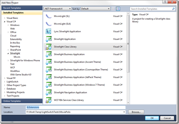
In the project, delete the default generated Class1.cs and add a new Silverlight User Control. I’ve named this control BrowserControl.xaml as shown below.
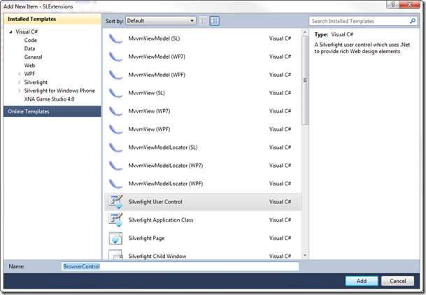
We can now write some code for this control. The code below creates a very simple browser, based on the Silverlight WebBrowser control.
<UserControl x:Class="SLExtensions.BrowserControl"
xmlns="http://schemas.microsoft.com/winfx/2006/xaml/presentation"
xmlns:x="http://schemas.microsoft.com/winfx/2006/xaml"
xmlns:d="http://schemas.microsoft.com/expression/blend/2008"
xmlns:mc="http://schemas.openxmlformats.org/markup-compatibility/2006"
mc:Ignorable="d"
d:DesignHeight="300" d:DesignWidth="400">
<Grid x:Name="LayoutRoot" Background="White">
<Grid.RowDefinitions>
<RowDefinition Height="40"></RowDefinition>
<RowDefinition Height="*"></RowDefinition>
</Grid.RowDefinitions>
<StackPanel Grid.Row="0" Orientation="Horizontal"
VerticalAlignment="Center">
<TextBlock Text="Address:" Margin="5"
VerticalAlignment="Center">
</TextBlock>
<TextBox Text="Enter URL" Width="300" Margin="5"
Name="AddressTextBox">
</TextBox>
<Button Content="Go" HorizontalAlignment="Center"
VerticalAlignment="Center" Margin="5" Name="GoButton"
Click="GoButton_Click" >
</Button>
</StackPanel>
<WebBrowser Grid.Row="1" Name="MainWebBrowser" Width="1000"
Height="800"></WebBrowser>
</Grid>
</UserControl>
In the code-behind, add the following code. This code simply checks if the URL starts with http:// and adds it if not. Finally, it sets the source of the WebBrowser control.
private void GoButton_Click(object sender, RoutedEventArgs e)
{
string uri = string.Empty;
if(AddressTextBox.Text.Length > 0)
{
uri = AddressTextBox.Text;
if(!uri.StartsWith("http://"))
uri = "http://" +AddressTextBox.Text;
MainWebBrowser.Source = new Uri(uri, UriKind.Absolute);
}
}
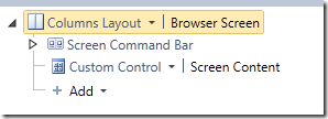
Now, build the solution. In the LightSwitch application, add a new screen, but don’t add any data to it, as shown below. The screen template you select is of no importance. Give the screen a meaningful name (I’ve named it BrowserScreen). In the screen designer, select to add a New Custom Control, as shown below.
This will open a dialog, asking you which control you want to add.
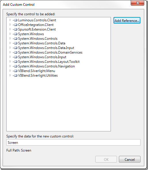
Click on the Add Reference button and select the SLExtensions project.
Within this project, select your user control, as shown next.
Your new control will now be used on the screen.
Run the application now and navigate to the Browser screen. We can enter a URL, hit the Go button and the page will be shown.
We have successfully created a new custom Silverlight control and added it to LightSwitch.
Summary
In this article, we’ve taken a look at the options we have at our disposal to create extensions in LightSwitch applications. We’ve installed and used several of these and created a custom Silverlight control to be used from a LightSwitch application.
In the next article, we’ll be using the extensibility toolkit to create more extensions!
About Gill Cleeren
Gill Cleeren is Microsoft Regional Director (www.theregion.com), Silverlight MVP (former ASP.NET MVP), INETA speaker bureau member and Silverlight Insider. He lives in Belgium where he works as .NET architect at Ordina. Passionate about .NET, he’s always playing with the newest bits. In his role as Regional Director, Gill has given many sessions, webcasts and trainings on new as well as existing technologies, such as Silverlight, ASP.NET and WPF at conferences including TechEd Berlin 2010, TechDays Belgium, DevDays NL, NDC Oslo Norway, SQL Server Saturday Switzerland, Spring Conference UK, Silverlight Roadshow in Sweden… He’s also the author of many articles in various developer magazines and for SilverlightShow.net. He organizes the yearly Community Day event in Belgium.
He also leads Visug (www.visug.be), the largest .NET user group in Belgium. Gill recently published his first book: “Silverlight 4 Data and Services Cookbook” (Packt Publishing). You can find his blog at www.snowball.be.
Twitter: @gillcleeren