 We have arrived at part 8 in this article series on LightSwitch… And it is the final part. However, to go out with a bang, we’ll look at some more extension building with the extensibility toolkit.
In
part 6, we looked at building custom controls as a way to extend what LightSwitch has in the box. In
part 7, the previous part, we used the extensibility toolkit for the first time. We created two types of custom control extensions. First, we created a value control extension, which gave us a way of overriding how a value was displayed using a custom control that we created. Secondly, we created a smart layout extension, which allowed us to create a layout, add placeholders to that layout and in the end, allow the end user of the extension to place controls in the placeholders.
Controls are just one of the six hooks we get with the LightSwitch Extensibility Framework. In this part, we’ll look at using some of the others.
Creating a new theme
As much as I want, I always fail miserably at creating great looking layouts. I think that if you are a developer reading this article, you’ll understand what I mean. We as developers aren’t meant to create great layouts; that’s the work of a designer in most cases.
In LightSwitch, the extensibility framework helps us in creating a new theme. Let’s look at how we can create such a custom theme.
1. Create a LightSwitch extension project
Just like we did in the previous part, create a new extension project. For this example, name the project CustomThemes.
2. Create the LightSwitch extension
Similarly to part 7, add a new theme extension to the Lspkg project. In this case, we are creating a new theme for MoviePolis so name the theme MoviePolisTheme.
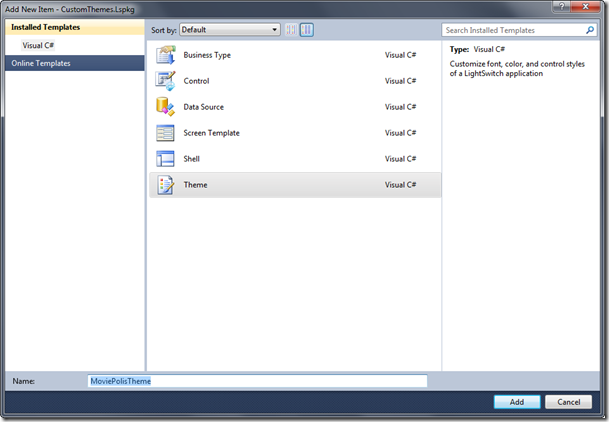
3. Give the theme a meaningful name and description
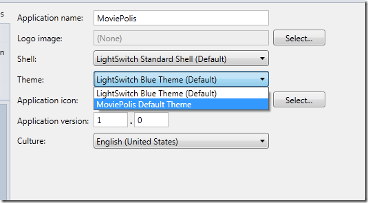
Open the MoviePolisTheme.lsml file in the CustomThemes.Common –> Metadata –> Themes folder. In this file, the theme is described. We can change this default name, since this is the name that will be appearing later in the properties window in Visual Studio. Change the values as shown in the code below.
<?xml version="1.0" encoding="utf-8" ?>
<ModelFragment
xmlns="http://schemas.microsoft.com/LightSwitch/2010/xaml/model"
xmlns:x="http://schemas.microsoft.com/winfx/2006/xaml">
<Theme Name="MoviePolisTheme">
<Theme.Attributes>
<DisplayName Value="MoviePolis Default Theme"/>
<Description Value="MoviePolisTheme contains all colors corresponding to
the colors of the company"/>
</Theme.Attributes>
</Theme>
</ModelFragment>
4. Start being creative… or let someone else do it!
A theme in LightSwitch is defined again in the CustomThemes.Client project. It exists out of a class which implements the ITheme interface. Theming (just like creating a custom Shell) is based on MEF (Managed Extensibility Framework): the class exposes itself through the Export attribute, passing in the ITheme type. A second attribute, the Theme attribute, receives as parameters the ID of the theme and the version. Both these parameters are defined further in the Constants block of the code.
The ITheme interface has another important property, namely the ColorAndFontScheme. This property returns a URI, containing the XAML that makes up the theme. This XAML file is nothing more than a Silverlight resource dictionary, containing a long list of named brushes, text styles… that are used by LightSwitch.
[Export(typeof(ITheme))]
[Theme(MoviePolisTheme.ThemeId, MoviePolisTheme.ThemeVersion)]
internal class MoviePolisTheme : ITheme
{
#region ITheme Members
public string Id
{
get { return MoviePolisTheme.ThemeId; }
}
public string Version
{
get { return MoviePolisTheme.ThemeVersion; }
}
public Uri ColorAndFontScheme
{
get
{ return new
Uri(@"/CustomThemes.Client;component/Presentation/Themes/MoviePolisTheme.xaml",
UriKind.Relative);
}
}
#endregion
#region Constants
internal const string ThemeId = "CustomThemes:MoviePolisTheme";
internal const string ThemeVersion = "1.0";
#endregion
}
A short extract of the XAML file is shown next. Note that we don’t have to specify the names, they are used internally. What we can do, is changing the default values to something that stands closely to the theme we want to create to incorporate our company’s colors.
<ResourceDictionary
xmlns="http://schemas.microsoft.com/winfx/2006/xaml/presentation"
xmlns:x="http://schemas.microsoft.com/winfx/2006/xaml"
xmlns:sys="clr-namespace:System;assembly=mscorlib">
<!--
********************************************************************************
-->
<!-- Control: Text Styles - Can be displayed on ScreenBackground, if not
use FontBackgroundBrush -->
<!-- States: FontFamily, FontStyle, FontSize, FontWeight, FontBrush,
FontBackgroundBrush -->
<!-- Font Style: Normal -->
<!-- The standard font style -->
<FontFamily x:Key="NormalFontFamily">Segoe UI, Arial</FontFamily>
<sys:Double x:Key="NormalFontSize">11</sys:Double>
<FontWeight x:Key="NormalFontWeight">Normal</FontWeight>
<FontStyle x:Key="NormalFontStyle">Normal</FontStyle>
<SolidColorBrush x:Key="NormalFontBrush" Color="#FF404040"/>
<SolidColorBrush x:Key="NormalFontBackgroundBrush"
Color="White"/>
…
By means of test, change the following brush:
<!-- ScreenBackground - The background of the screen. -->
<SolidColorBrush x:Key="ScreenBackgroundBrush" Color="Red"/>
5. Test the theme
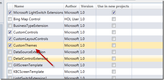
We can now test how the theme looks by running the extension. The experimental instance will open in which we again have to enable the extension like we did in the previous part.
After that, we need to select the theme to be the active theme for the application. In the General Properties tab, select the new theme from the dropdown list.
Run the application now and be amazed of your artistic work!
If you’re up for it, we’ll take a look at another extension!
Building a new business type for the movie duration
In part 7, we created a new control for the movie length (the Duration field). It contained an extra TextBlock that specified to the user that the movie duration is supposed to be entered in minutes.
We can take things a bit further here and create a new business type for this. This way, we create a new logical type on top of the Int32 type which contains extra logic such as validation (a movie length can’t be smaller than zero) and formatting. For the Minutes business type, we can specify the following rules:
- Not negative
- Not greater than 240 (who wants to sit through a film longer than 4 hours?)
- Numeric
We’ll wrap these in a new business type in the following steps.
1. Create a LightSwitch extension project
This is getting boring, isn’t it? You already know now that you’ll need to create a new extension project. This time, I’ve named the project CustomBusinessTypes.
2. Create the LightSwitch extension
Create a new extension of type Business Type in the Lspkg project and name is MovieDuration.
3. Change the base type
The default base type is set to String. We can see that in the MovieDuration.lsml file. We can change that into Int32 as shown below. We have now indicated that in the database, the value is stored as an Integer value. The extra logic we’ll add is purely inside LightSwitch.
<SemanticType Name="MovieDuration"
UnderlyingType=":Int32">
<SemanticType.Attributes>
<DisplayName Value="MovieDuration" />
</SemanticType.Attributes>
</SemanticType>
4. Create a corresponding control for the type
If we would run the application with the new business type added at this point, we would see the business type appearing (after adding the extension of course). However, it would have no different way of working than any other control to enter an integer value into. At this point, that is quite logical since we haven’t specified how we want to display the control for the type nor did we specify any validation. We’ll start with the creation of a new control for the type.
Visual Studio has already created a default representation in the MovieDurationControl.xaml in the CustomBusinessTypes.Client project.
<UserControl
x:Class="CustomBusinessTypes.Presentation.Controls.MovieDurationControl"
xmlns="http://schemas.microsoft.com/winfx/2006/xaml/presentation"
xmlns:x="http://schemas.microsoft.com/winfx/2006/xaml">
<TextBox Text="{Binding StringValue, Mode=TwoWay}"/>
</UserControl>
We can change that to the following:
<UserControl
x:Class="CustomBusinessTypes.Presentation.Controls.MovieDurationControl"
xmlns="http://schemas.microsoft.com/winfx/2006/xaml/presentation"
xmlns:x="http://schemas.microsoft.com/winfx/2006/xaml">
<Grid>
<Grid.RowDefinitions>
<RowDefinition></RowDefinition>
</Grid.RowDefinitions>
<Grid.ColumnDefinitions>
<ColumnDefinition Width="50"></ColumnDefinition>
<ColumnDefinition Width="80"></ColumnDefinition>
</Grid.ColumnDefinitions>
<TextBox Text="{Binding Details.Value, Mode=TwoWay}" Grid.Column="0"/>
<TextBlock Text="minutes" Margin="5 0 0 0" Grid.Column="1">
</TextBlock>
</Grid>
</UserControl>
We‘ve made a very simple change here; however we can go much further in this. There’s really no limit as this is pure Silverlight code.
5. Add validation rules
We are now ready to add validation rules onto the type. First, create a class that contains some constants for the project. Do this by creating a new class in the CustomBusinessTypes.Common project. The following code should be added in this class.
namespace CustomBusinessTypes
{
internal static class SharedNames
{
private const string Name = "CustomBusinessTypes";
private const string ModulePrefix = Name + ":";
private const string AttributePrefix = ModulePrefix + "@";
internal static class MovieDuration
{
private const string Name = "MovieDuration";
public const string GlobalName = ModulePrefix + Name;
internal static class ValidationAttribute
{
private const string Name = "MovieDurationValidation";
public const string GlobalName = AttributePrefix + Name;
}
}
}
}
Next, create another class in the same location which will contain the actual validation logic. In the Validate method, which will be called automatically, we first check if the underlying type is effectively of type Int32. If this is not the case, we can proceed with the normal validation rules. We first cast the passed-in value to an integer. After that, we write code which checks that the value is greater than 0 but less than 240. If not, the AddPropertyError method is used to raise the error.
public class MovieDurationValidation : IAttachedPropertyValidation
{
public MovieDurationValidation(IEnumerable<IAttribute> attributes)
{
_attributes = attributes;
}
private IEnumerable<IAttribute> _attributes;
public void Validate(object value, IPropertyValidationResultsBuilder results)
{
if (value != null)
{
// We need to check if the type is indeed Int32
if (typeof(Int32) != value.GetType())
{
throw new InvalidOperationException("Only valid on integer fields");
}
int duration = (int)value;
// Rule #1: value should not be less than 0
if (duration <= 0)
{
results.AddPropertyError("Duration of a movie can't be negative");
}
// Rule #2: value should not be greater than 240
else if (duration > 240)
{
results.AddPropertyError("Duration of a movie should not be longer than 4
hours");
}
}
}
}
Now we need to create another class, the factory class for the Validation rules. This class will instantiate the class we just created. The code for this class is shown below (it can be found on MSDN as well, as this class is most of the time the same code).
[Export(typeof(IValidationCodeFactory))]
[ValidationCodeFactory(SharedNames.MovieDuration.ValidationAttribute.GlobalName)]
public class MovieDurationValidatorFactory : IValidationCodeFactory
{
public IAttachedValidation Create(IStructuralItem modelItem,
IEnumerable<IAttribute> attributes)
{
if (!IsValid(modelItem))
{
throw new InvalidOperationException("Only valid on integer fields");
}
return new MovieDurationValidation(attributes);
}
public bool IsValid(IStructuralItem modelItem)
{
INullableType nullableType = modelItem as INullableType;
modelItem = null != nullableType ? nullableType.UnderlyingType : modelItem;
while (modelItem is ISemanticType)
{
if (String.Equals(((ISemanticType)modelItem).Id,
SharedNames.MovieDuration.GlobalName, StringComparison.Ordinal))
{
return true;
}
modelItem = ((ISemanticType)modelItem).UnderlyingType;
}
return false;
}
}
Finally, we need to link the validation code with the business type. We can do that through the MovieDuration.lsml code. In the following code, we have linked the MovieDuration type with the MovieDurationValidation class.
<SemanticType Name="MovieDuration"
UnderlyingType=":Int32">
<SemanticType.Attributes>
<DisplayName Value="Movie Duration" />
<Attribute Class="@MovieDurationValidation">
</Attribute>
</SemanticType.Attributes>
</SemanticType>
<AttributeClass Name="MovieDurationValidation">
<AttributeClass.Attributes>
<Validator />
<SupportedType Type="MovieDuration?" />
</AttributeClass.Attributes>
</AttributeClass>
6. Test the business type and the validation logic
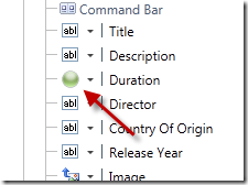
Now that we have written the validation code and the business type itself, it’s time to start playing with what’ve created. Run the extension and open the MoviePolis application in the Experimental Interface. Enable the extension first. Then, in the entity designer, change the type for Duration to Movie Duration.
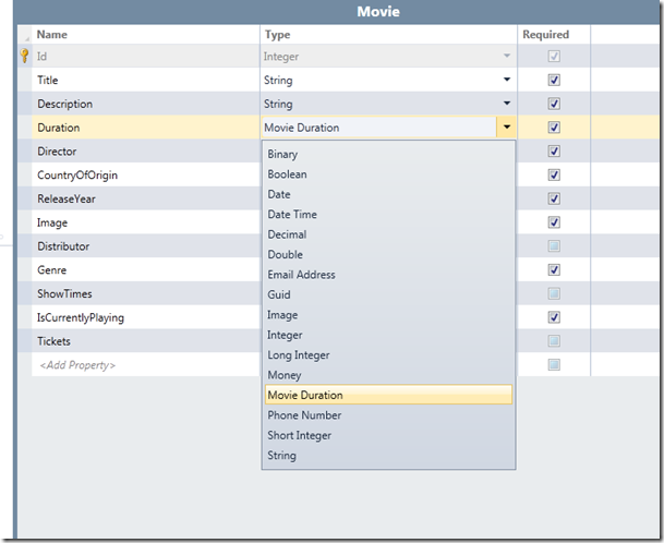
The screens using the Movie entity will be updated.
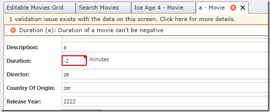
Run the application now. When you enter a non-valid value for the minutes (it should be between 0 and 240 to be valid), you’ll get a validation exception, just as you would expect with other types. However, in this case, we’ve wrapped all of this logic inside the newly created type ourselves.
Other extensibility points
As mentioned in part 6, there are some other hooks that you get access to with the extensibility framework. We can build a custom data source, which is in fact a WCF RIA Service that connects to an external source of data. If for example you need to store your data in XML, you can build such a WCF RIA Service that does the plumbing to and from XML. The LightSwitch application then connects with the service; this process is entirely transparent for the LightSwitch application.
We’ve seen how we create new themes. However, if we want to override more than just the colors, we can create an entirely new shell. This allows us to plug in new navigation for example. Finally, when we aren’t satisfied with the available screen templates within the application, we can create our own as well.
Take a look at the pages in the LightSwitch developer center on MSDN if you want to create any of these!
Summary
In this final part, we’ve seen some more extension being built with the Extensibility Framework. We’ve seen how to create new themes and how to create new business types.
About Gill Cleeren
Gill Cleeren is Microsoft Regional Director (www.theregion.com), Silverlight MVP (former ASP.NET MVP), INETA speaker bureau member and Silverlight Insider. He lives in Belgium where he works as .NET architect at Ordina. Passionate about .NET, he’s always playing with the newest bits. In his role as Regional Director, Gill has given many sessions, webcasts and trainings on new as well as existing technologies, such as Silverlight, ASP.NET and WPF at conferences including TechEd Berlin 2010, TechDays Belgium, DevDays NL, NDC Oslo Norway, SQL Server Saturday Switzerland, Spring Conference UK, Silverlight Roadshow in Sweden… He’s also the author of many articles in various developer magazines and for SilverlightShow.net. He organizes the yearly Community Day event in Belgium.
He also leads Visug (www.visug.be), the largest .NET user group in Belgium. Gill recently published his first book: “Silverlight 4 Data and Services Cookbook” (Packt Publishing). You can find his blog at www.snowball.be.
Twitter: @gillcleeren